We’re based in Bristol, famous for its array colourful houses that are so often shown as the face of our city to any ‘outsiders’! There is more to colour than meets the eye and as interior designers it’s a vital part of our role to understand the impact colour has on the environment it is placed in and the user of those spaces. Colour is an important part of visual communication and the way we use it changes the influence of and character of a place. Only a month ago we were discussing the use of colour and showing you how we have used it across all of our projects, but as we set up to launch the Wylde IA Happiest Workplace Competition 2018 we wanted to highlight the psychological impact of certain colours.
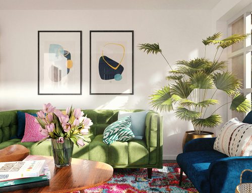
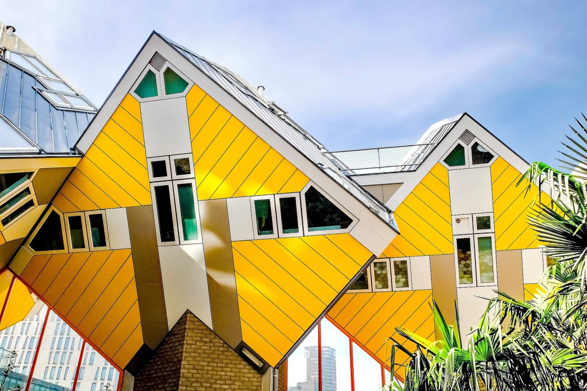
Our brains process and interpret different colours in different ways, as a visual language. We know that certain colours promote specific emotional responses which is why it’s so necessary to get the colour schemes spot on in terms of interior and exterior architectural design schemes. We have simplified some basic colours and defined what they ‘express’; Colours that can only be used with very careful consideration are the bright, punchy colours such as Red, Orange and Purple – all passionate and aggressive meaning they will dominate and often take over a space. Red is a stimulating colour that kicks an immediate emotive response, similarly purple is a bold and dramatic colour that punches a sense of formal ambience, royalty and sophistication! Yellow creates a sunny, welcoming and cheerful atmosphere, but overuse can turn childish and even sickly, whereas greens represents nature, peaceful and simplistic tones much like the use of white which is often linked to sterility but also can appear bland.
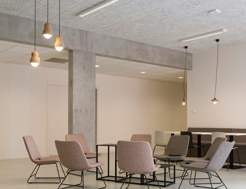
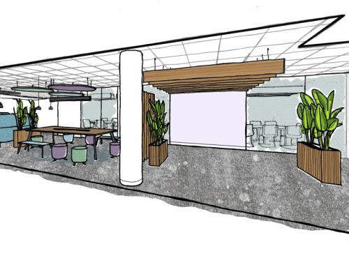
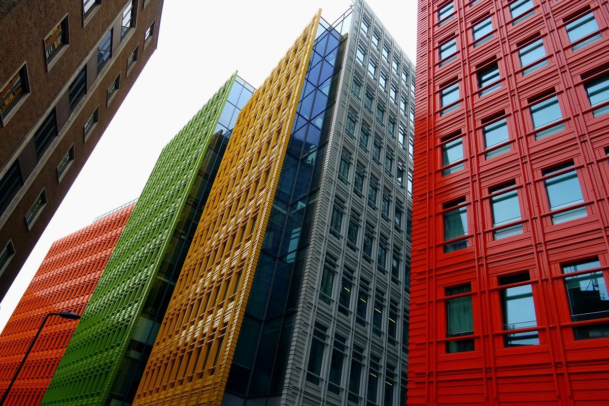
The impression of a colour scheme in any built environment is directly correlated to the psychological experience of the space and therefore function. It is becoming evermore apparent that architects and designers are carefully considering the colours within a space and the light that illuminates them. Often we see design schemes that select no more than three core colour palettes to work with, but we’ve found some projects that really dare to go bright – even on the outside!