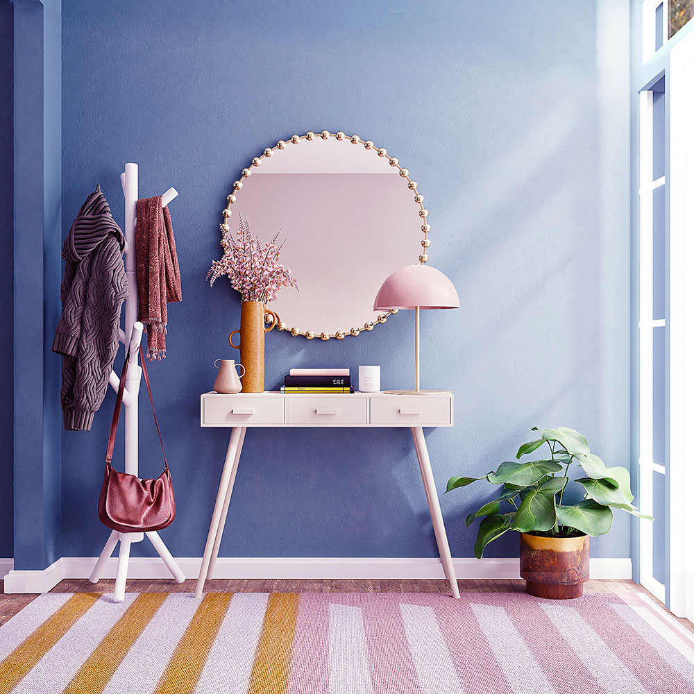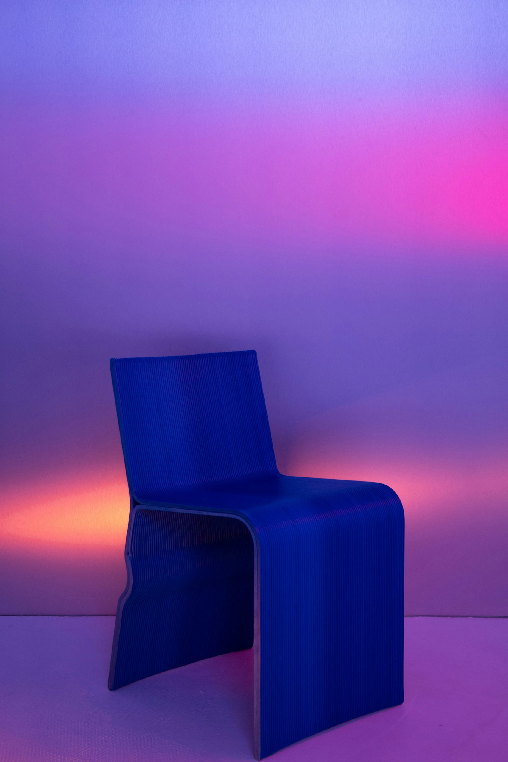
As we confidently head towards summer, the soft (and longer lasting) light of May fills our homes, there’s something quietly compelling about mauve. This understated yet confident hue, somewhere between dusty lavender and muted plum, offers a nuanced alternative to the usual pastel palette. Neither overly sweet nor too sombre, mauve brings with it a kind of modern romanticism — perfect for interiors seeking warmth, depth and a touch of the unexpected.
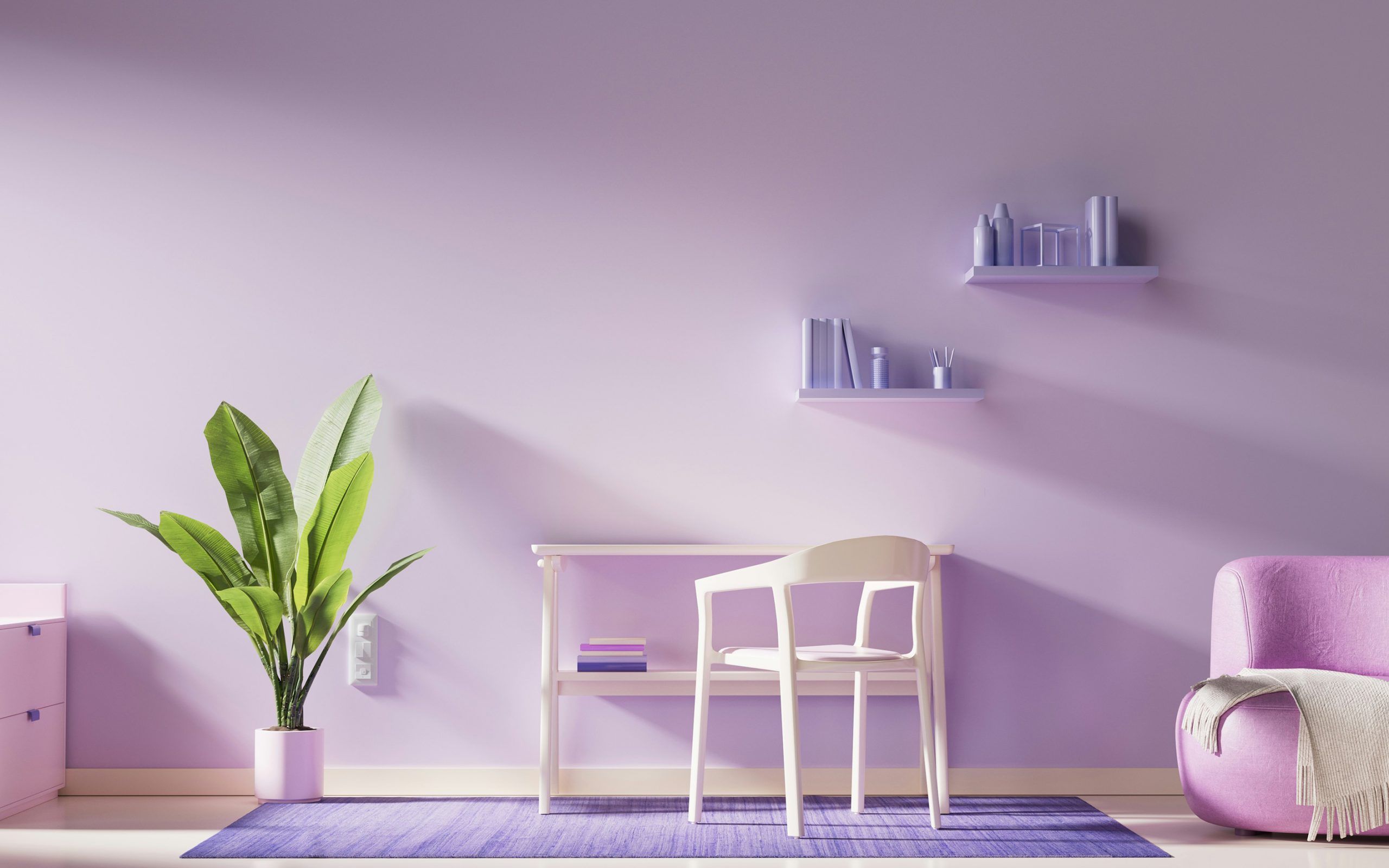
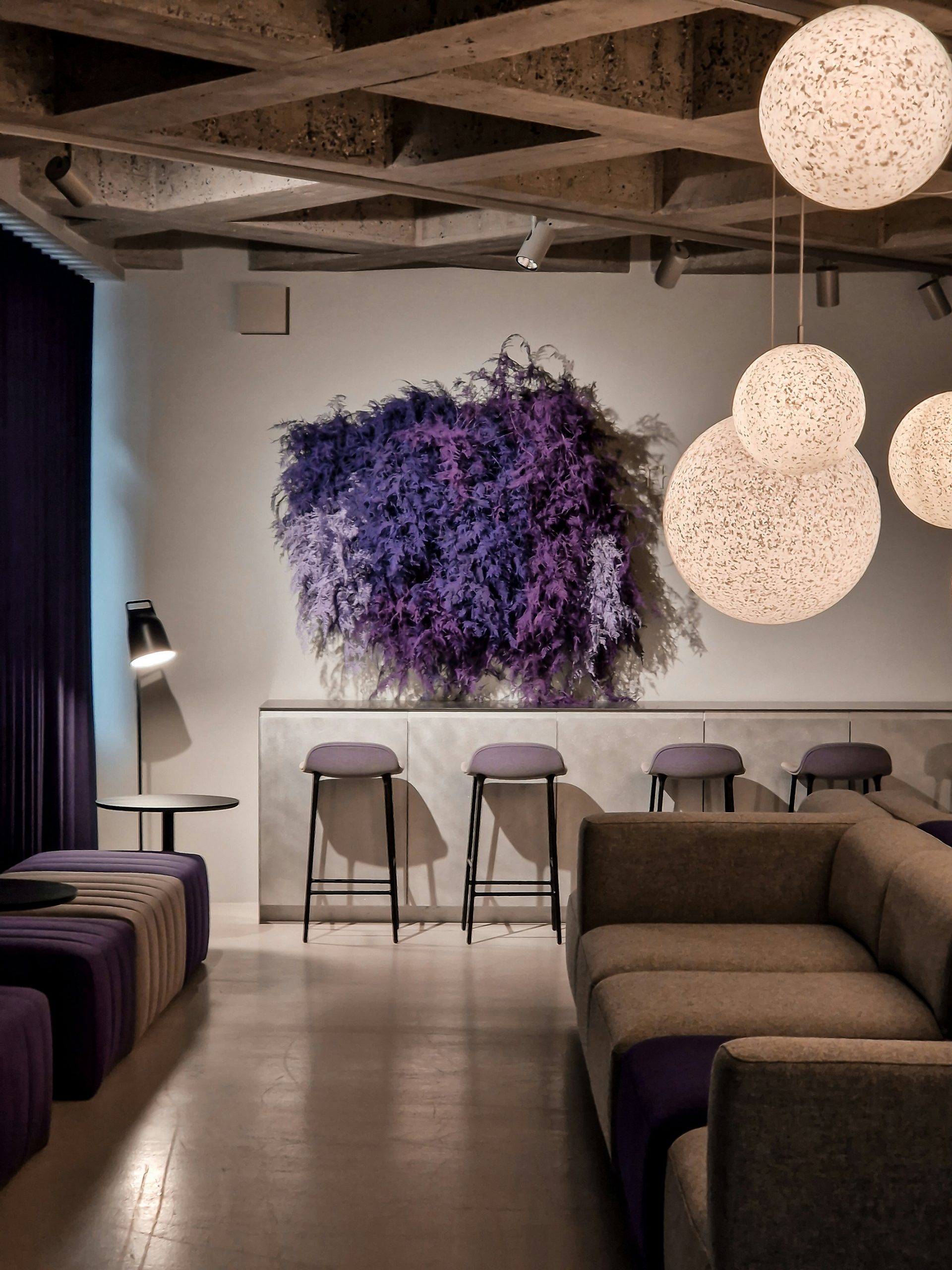
Mauve has long associations with vintage glamour, but in today’s interiors, it has found a new role. Paired with the right materials and tones, it can feel utterly contemporary. Think plaster walls with a hint of greyed violet, or upholstery in washed lilac velvet offset by pale oak or brushed brass. Rather than dominating a space, mauve sits back, allowing form, texture and light to do the talking. It works brilliantly as a backdrop for layered neutrals — clay, linen, chalk — creating interiors that feel calm but not cold.
To use mauve well is to understand its subtleties. It’s most effective when incorporated into a tonal scheme rather than as a pop of colour. Mauve pairs naturally with earthy pinks, soft browns and muted blues, but can also provide a surprisingly elegant contrast with deep charcoal or inky navy. For more daring compositions, it can even bridge cooler tones like sage green or slate. The key is softness and balance — avoid anything too stark or saturated.
Mauve lends itself beautifully to tactile materials. Upholstered furniture, heavy linen curtains, hand-thrown ceramics and limewashed walls all benefit from its powdery finish. It is especially at home in rooms that lean towards relaxed refinement — reading corners, bedrooms, or dining spaces where atmosphere matters more than statement. Even a small touch, such as a mauve-toned glass pendant or a subtly tinted concrete basin, can introduce a gentle design language into a space.
This May, as the palette of nature shifts from fresh greens to the softer tones of early summer, mauve offers a timely reflection of the season’s mood. It’s a shade that whilst being subtle, can be bold and effective — perfect for homes that favour elegance over extravagance. In a design world often caught between extremes, mauve offers something quieter: a considered, confident in-between.