The first Wylde insight of the year usually lands with a surge of colour-led anticipation, so we’ll admit there was a collective sigh when Pantone revealed the Colour of the Year 2026 as “Cloud Dancer”. An off-white. Not even a dramatic white! More of a ‘new tenancy, keys collected, walls still drying’ white also known as landlord white. While we can’t pretend we’re not slightly disappointed that the colour of the year is barely a colour at all, once the sarcasm settles, the concept starts to slowly make sense.
Cloud Dancer isn’t about emptiness, it’s about lightness. “soft, airy off-white symbolising calm, fresh starts, and clarity in a noisy world”. The colour of 2026 leans into softness and a kind of visual quiet that feels increasingly appealing. When you take it out of the branding decks and drop it into the home, it opens up a surprisingly playful direction: especially with regards to cloud-like interiors that prioritise comfort, tactility and a sense of gentle escape. Forget painting the walls, we’re talking cloud inspiration!
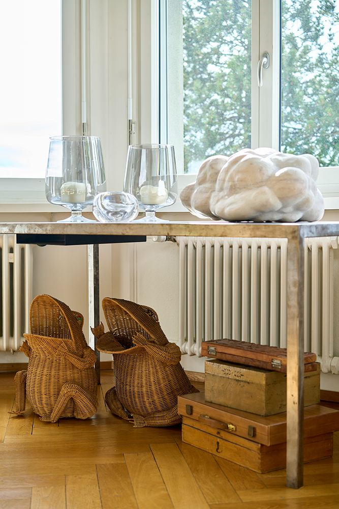
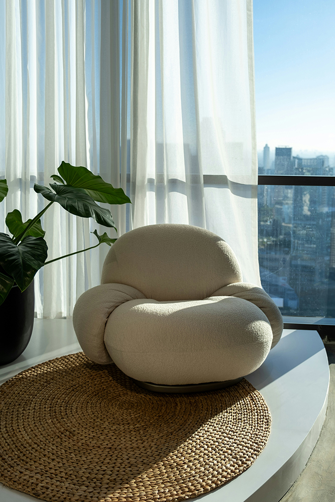
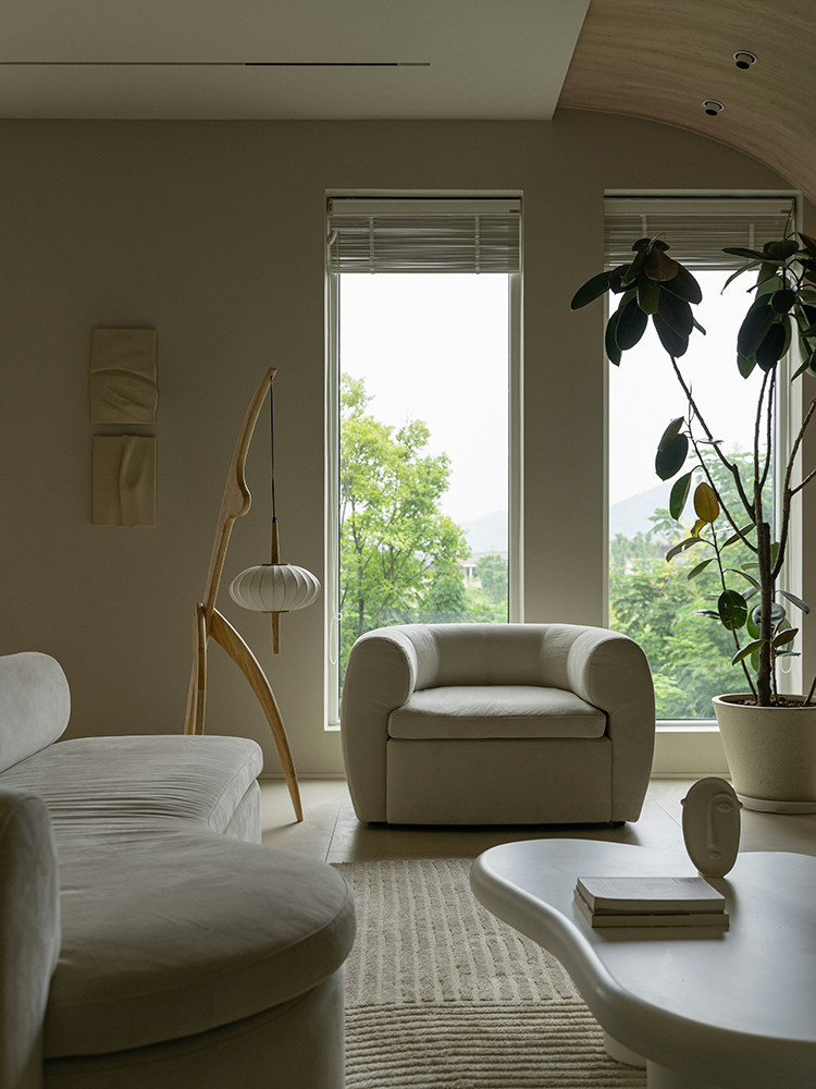
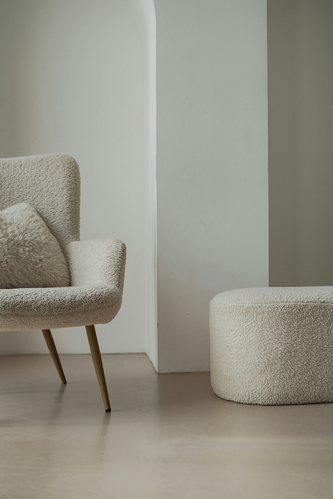
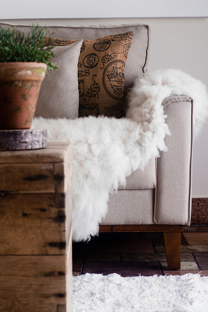
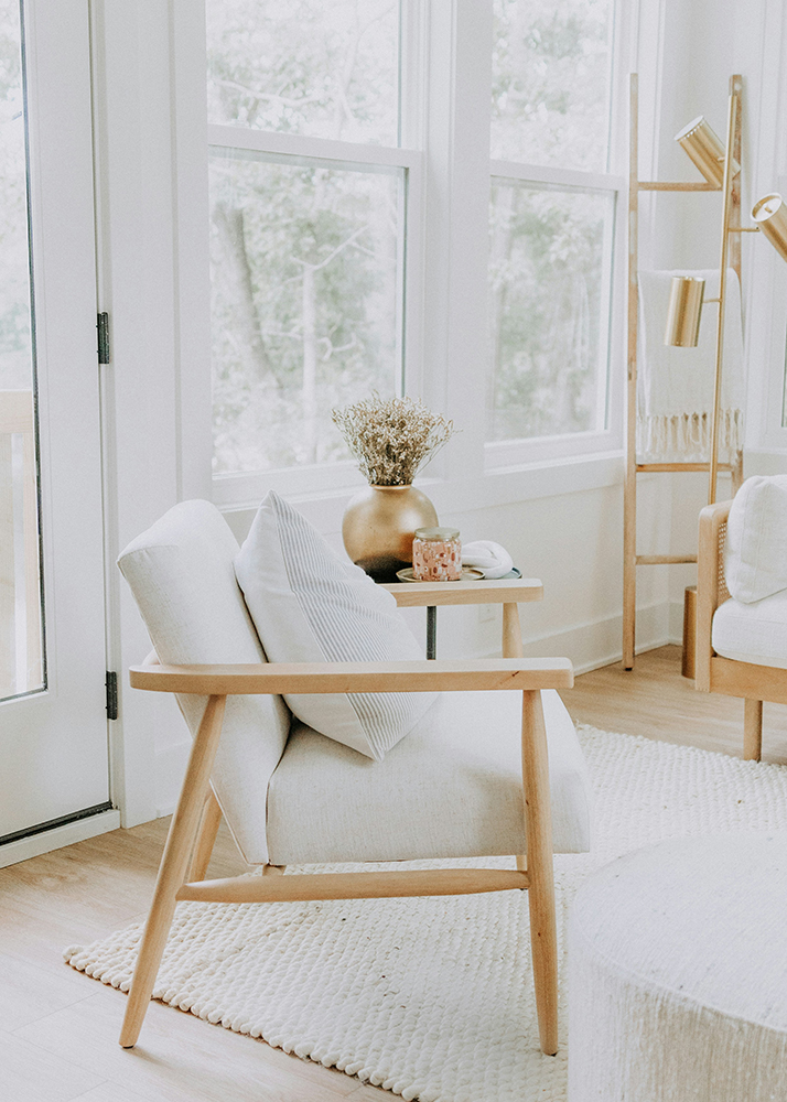
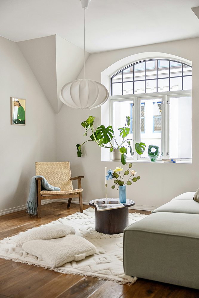
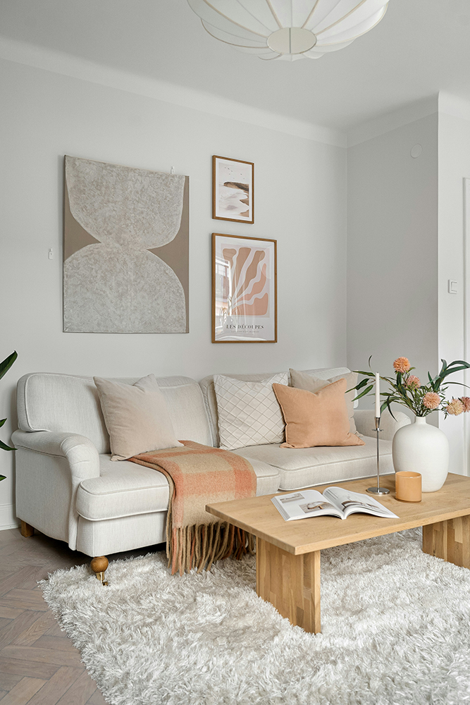
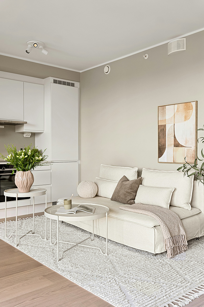
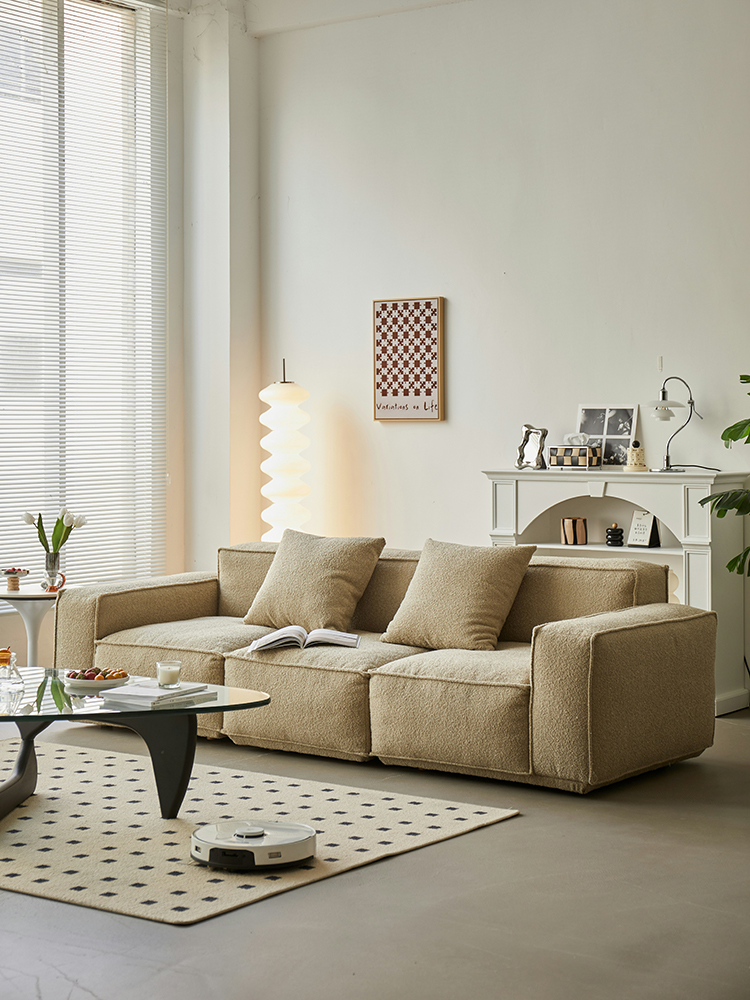
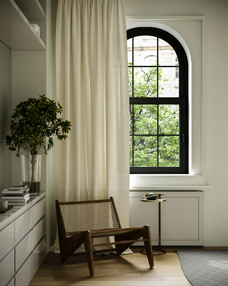
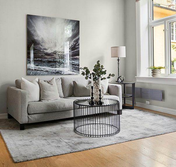
Fluffiness is key. This is where cotton wool textures come into their own. Bouclé sofas, deep-pile rugs, brushed throws and oversized cushions create that sink-in, cloud-adjacent feeling. Upholstery should feel padded and generous, slightly indulgent, think: floating on a cloud! Layering these softer elements against clean fresh backdrops (not necessarily white!) keeps the space from feeling heavy while dialling up the comfort.
Fabrics should feel as airy. Sheer curtains, gauze-like linens and lightweight wool blends help soften edges and diffuse light. Nothing stiff, nothing sharp. The movement of fabric becomes part of the atmosphere, catching air and light in a way that makes rooms feel alive rather than static. Even bedding can lean into this, with crumpled layers that feel inviting rather than overly styled.
Lighting does much of the heavy lifting in a cloud-inspired home. Harsh white bulbs are the enemy here. Instead, think muffled white light, warm but not yellow, filtered rather than direct. Paper lampshades, frosted glass, fabric sconces and concealed LED strips help create a glow that feels suspended in the room. The goal is light that wraps around you, not light that announces itself.
Used in this way, Cloud Dancer becomes less about blank walls and more about mood. It’s a foundation rather than a feature, allowing texture, form and light to do the talking. So while we may have hoped for something a little more rebellious to kick off 2026, Pantone’s barely-there white quietly nudges us towards interiors that feel softer, calmer and a little more cloud-like. And honestly, after the last few years, that doesn’t feel like the worst place to land.