We love design and because it’s the week of love (a little reminder that it’s Valentine’s Day on Sunday everyone!) we’re looking at all things red & pink! Yes, it’s a little cliche – but we love an excuse to showcase some of our very own bright and bold colour schemes and select our favourite loud designs from across the internet also…
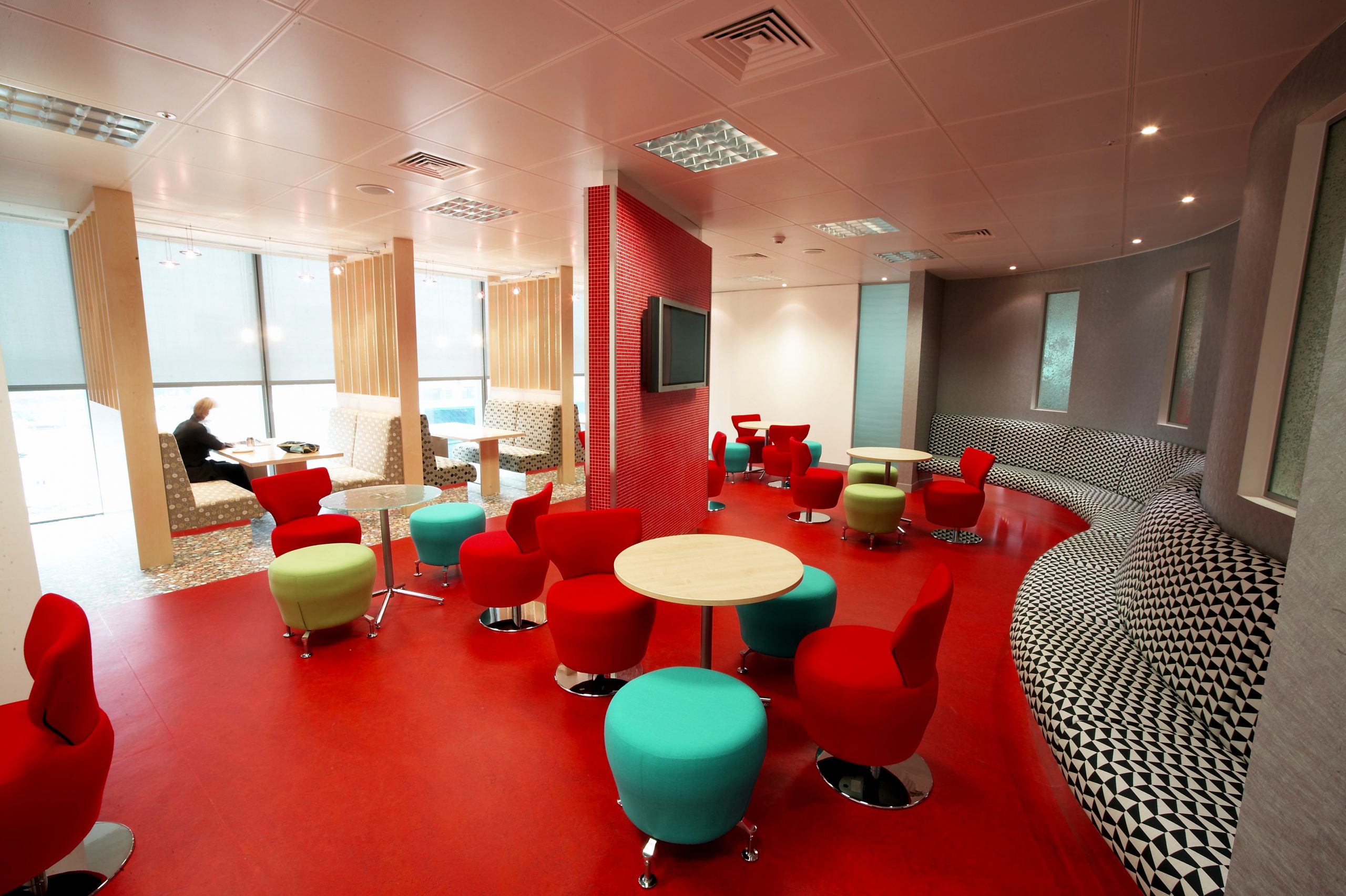
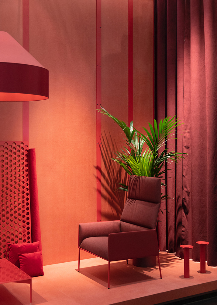
In terms of colour theory, reds and pinks are tightly intertwined with red being a primary colour and pink a tertiary derivative. Red is a hot, energetic colour associated with love and passion – sometimes even anger or danger (think warning signs and stop lights!). When used in interior design red can actually have a physical effect on users of the space, raising blood pressure and respiration rates. Red can also be associated with royalty and importance – so can be a daring colour choice for break out spaces and meeting rooms in workplaces.
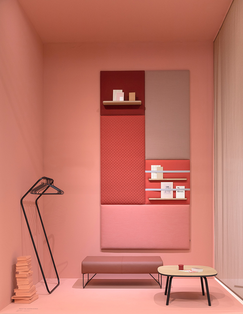
We think red – when used carefully – can be the perfect accent colour when used in interior design schemes. Red can insert energy into think-tank spaces and highlight important meetings areas. It takes a certain amount of confidence to use red in its purest form but we think it lends itself to some of the most powerful statement design aesthetics. Red in all its variants and shades is versatile from the palest pinks to the richest burgundy.
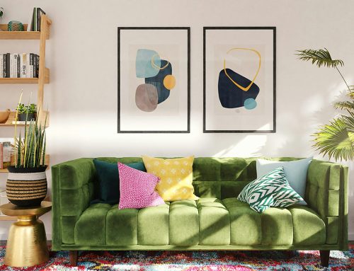
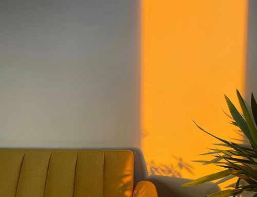
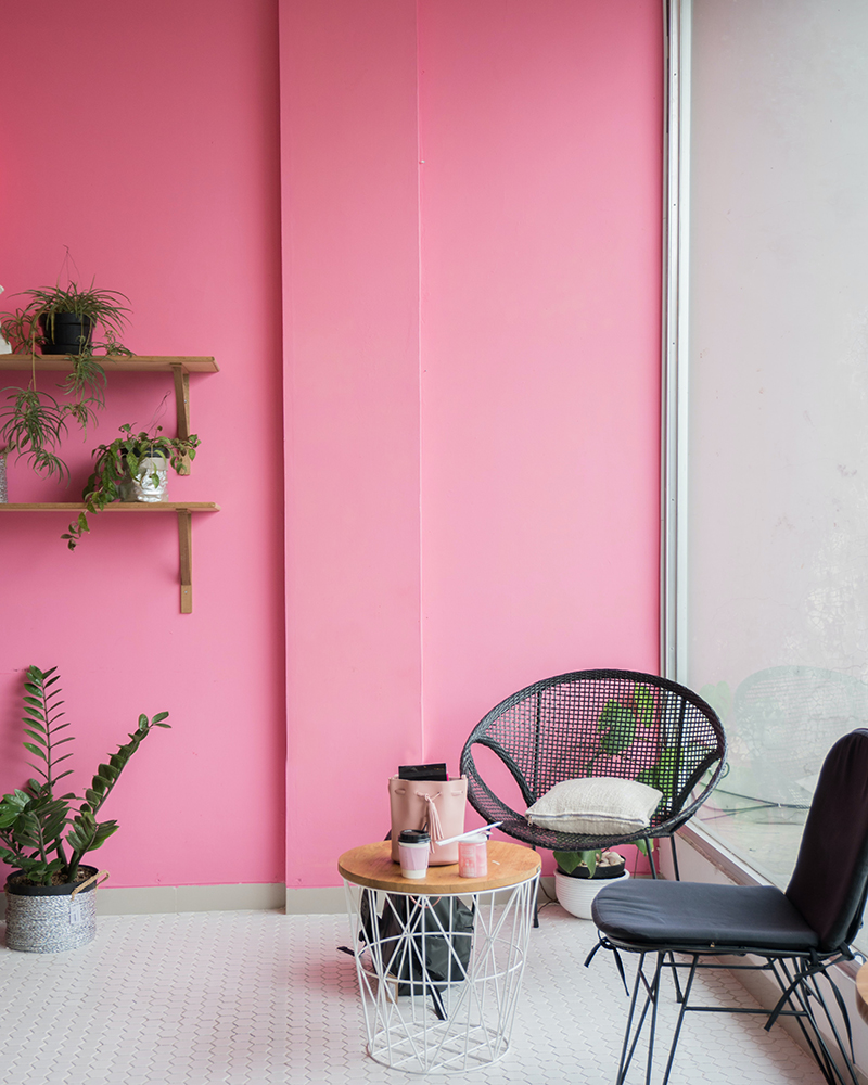
Pink is typically associated with love and romance. It is often described as a feminine color due to it’s associations with traditionally feminine qualities such as softness and compassion – in interior design pink is a calm, warm and relaxing colour. Pink shades have been increasingly popular in interior design trends over recent years as ‘millennial pink’ and ‘delicate blush’ take centre stage as the new gender-neutral palette.
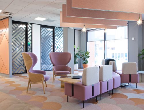
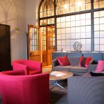
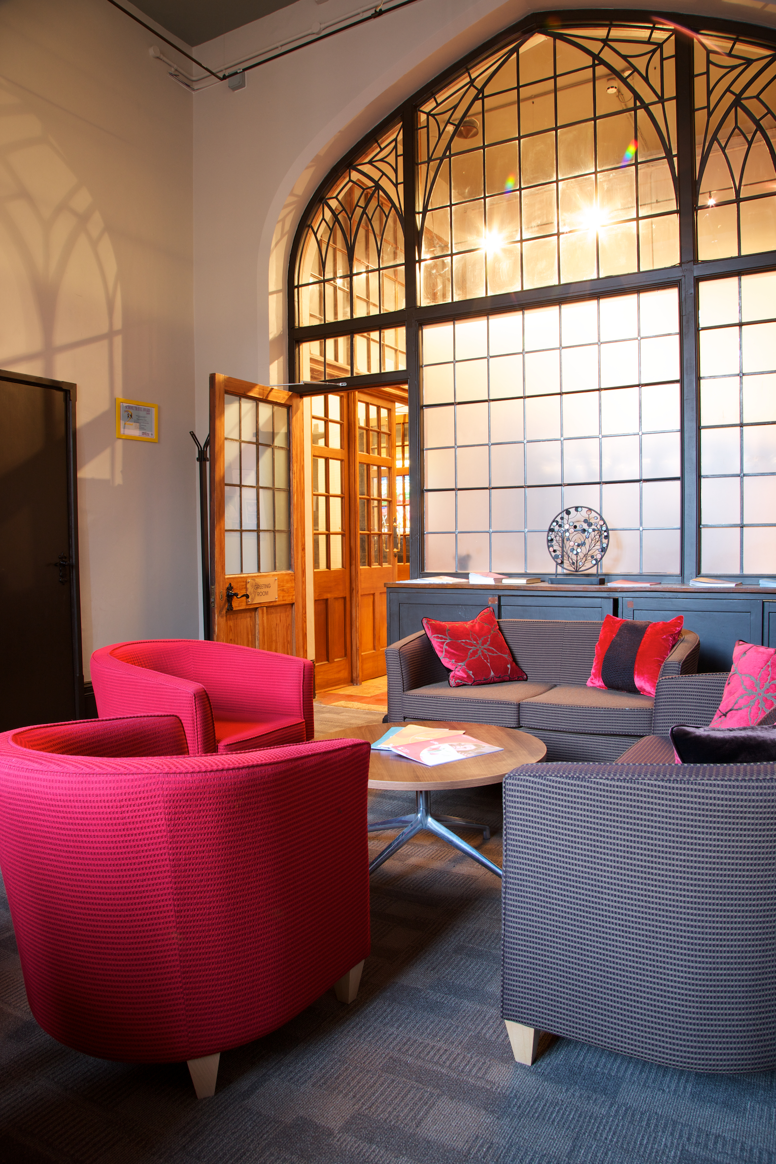
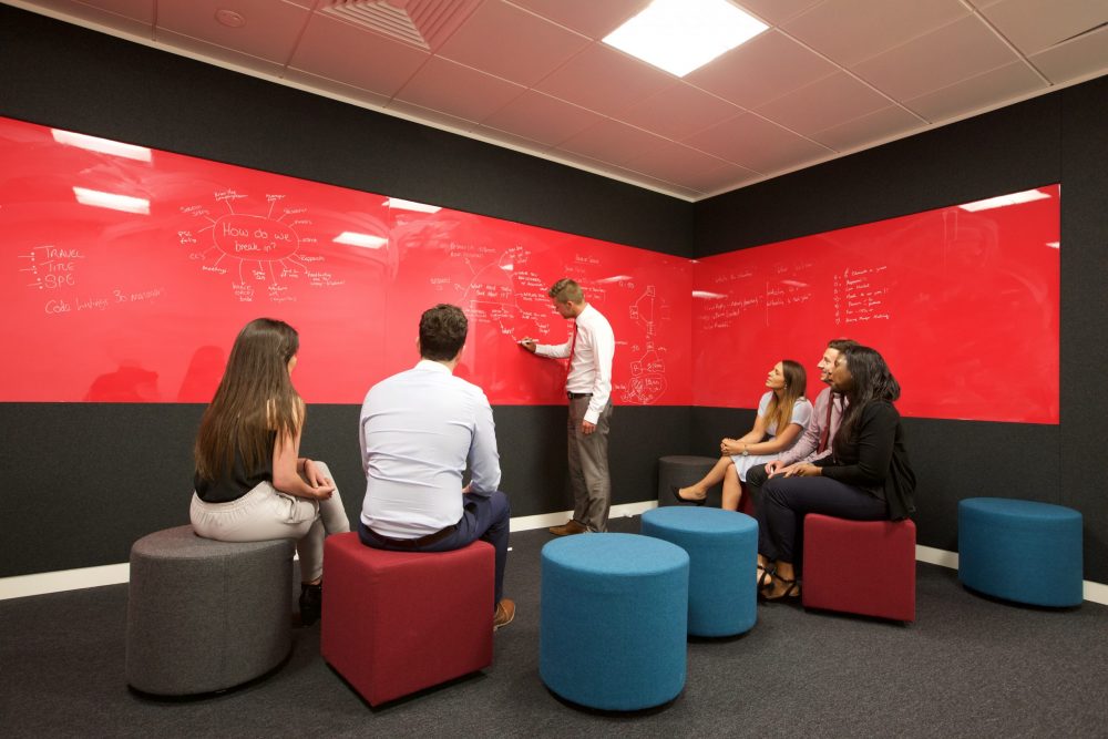
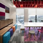
We’ve collected some of our favourite red and pink design schemes from our own projects. Have a wonderful Valentines Week… – or simply enjoy these snaps!
-

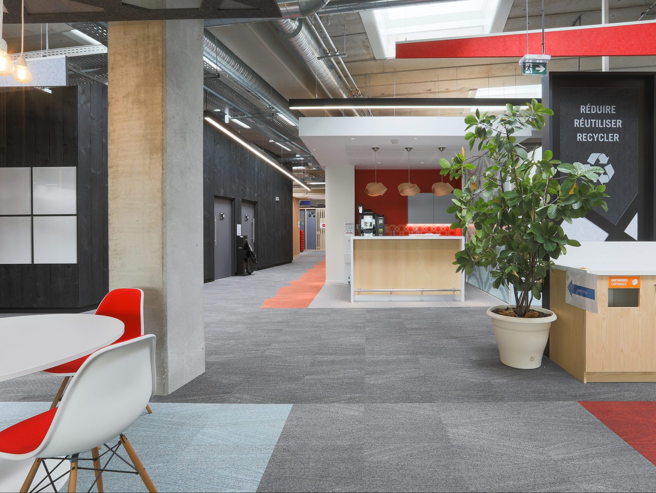
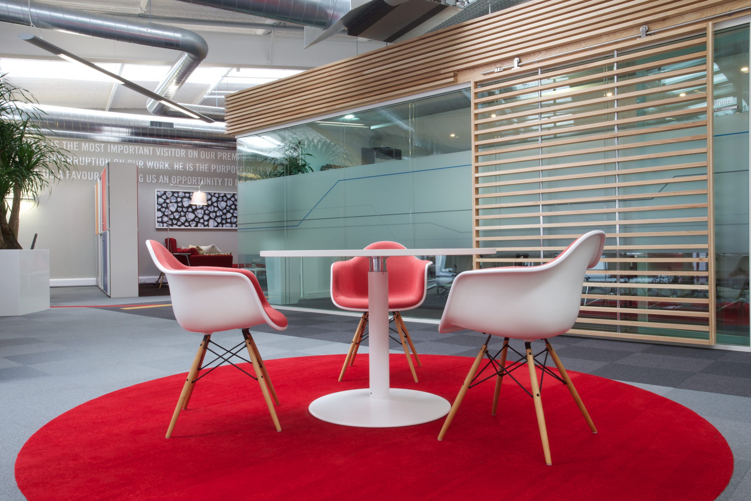
- Wylde Seco CGI
-
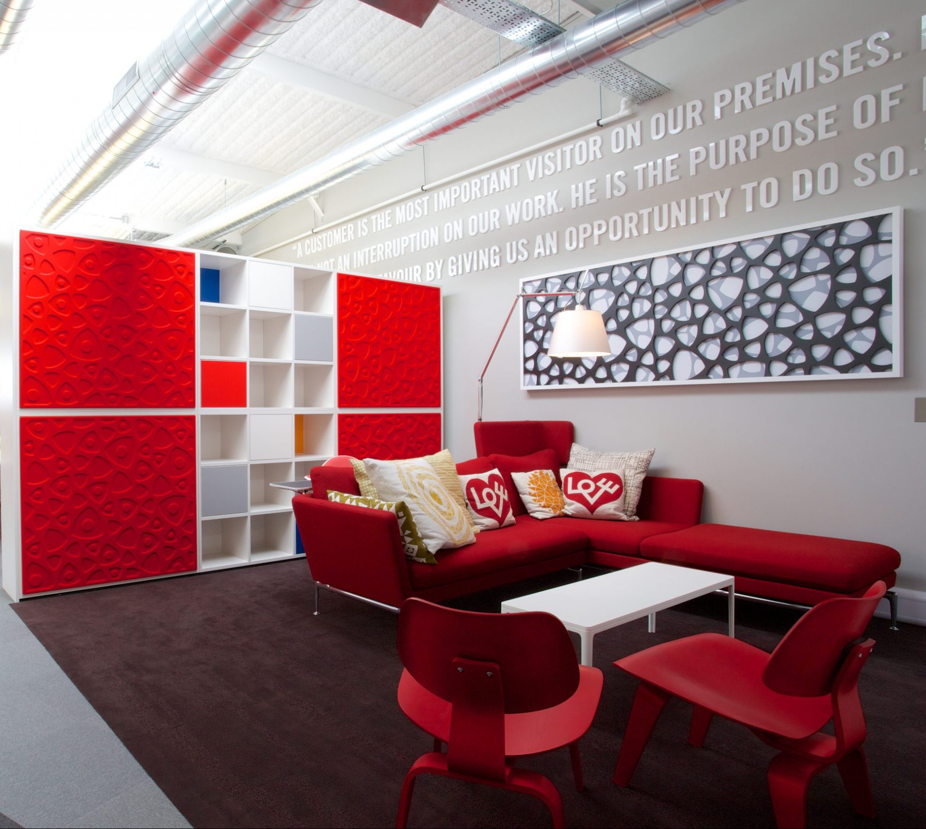
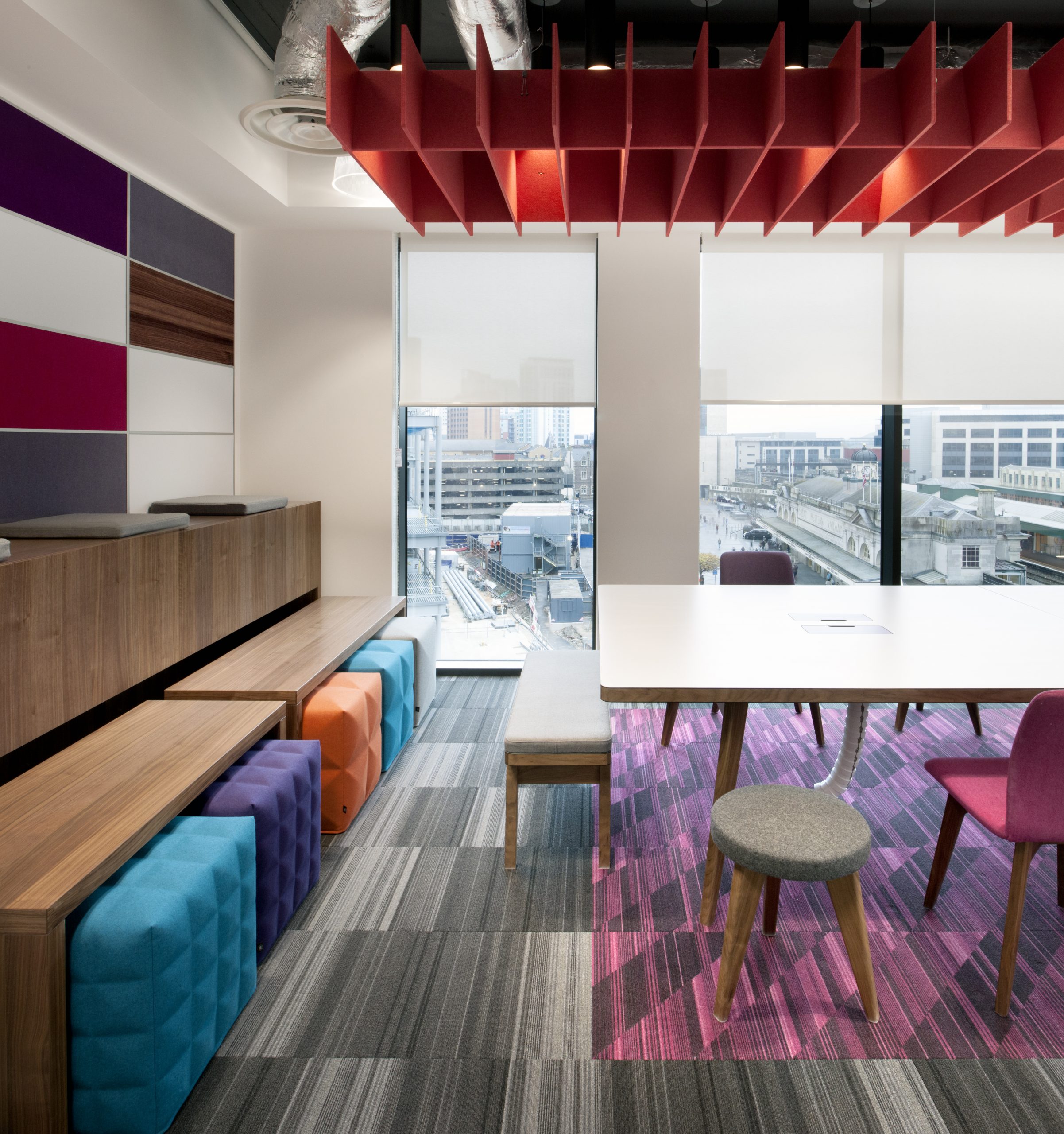
- Wylde – Seco
-
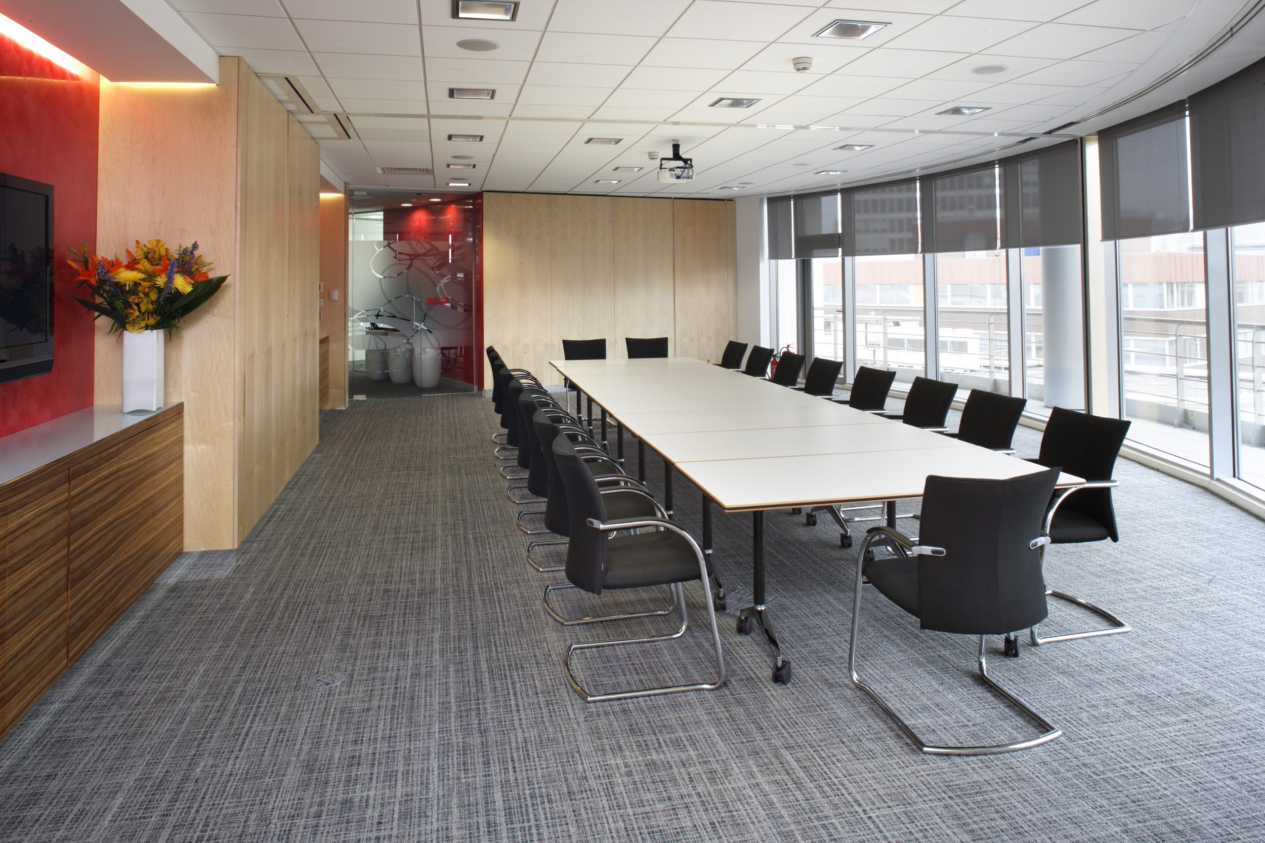
- Wylde – BGS
-

- Wylde – Opus
-
- Wylde – MotoNovo
-

- Wylde – Seco UK
-

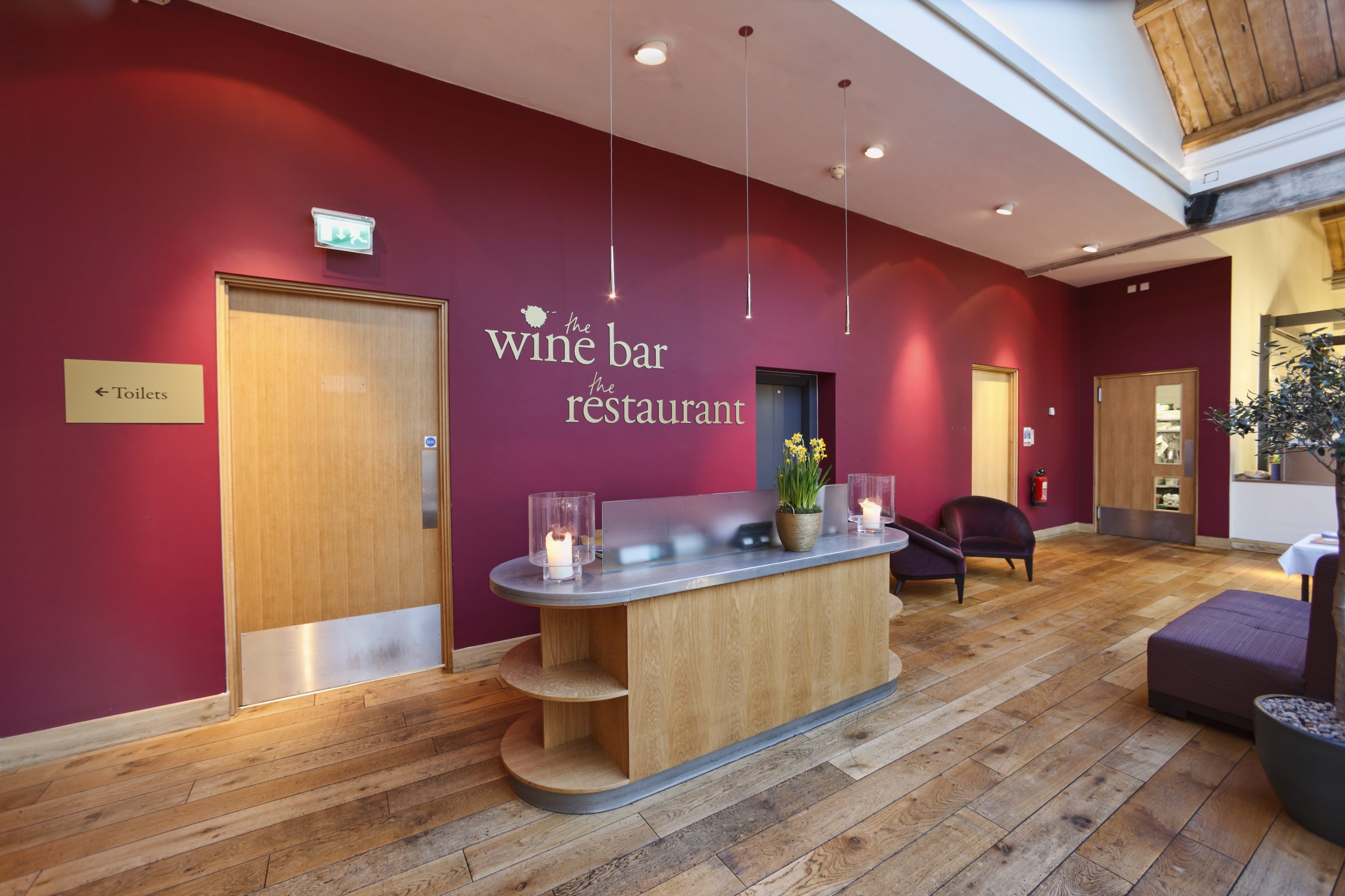
- Wylde – Bordeaux Quay
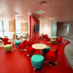
-

- Wylde – KMC
-
- Wylde – KMC