October arrives with its crisp air, golden leaves and the unmistakable presence of pumpkins in every shape and shade. Beyond the front porch or kitchen counter, pumpkin-inspired colours can bring warmth, creativity and a sense of seasonal character into our interiors. From homes filled with rustic charm to contemporary workplaces in need of a gentle lift, these hues have a remarkable versatility that stretches far beyond the familiar flash of bright orange.
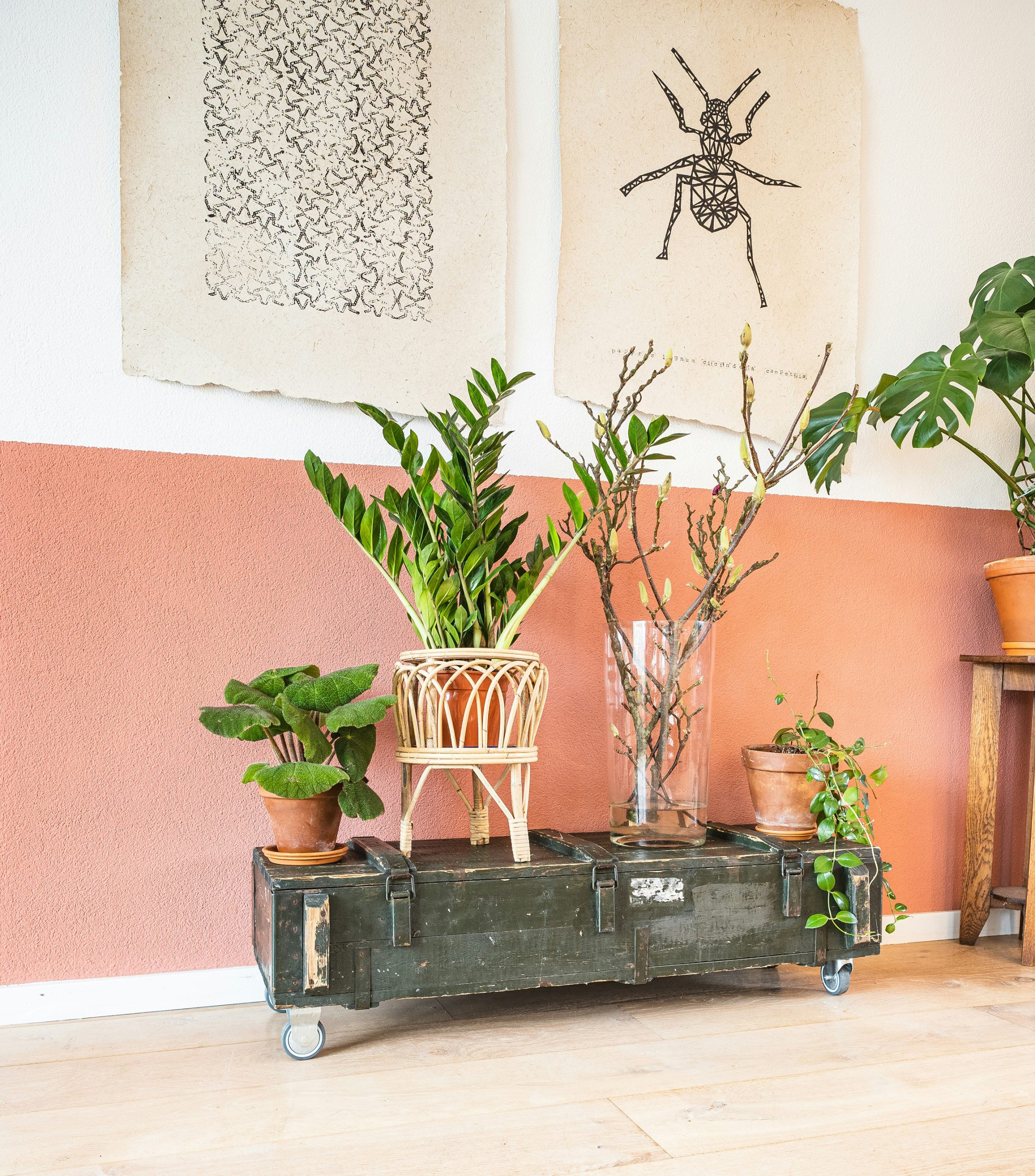
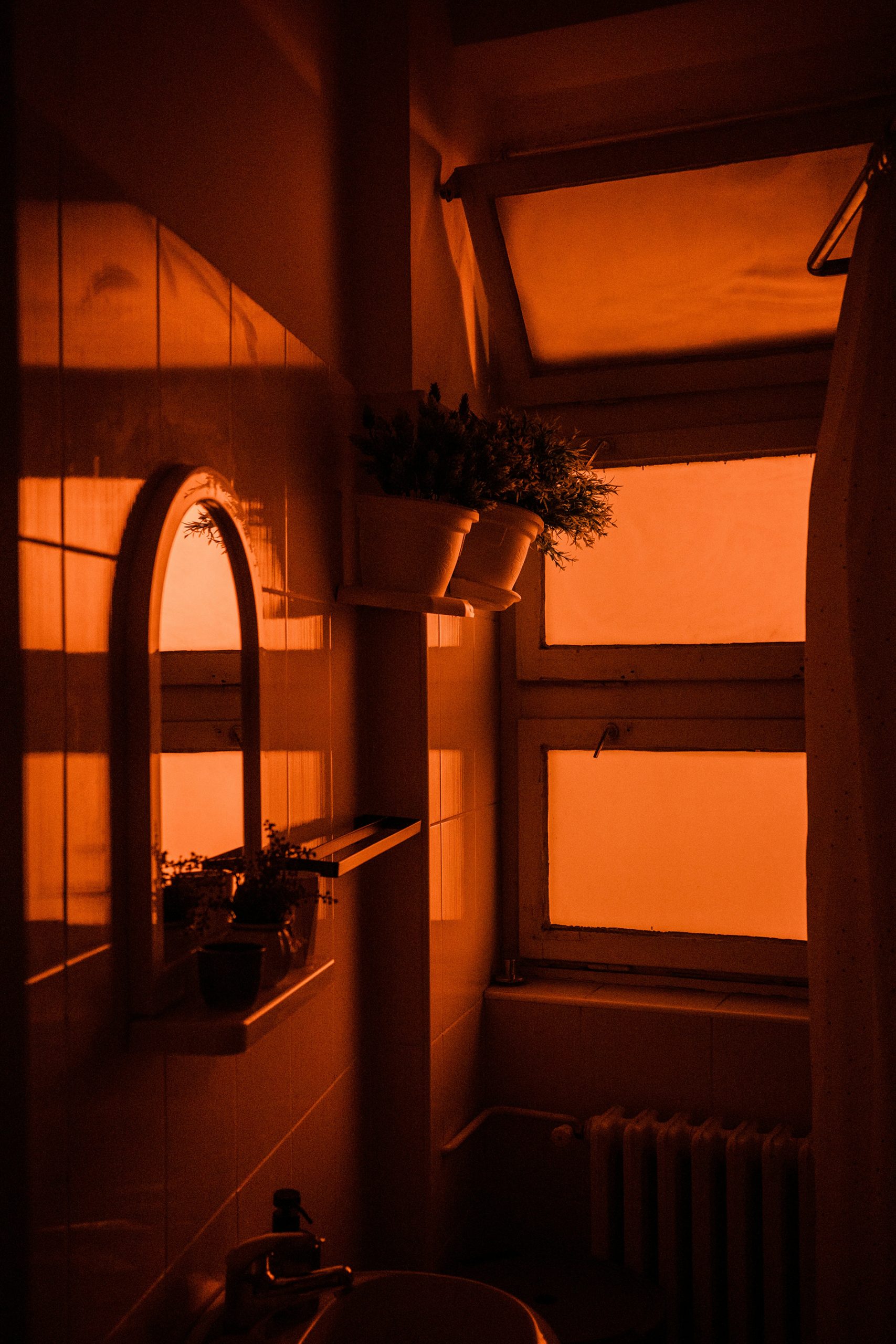
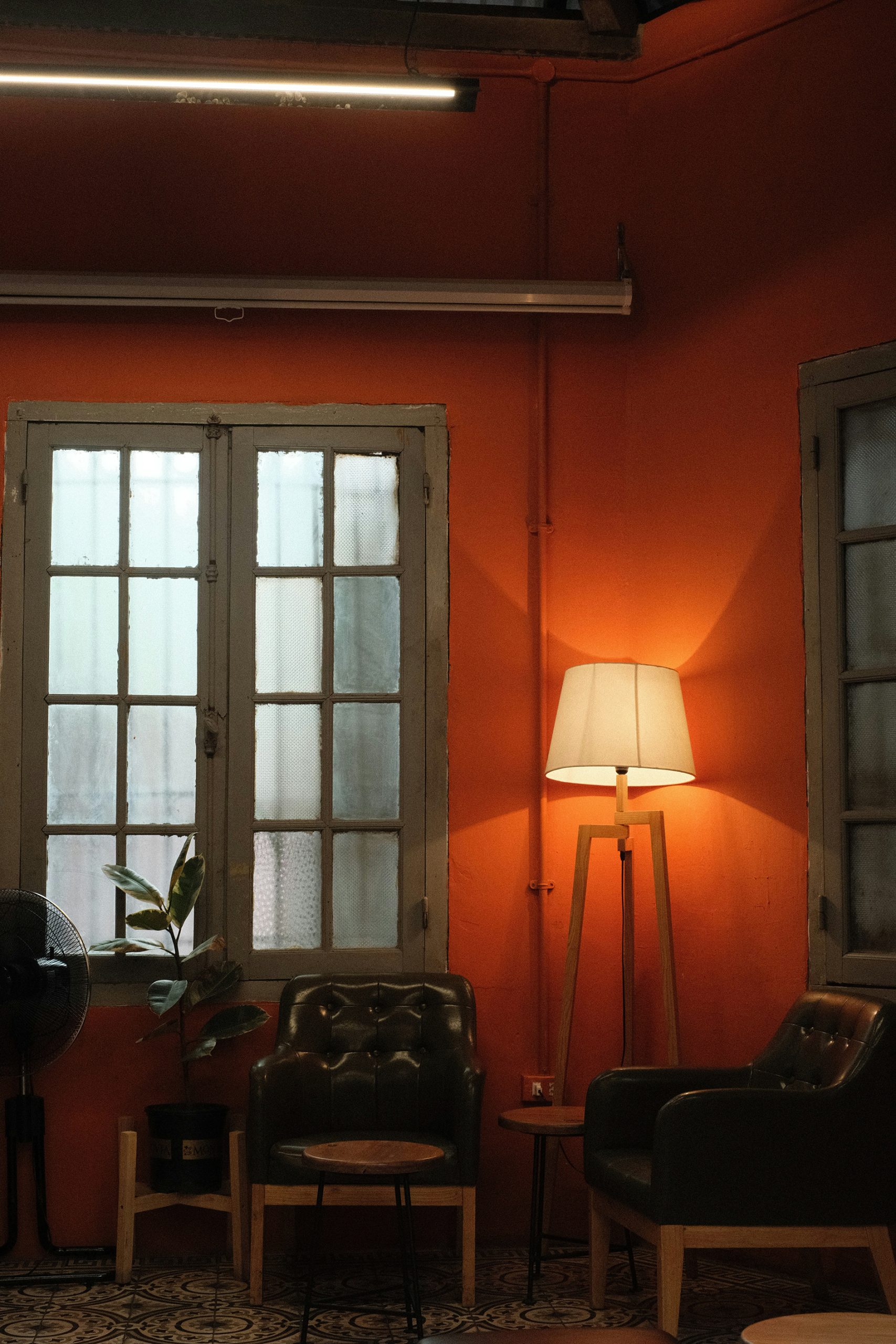
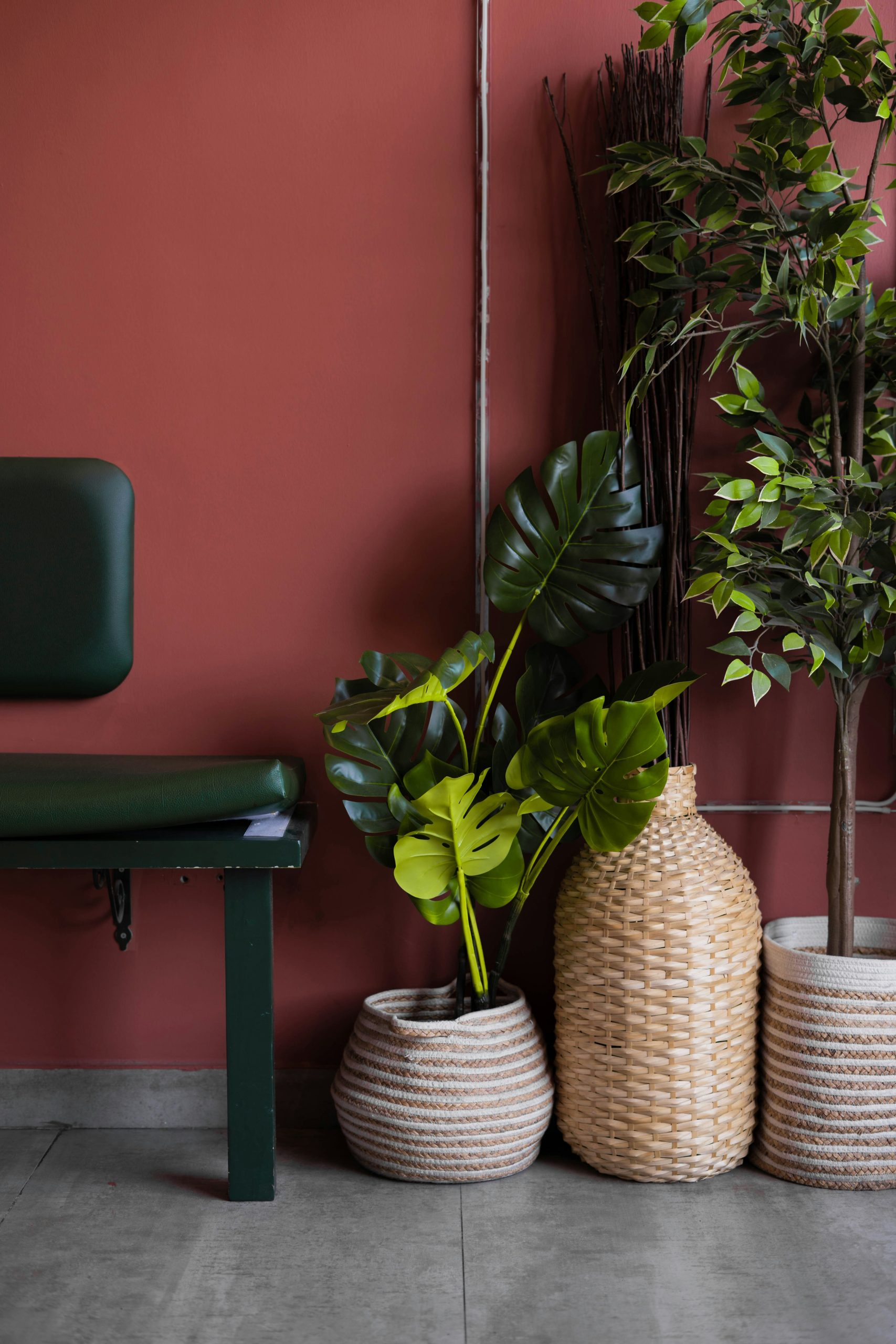
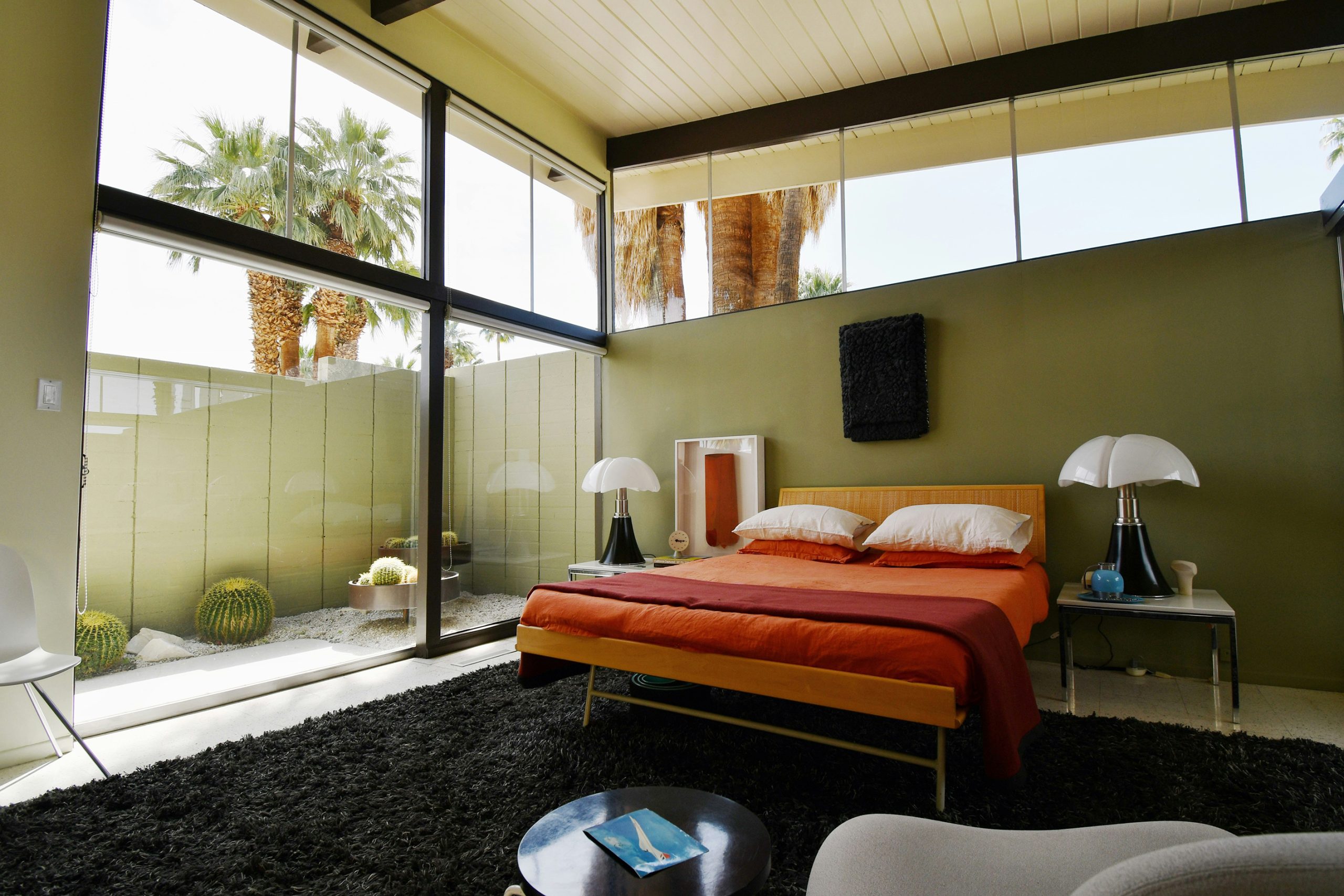
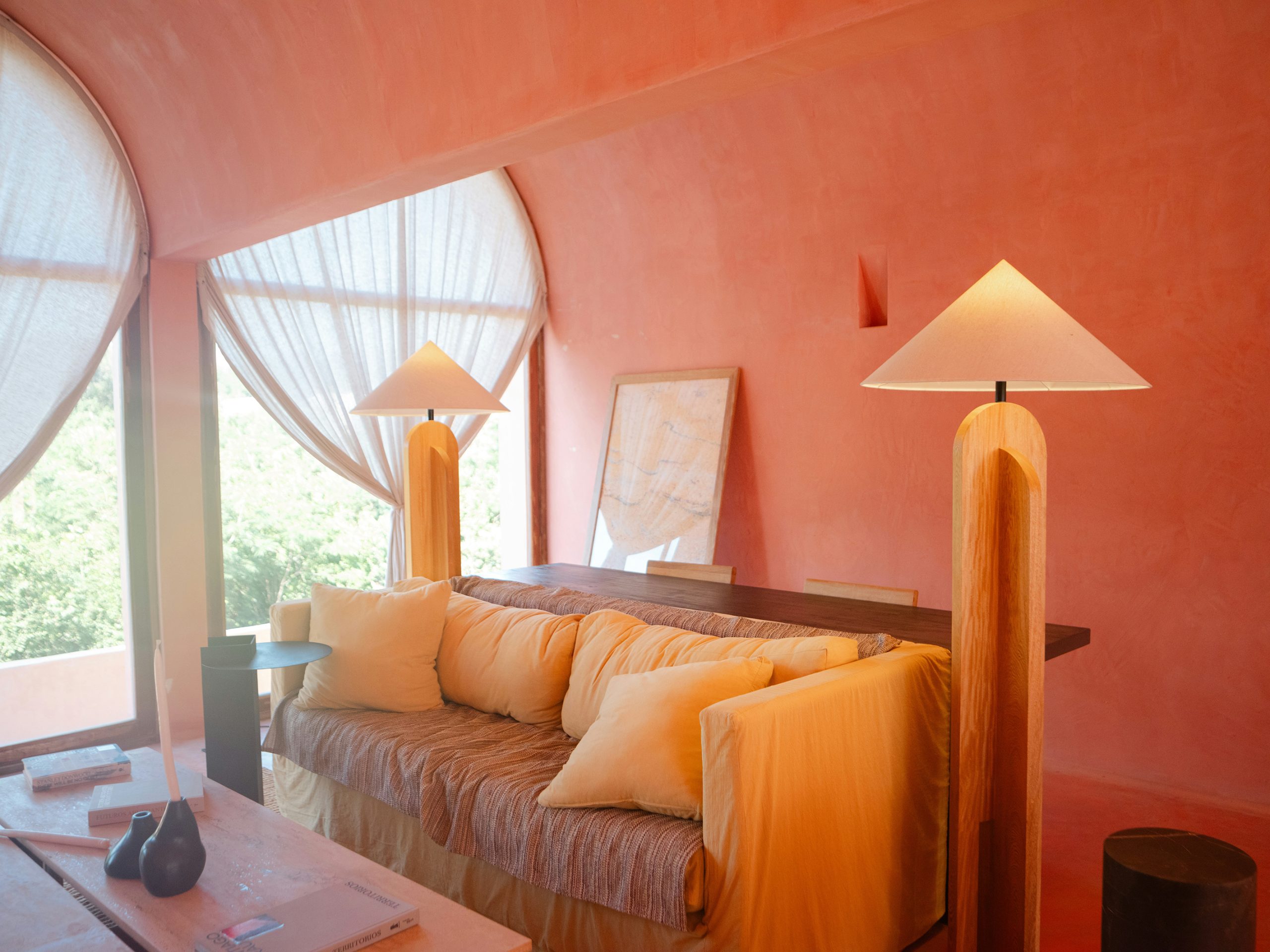
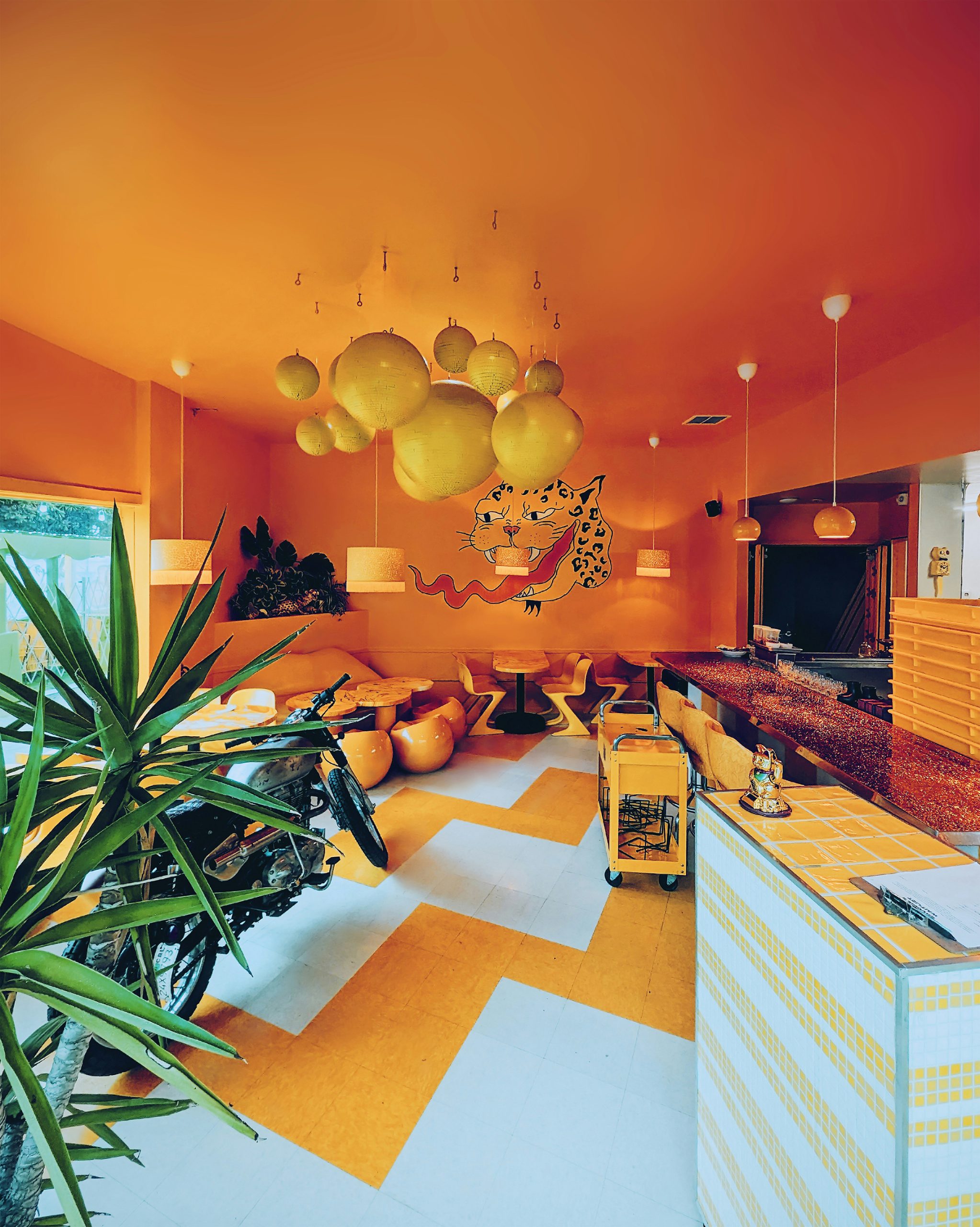
The pumpkin palette is far more diverse than one might first imagine. Classic harvest orange brings a cheerful and grounding energy, while richer tones such as burnt amber and terracotta create a sense of depth and earthy comfort. Softer variations in apricot or peach lend themselves to lighter, cosier moods, while muted sage greens and olives provide a natural counterpoint that evokes the vine itself. Even pale creams and chalky pumpkin shades offer an understated elegance that suits minimalist or more restrained spaces.
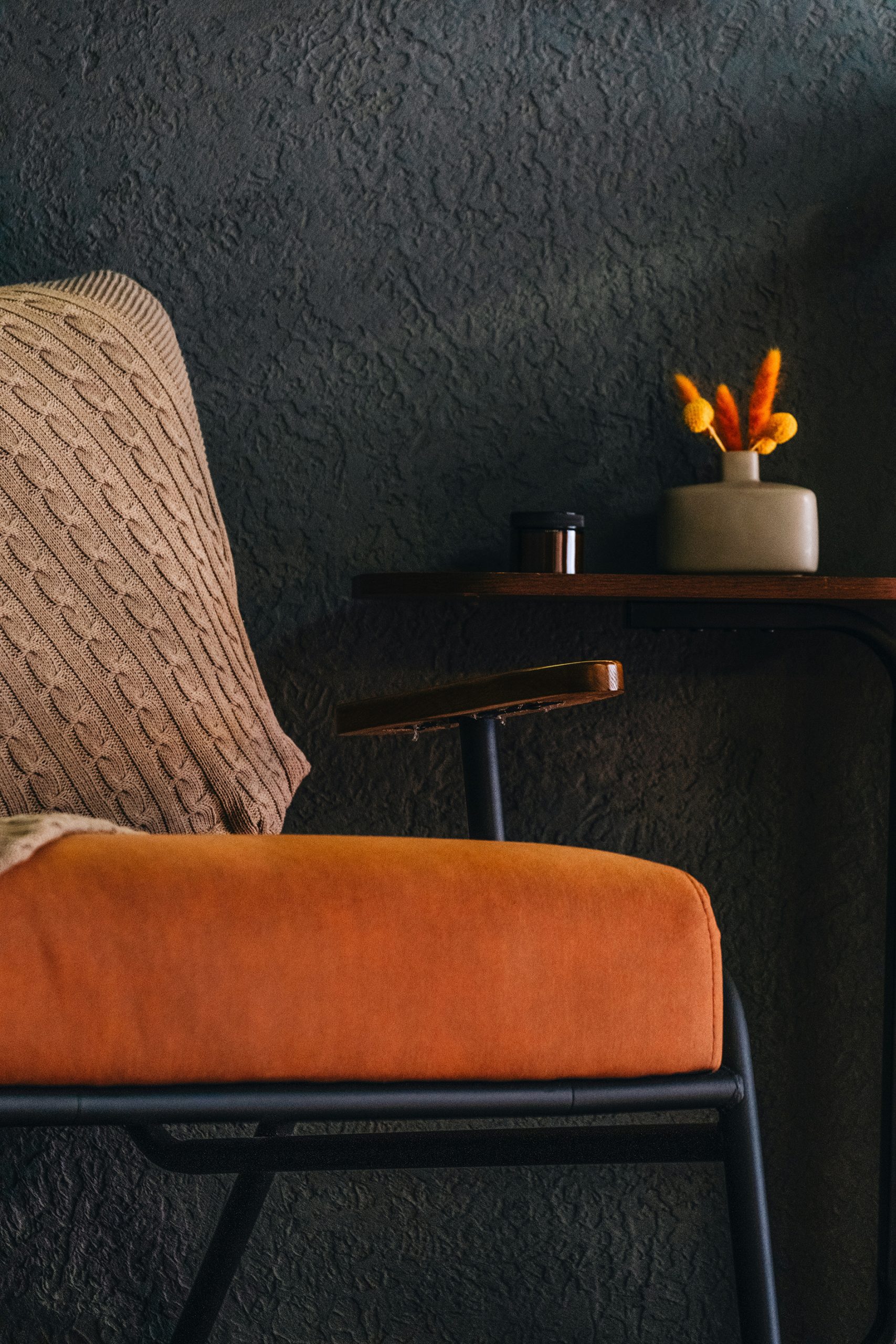
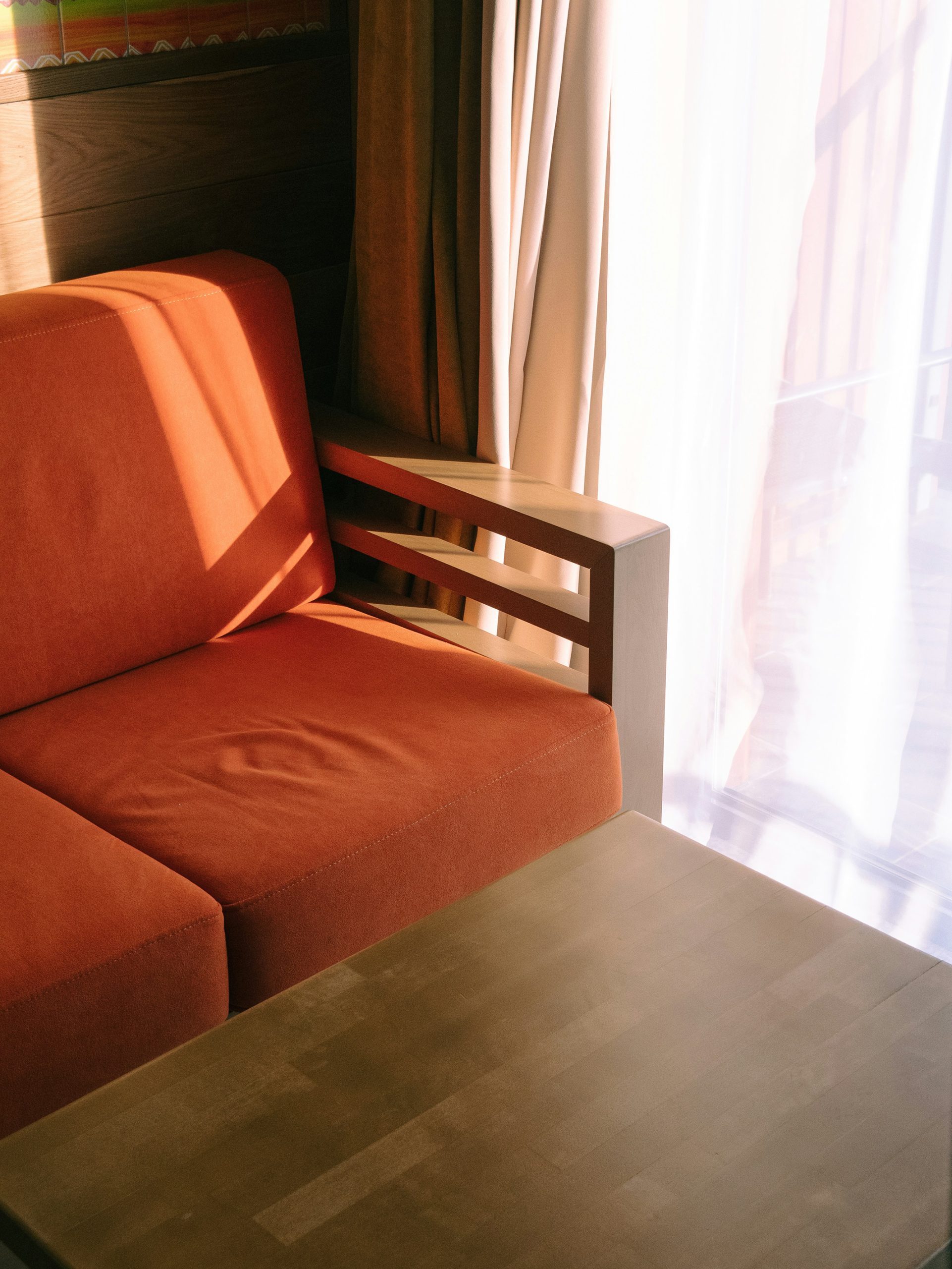
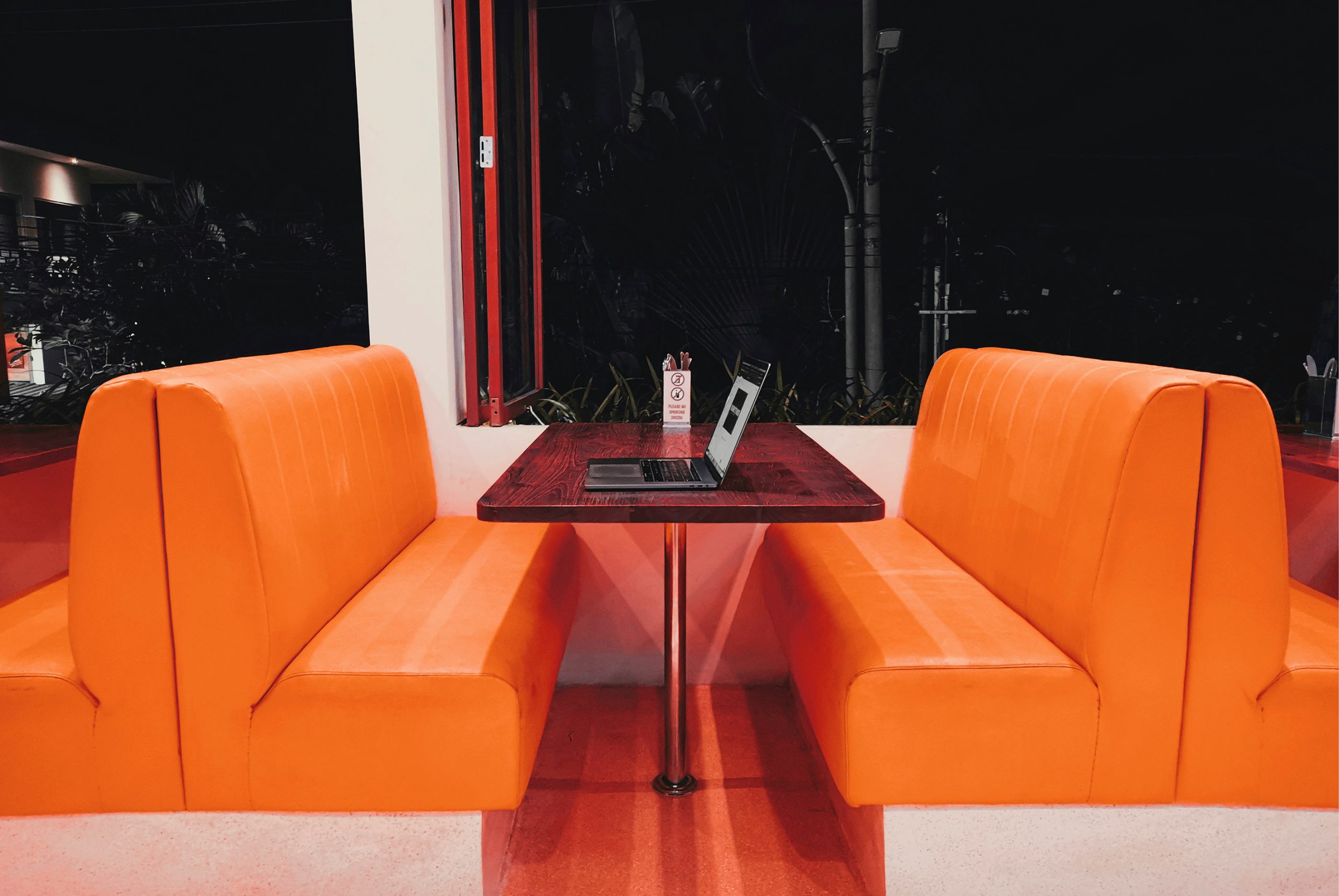
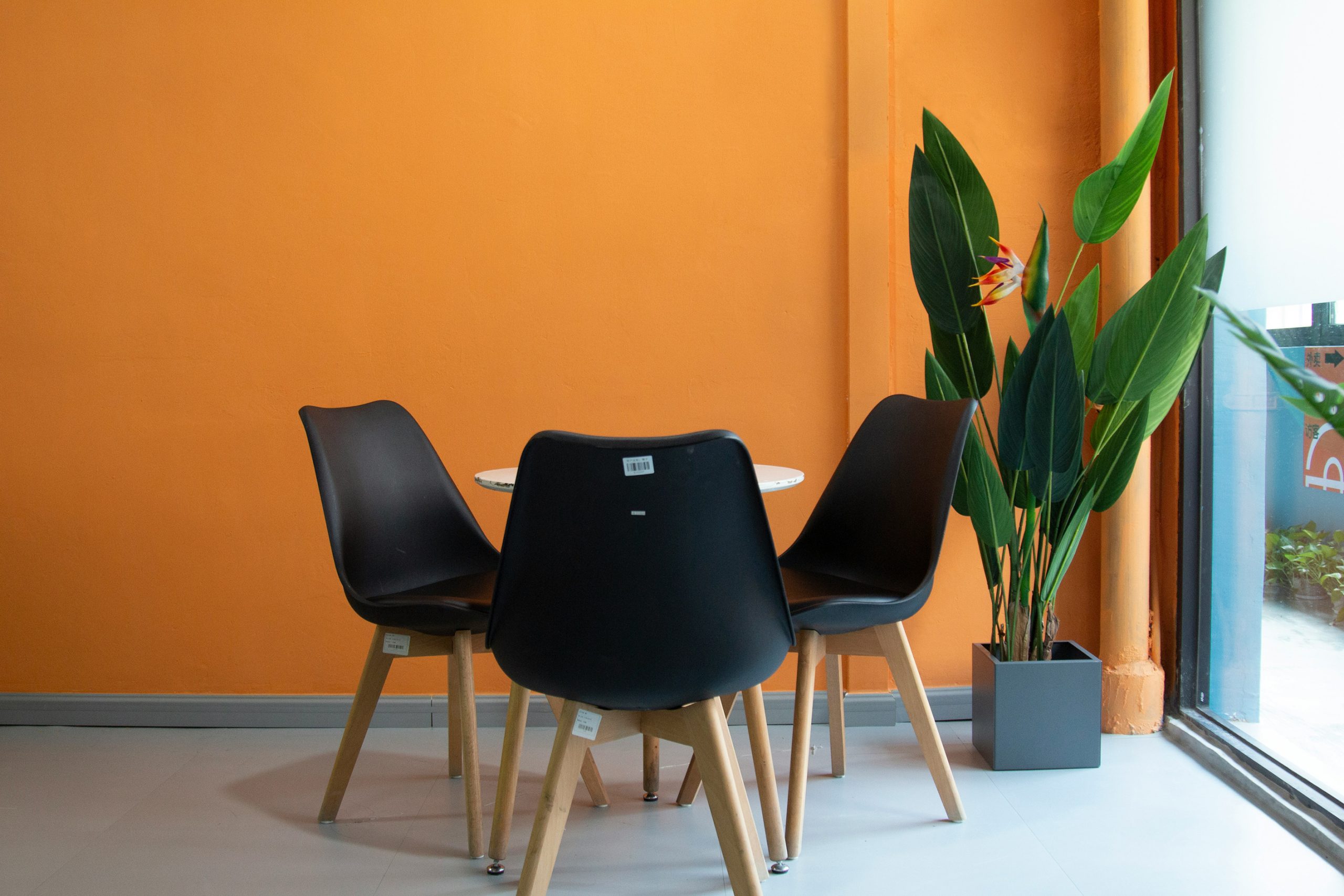
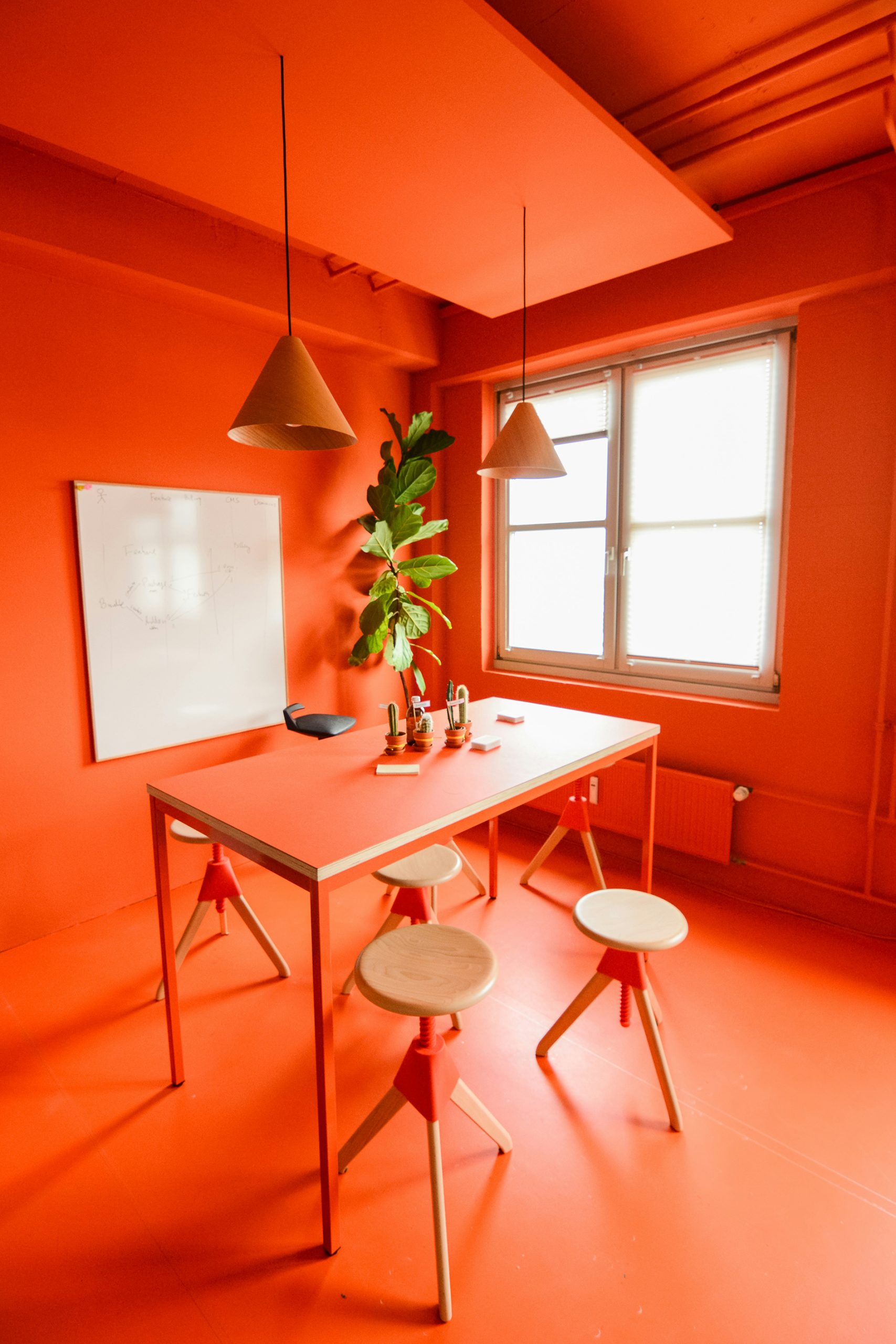
At home, the use of pumpkin tones is an easy way to signal the change of season. A neutral sofa instantly feels more inviting when layered with rust-coloured cushions or a knitted throw in warm orange. A dining table can be dressed with terracotta tableware, linen napkins in muted shades and a scattering of small gourds to create a setting that feels seasonal yet sophisticated. For those who like to embrace bold gestures, an accent wall in deep terracotta can dramatically transform a room, while those less certain might prefer a rug or artwork in pumpkin tones to achieve a similar sense of warmth without commitment.
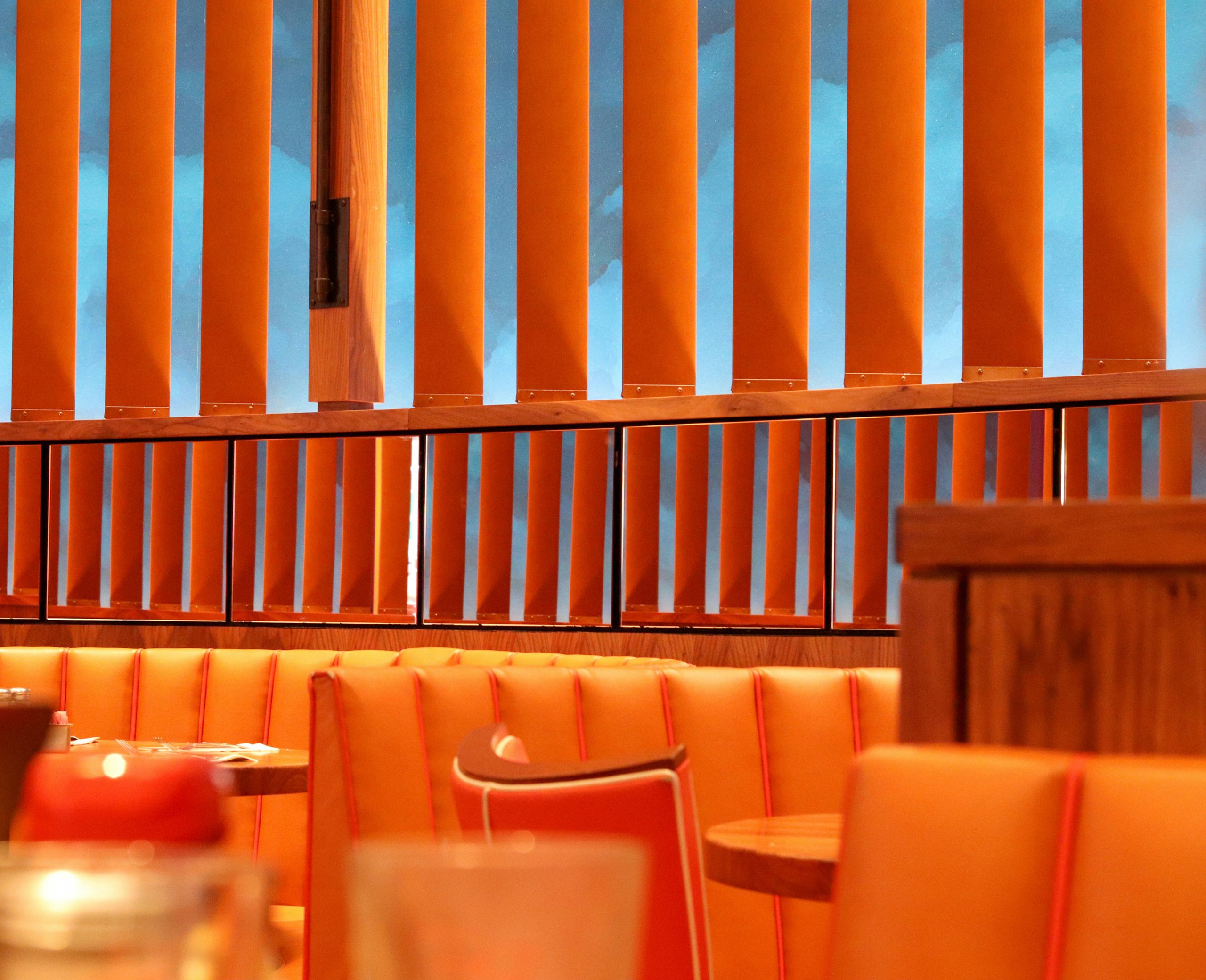
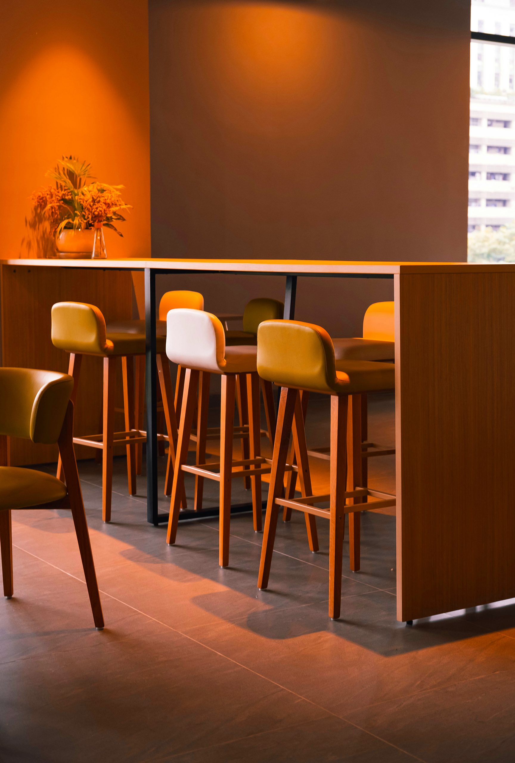
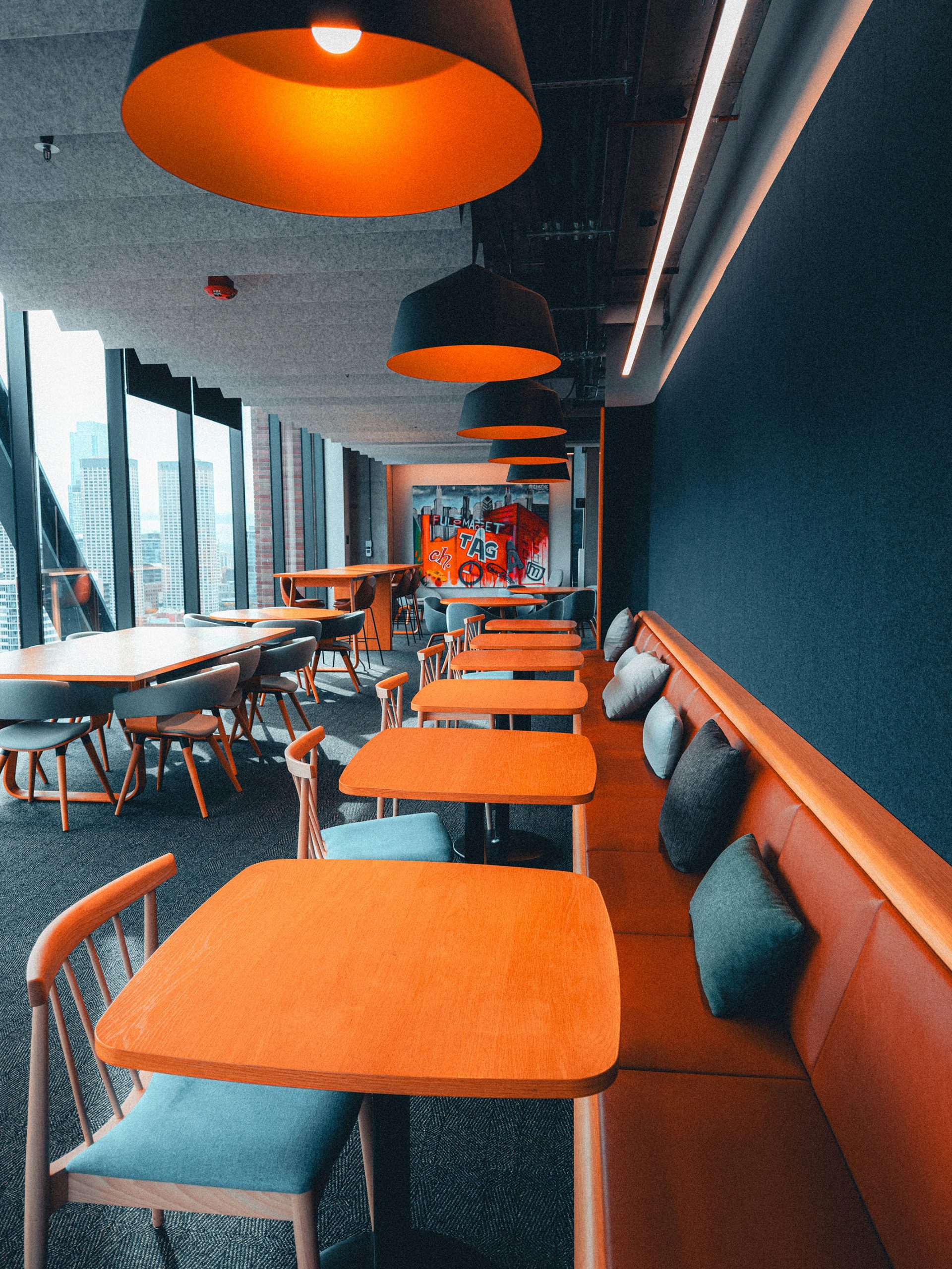
In the workplace, a subtler approach helps to strike the right balance between professionalism and seasonal charm. A ceramic pumpkin in cream or a muted shade of orange can add a gentle nod to October without becoming a distraction. Soft furnishings in communal areas—such as cushions in terracotta or rust—instantly add a layer of comfort, while natural elements like bowls of miniature pumpkins or amber-toned glassware bring warmth to shared spaces in an understated way.
The key to making these palettes work is balance. Pumpkin shades sing when grounded by neutrals, whether that be the softness of cream and taupe or the depth of charcoal and grey. For a bolder contrast, pairing warm orange with navy or even black creates a striking look that still feels firmly tied to the season.
Pumpkin palettes are not limited to porches or seasonal displays. They can be woven into both homes and workplaces to create interiors that feel welcoming, stylish and perfectly in tune with October. With careful attention to tone, texture and contrast, it is possible to celebrate the spirit of the season without ever slipping into cliché, ensuring spaces feel both timeless and tinged with a little autumn magic. Check out our pretty in pumpkin gallery here;