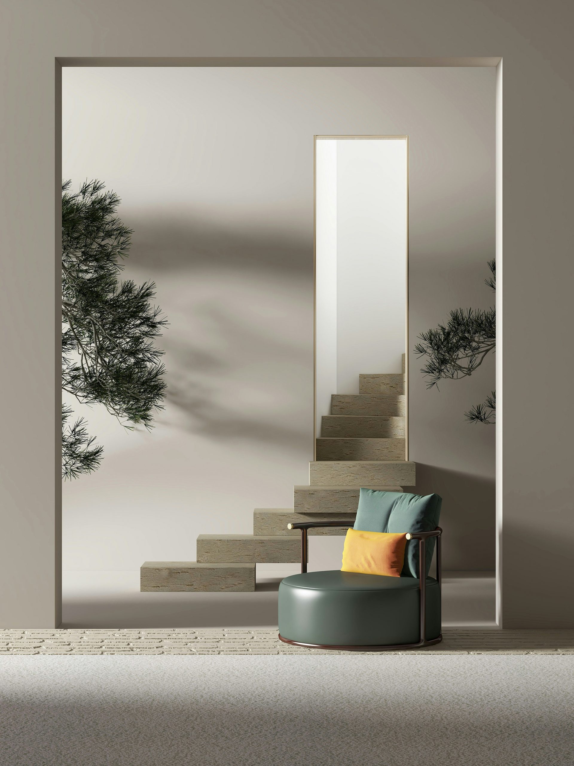
This week in the Wylde blog, we’re looking at sun-bleached neutrals: a softer take on summer 2025. Whilst we love a bold daring colour scheme, a quieter palette is also welcome in the Wylde world! Sun-bleached neutrals—chalky whites, warm oat, soft taupe, dusty pinks, and pale clay—are the trend for the hot weather months. We’re seeing the calmer tones across residential and workplace design, reflecting a collective shift toward natural materiality and tonal softness. Rather than aiming to stand out, these colours recede gently, letting texture and light take the lead.
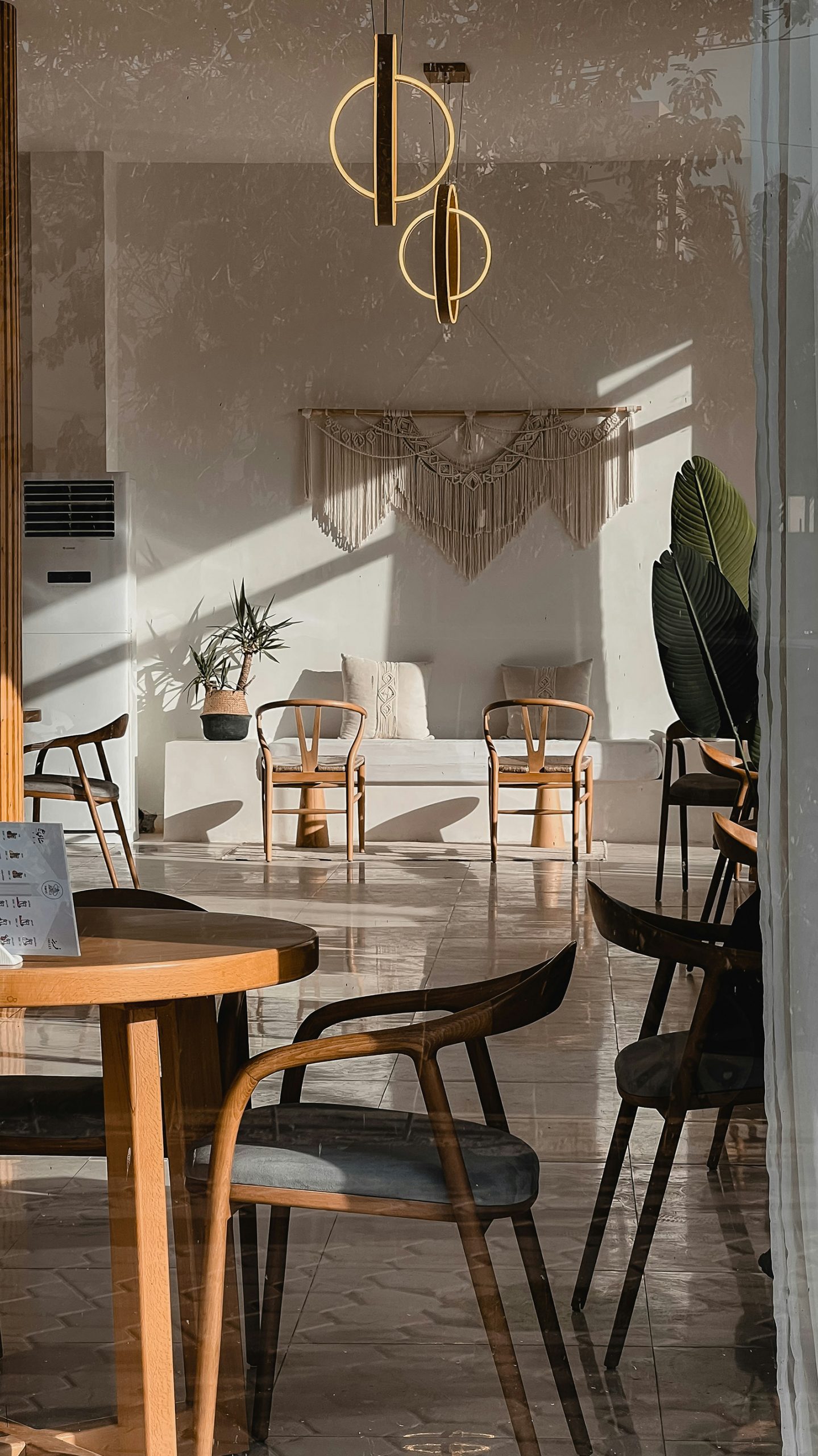
In workplace design, these neutrals can replace more corporate tones to create spaces that feel brighter, slower, and less visually noisy. Open-plan offices and co-working spaces could be reimagined with light-toned floors, off-white walls, and matte finishes that absorb rather than reflect. Textiles are tactile—linen, boucle, hemp—layered over pale timber joinery or softly curved forms. Even reception spaces can be lightened, favouring subtle travertine, limewashed surfaces, and diffuse lighting to create a welcoming, grounded first impression.
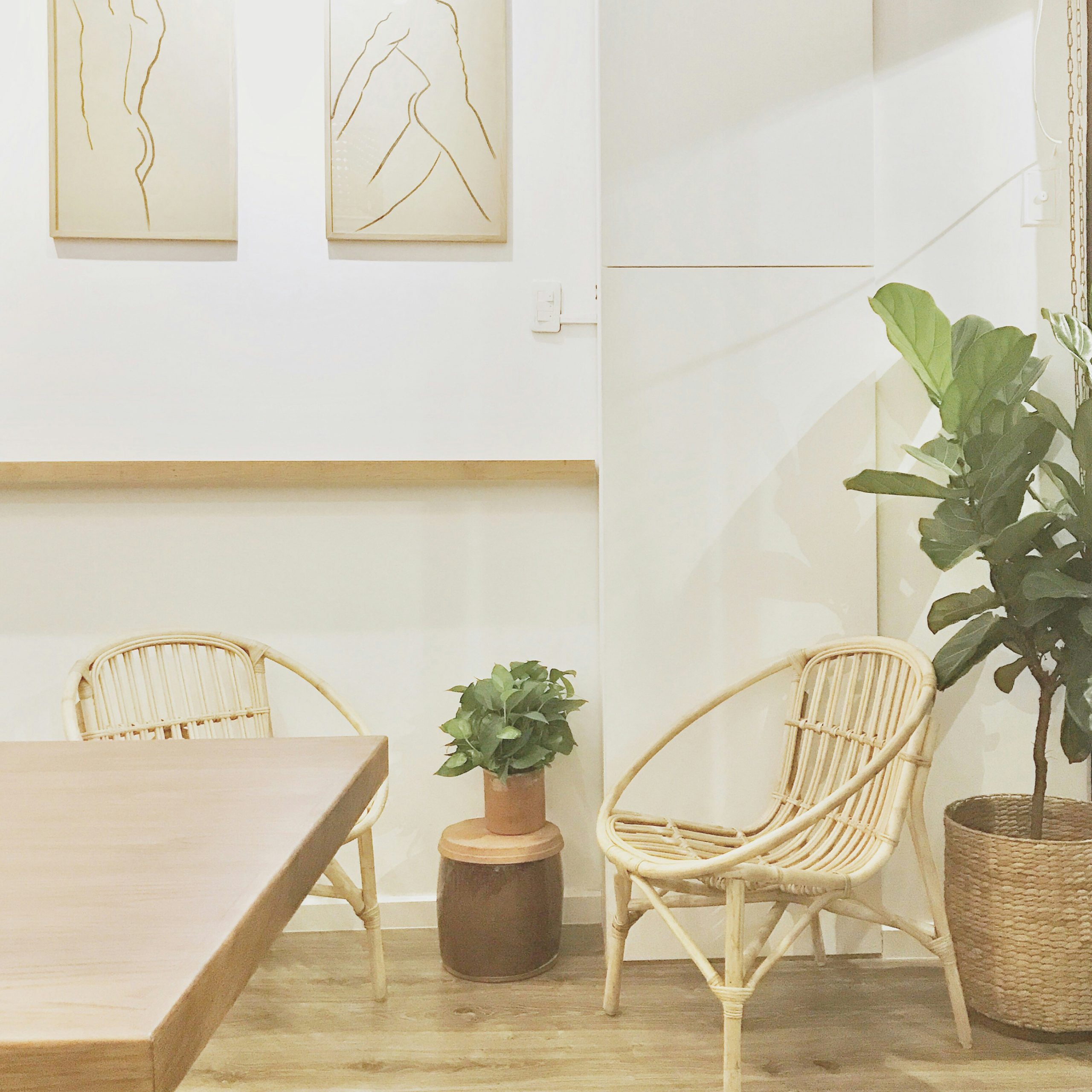
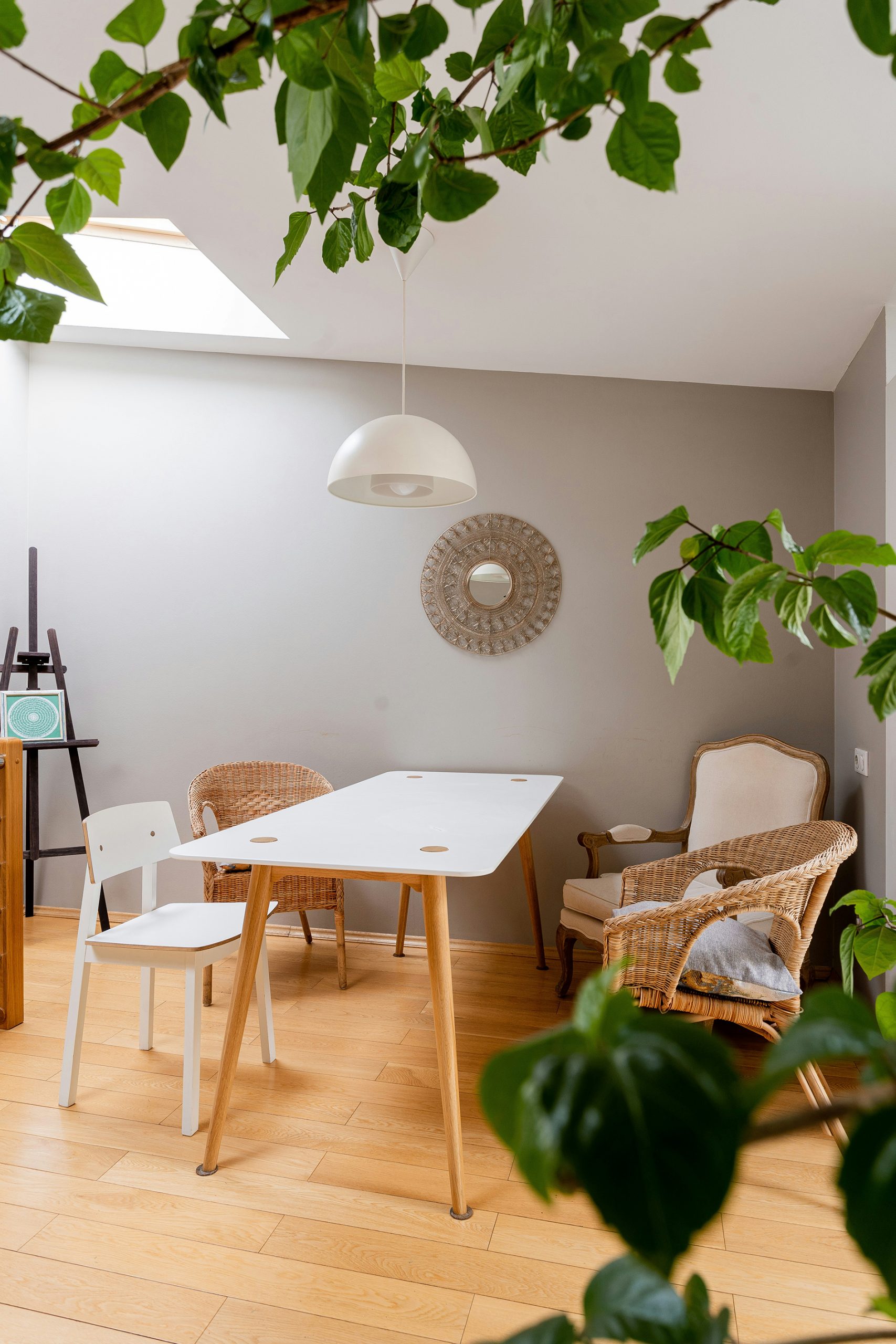
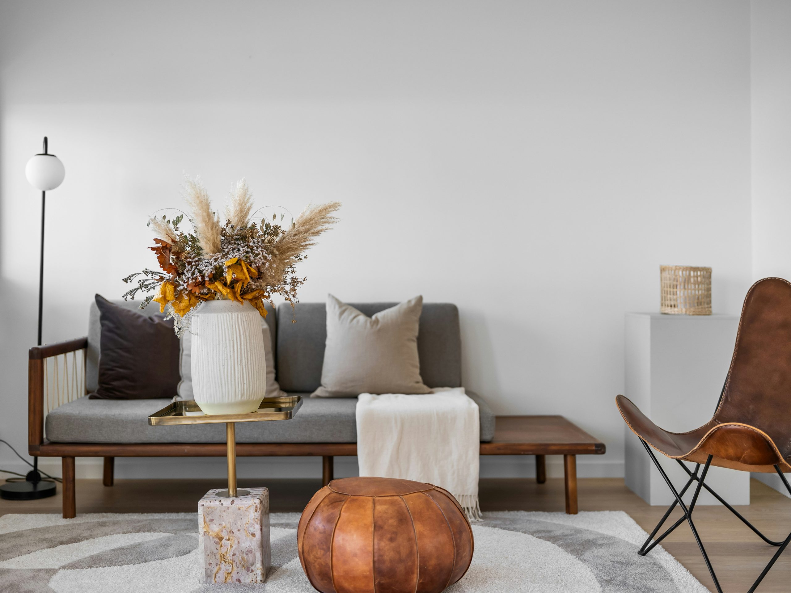
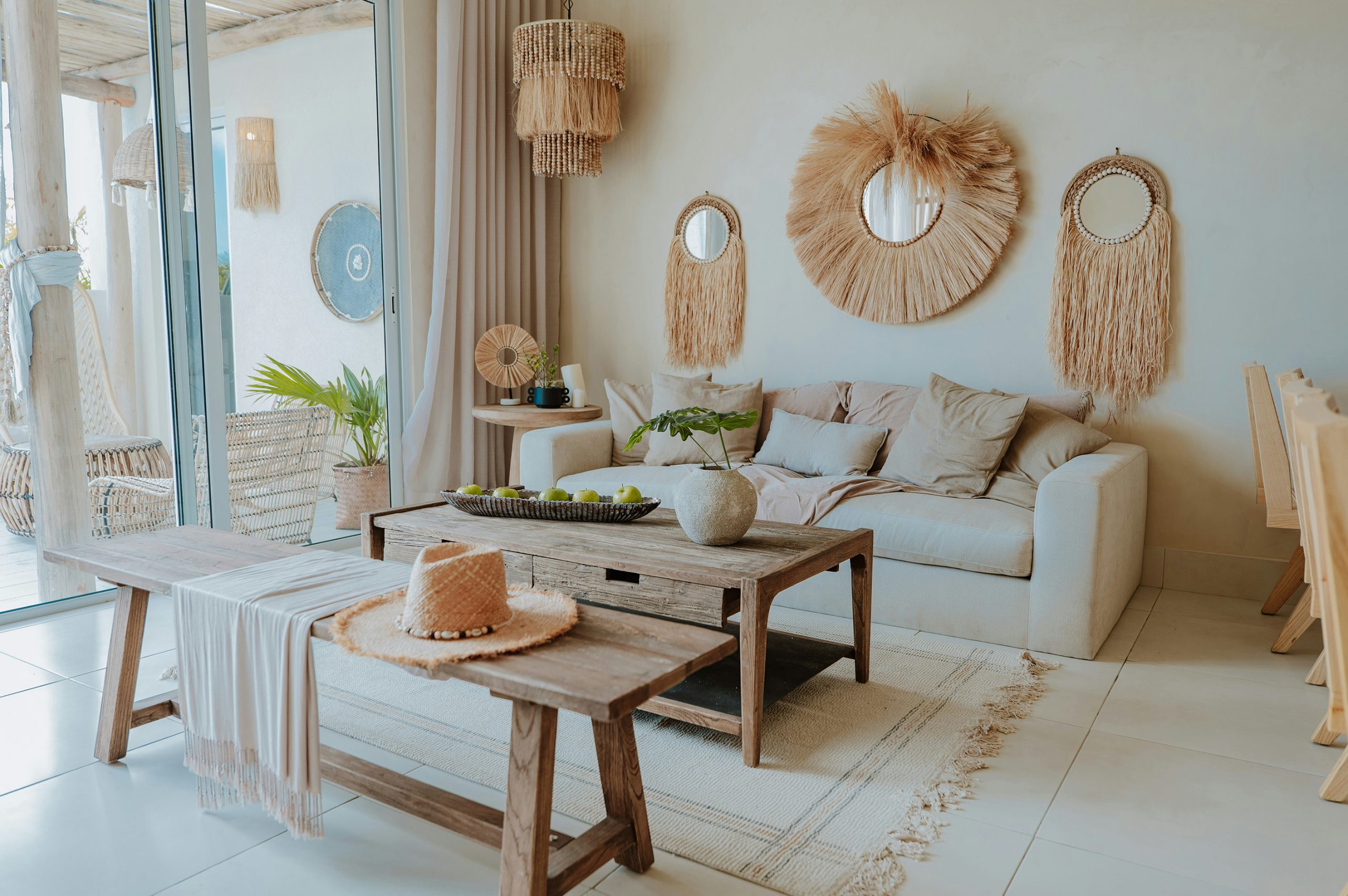
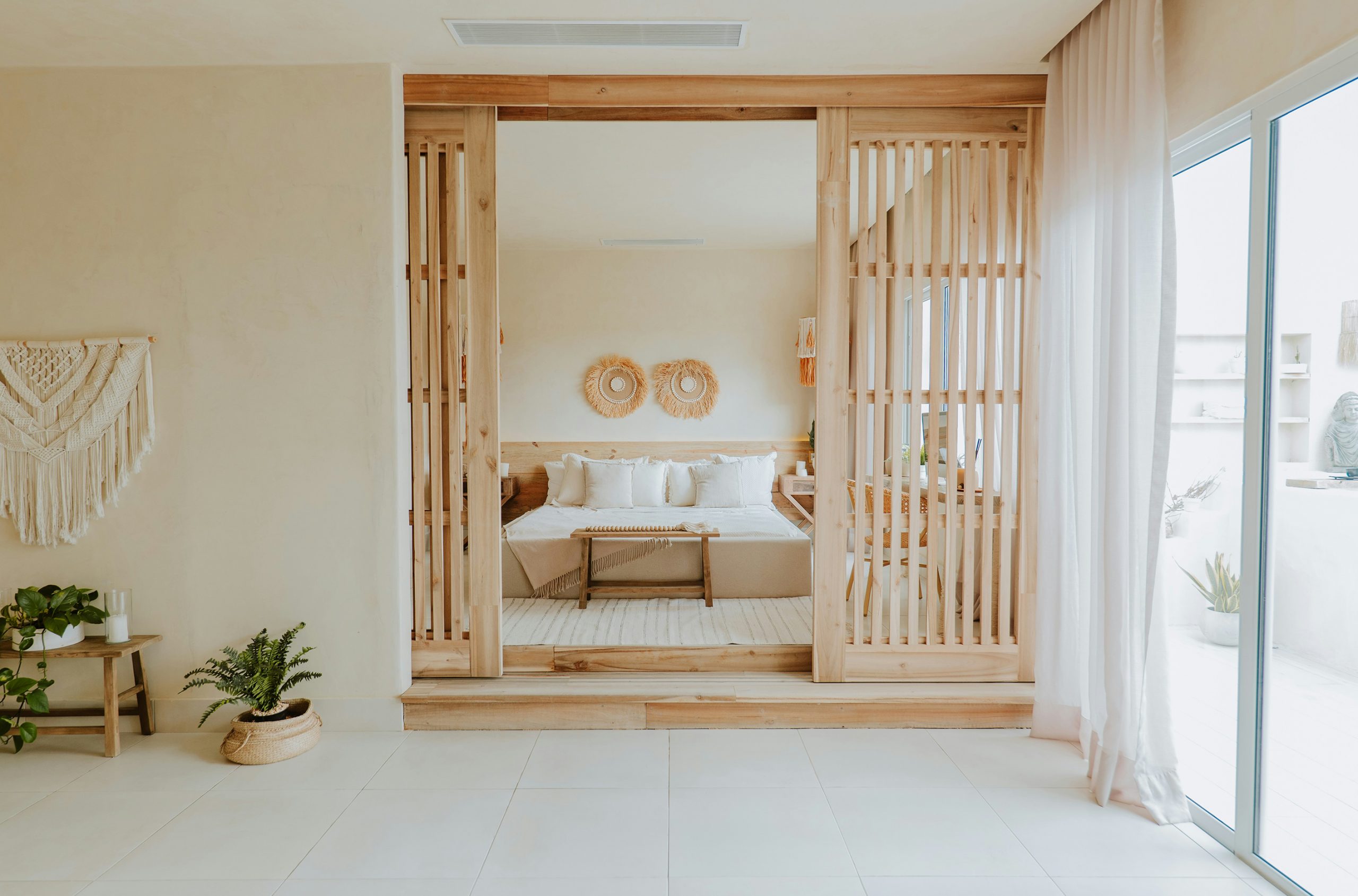
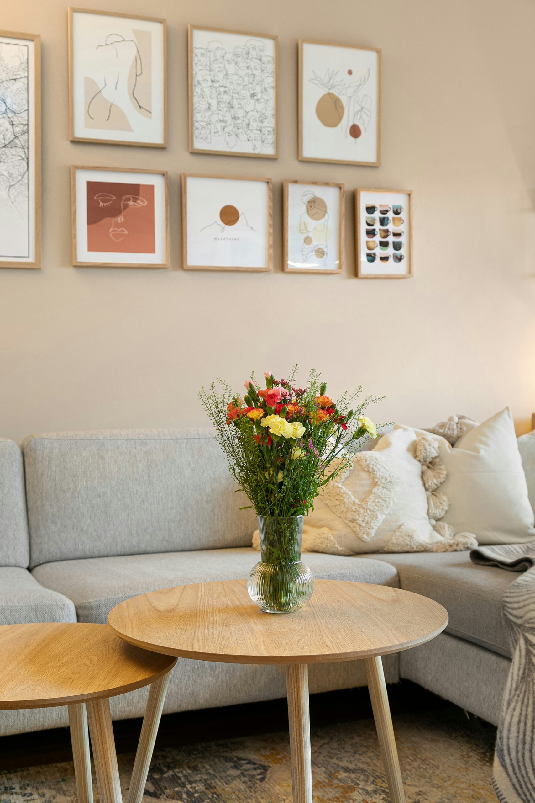
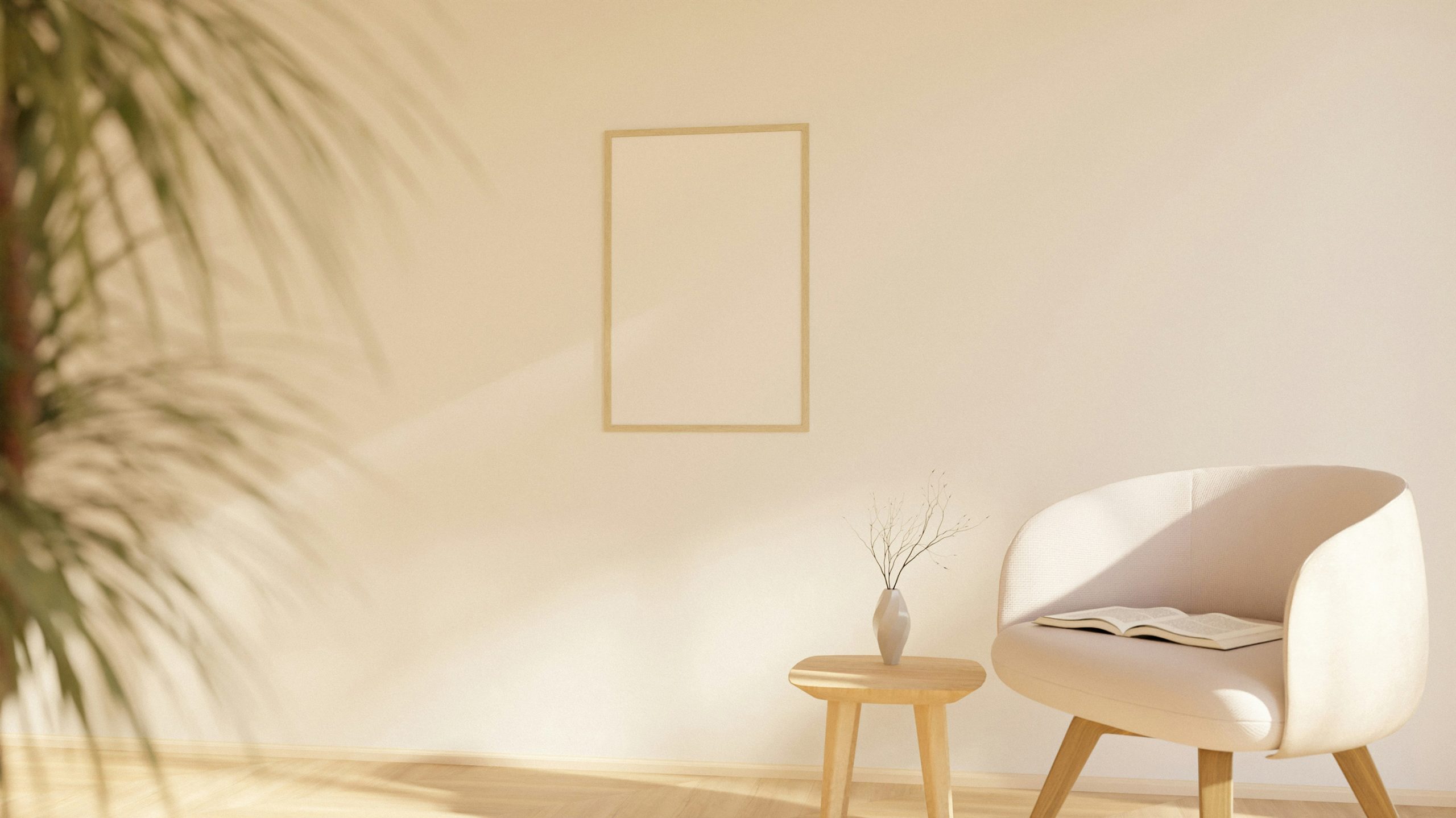
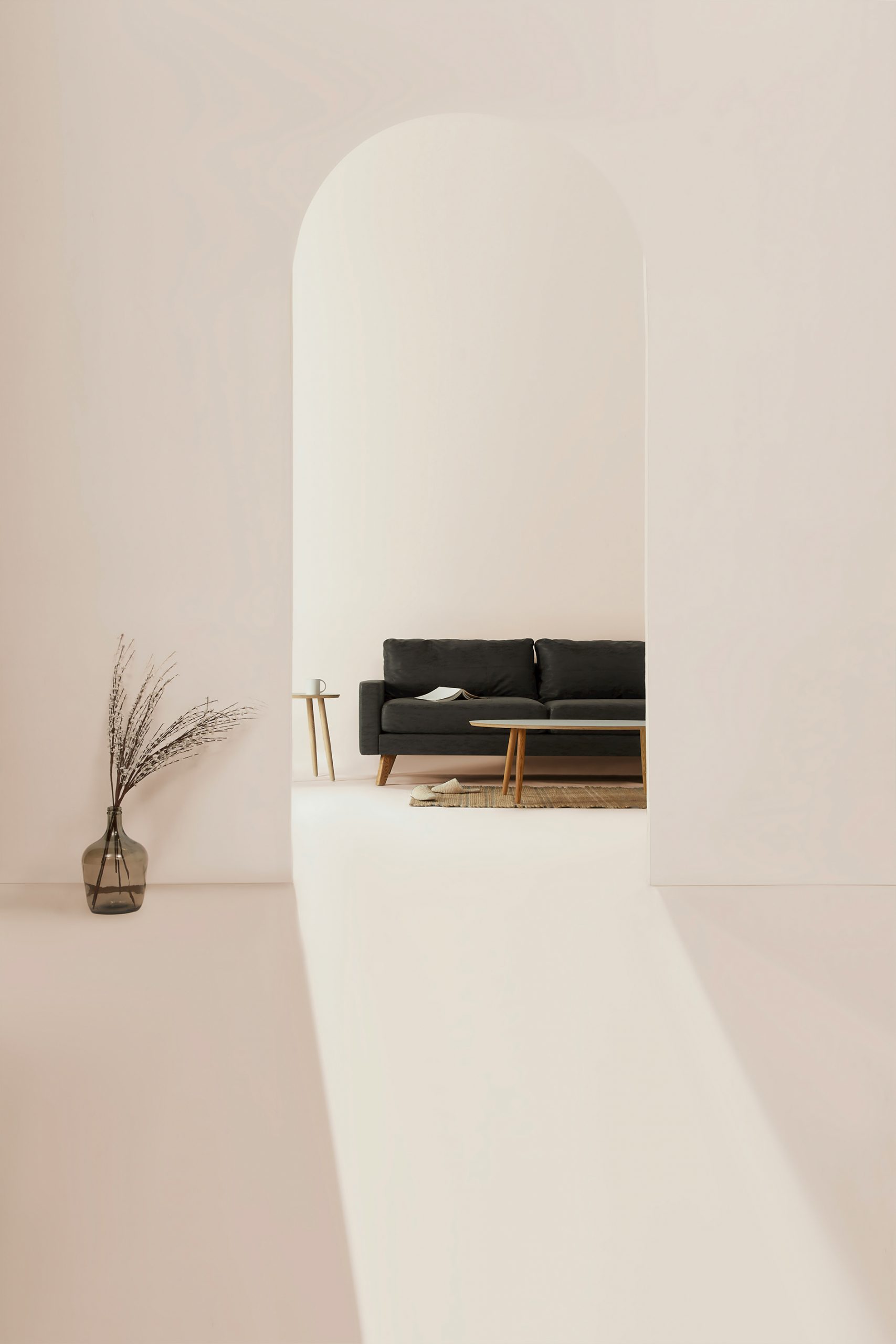
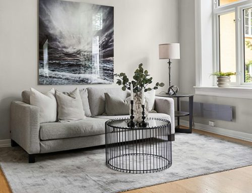
The same palette can find its way into homes, particularly in living spaces where comfort and calm are prioritised. Neutral walls and flooring are paired with natural textures—woven rugs, hand-finished ceramics, raw-edge wood—building quiet depth. In bedrooms, the focus is on material layering: stonewashed linens, chalky paints, soft wool throws, and organic forms all contribute to a restful, understated atmosphere. Bathrooms are following suit, with pale micro-cement, natural stone, and aged brass finishes creating tactile spaces that feel spa-like without excess.
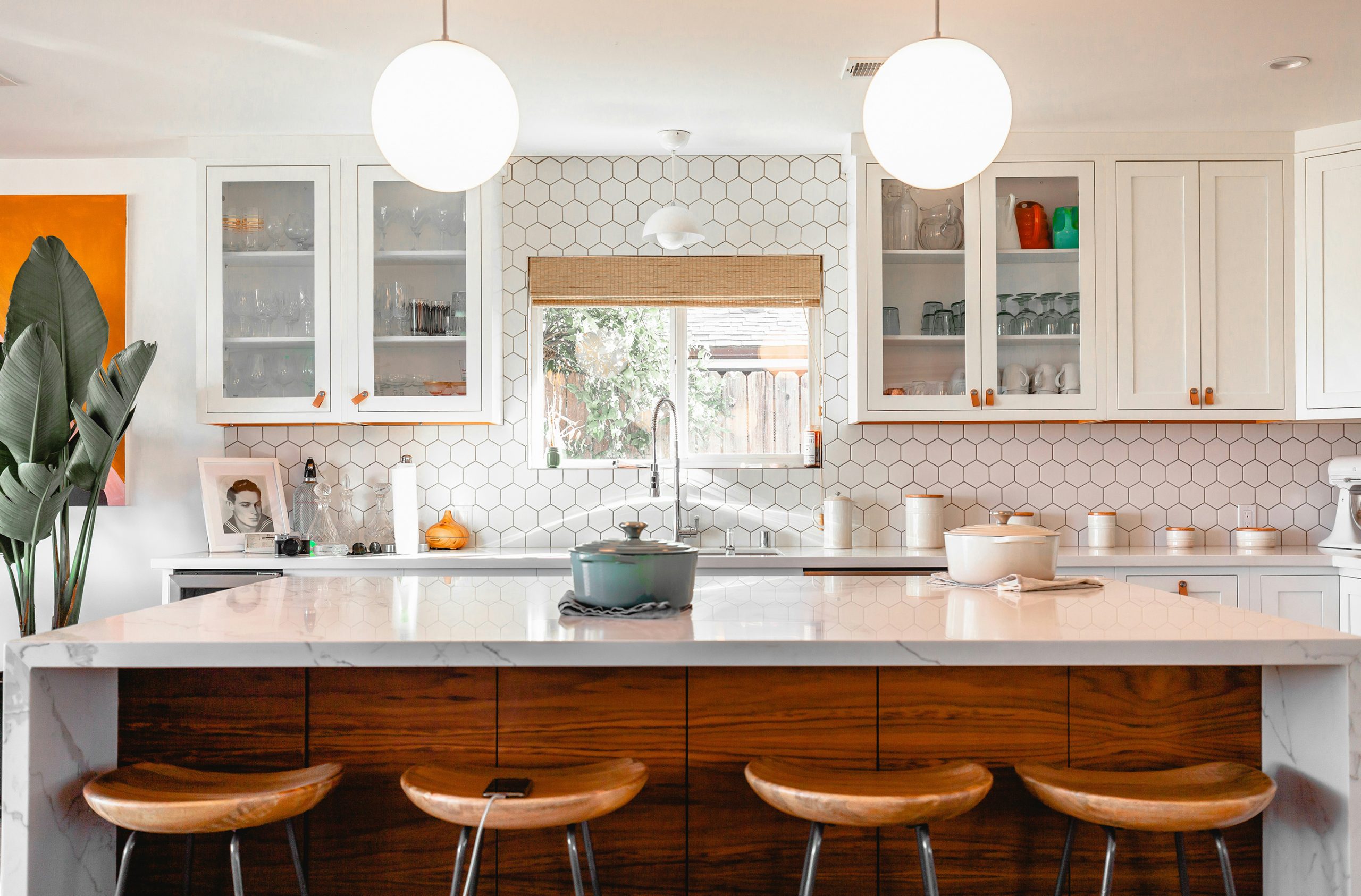
In kitchens, sun-bleached tones are often used to soften clean lines and functional layouts. Cabinetry in putty, mushroom, or dusty sage is complemented by matte stone surfaces, open shelving, and muted metalwork. The effect is one of ease and effortlessness—light-filled, neutral spaces that feel both modern and timeless.
At Wylde, we see sun-bleached neutrals as more than a trend—they reflect a growing desire for spaces that support wellbeing through calm, natural colour and texture. It’s a palette that invites you to slow down, breathe, and enjoy interiors that age gracefully with light and time. Whilst we won’t be throwing away our bright, bold palettes in our schemes, we can definitely make room for more sun-bleached lightness!