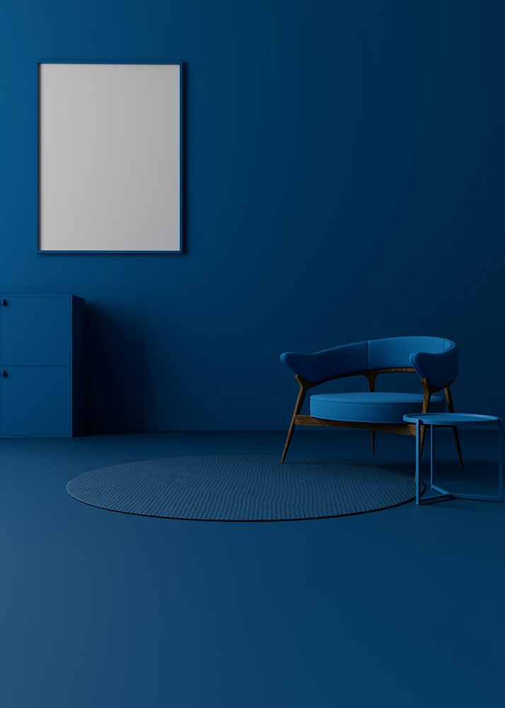
In the Wylde blog we’ve got the winter blues – but fear not, we’re just talking colour palettes! As winter settles in and the days become shorter, it’s natural to crave warmth and comfort in our surroundings. Blue, often seen as a ‘cool’ colour, might not seem like the obvious choice for creating inviting interiors. Yet this versatile hue is having a major moment in design with shades ranging from soft sky tones to moody midnight blues bringing a sense of calm sophistication to contemporary spaces. When used thoughtfully, blue can be anything but cold.
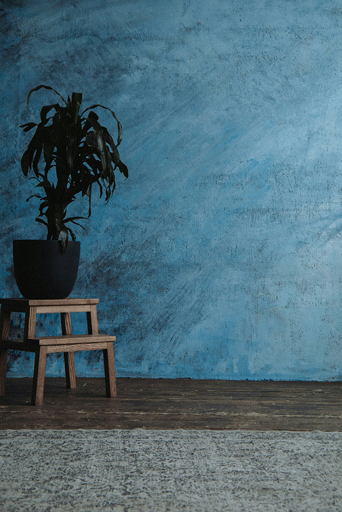
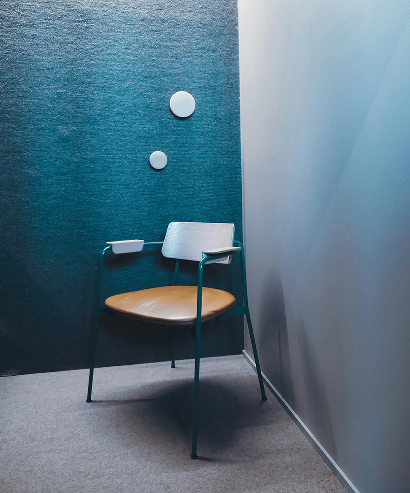
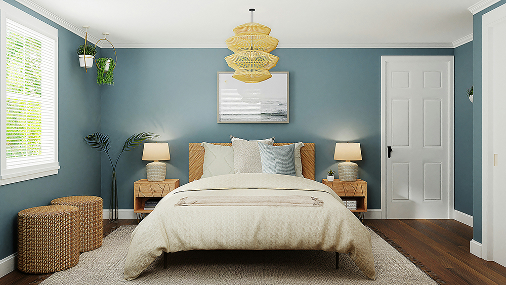
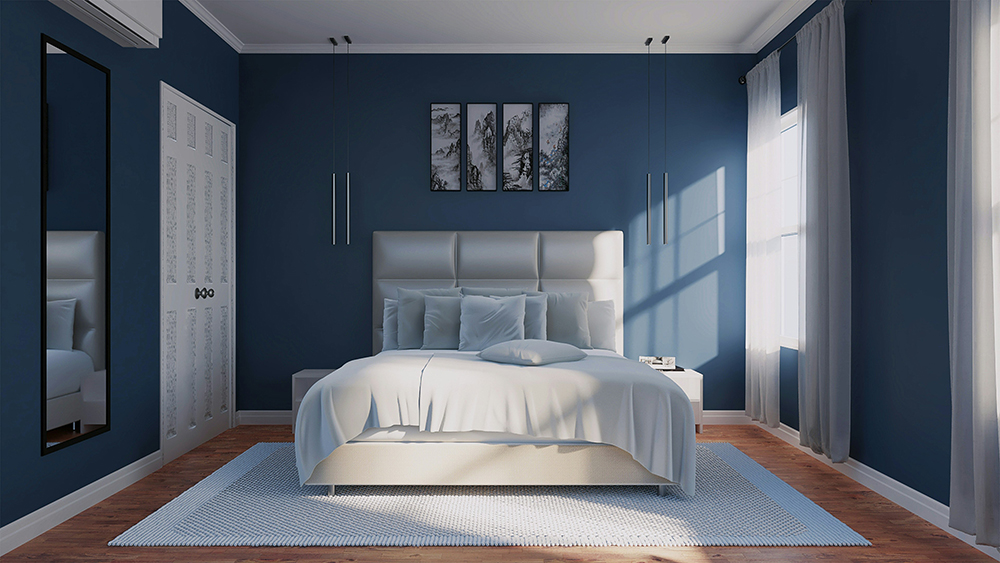
One of the biggest trends this season is layered blues. Rather than sticking to a single tone, designers are mixing gradients of blue across surfaces, textiles and finishes. Think inky navy walls balanced by pale duck-egg furnishings, or deep teal cabinetry paired with sky-blue tiles. The layering effect creates a cocooning depth that feels rich and immersive rather than stark.
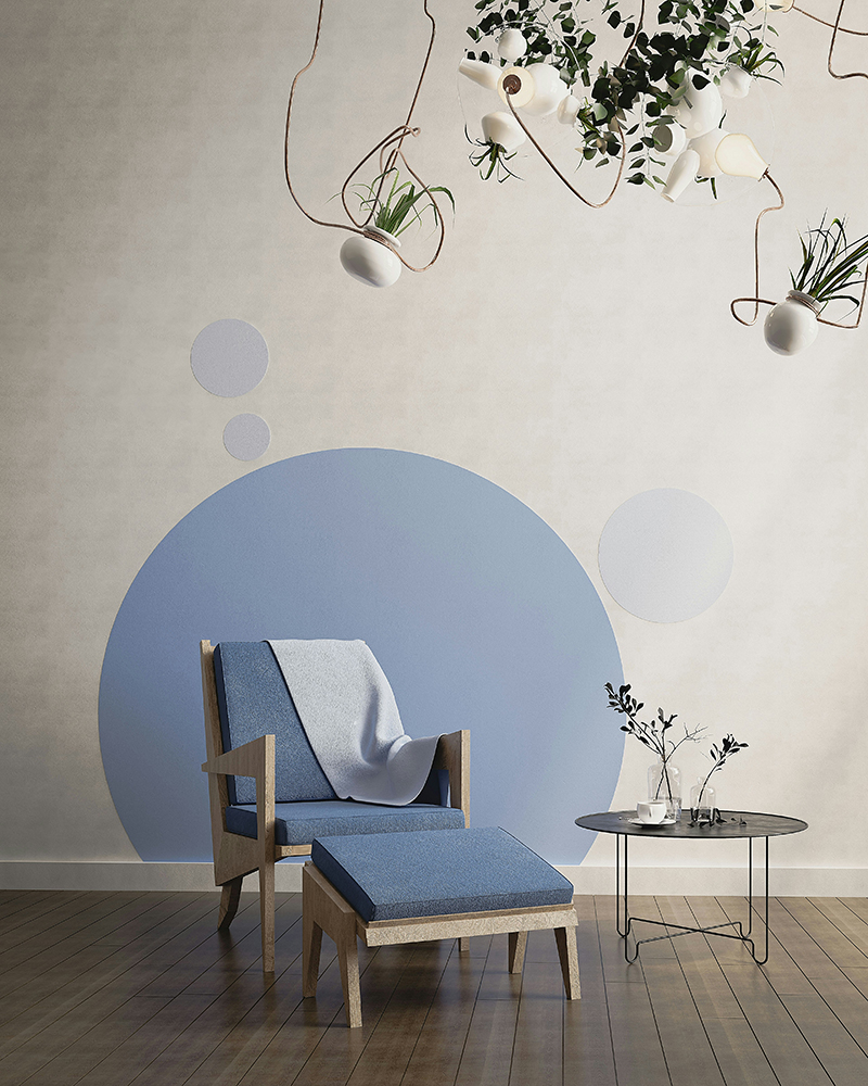
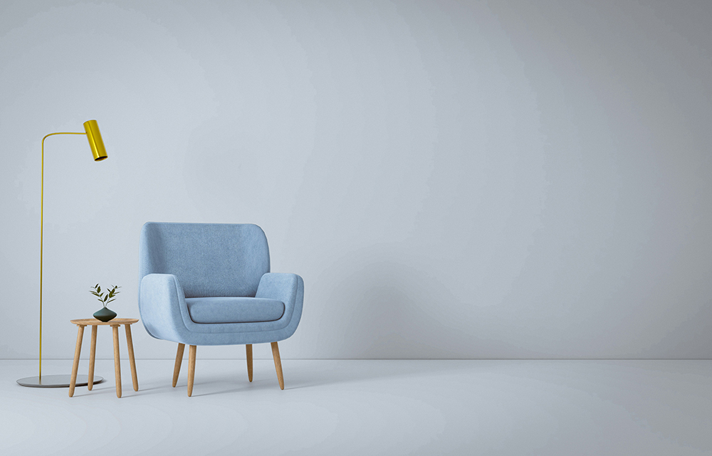
Another growing trend is the use of blue with natural materials and textures. The combination of cool tones and organic materials is a timeless way to soften the palette. Pairing blue walls with warm oak, rattan or cork instantly grounds the space, while brass, bronze or brushed gold details add a touch of understated luxury. Even small accents like a ceramic vase in ocean blue or a linen throw in dusty indigo can totally shift the mood of a room.
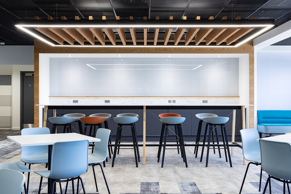
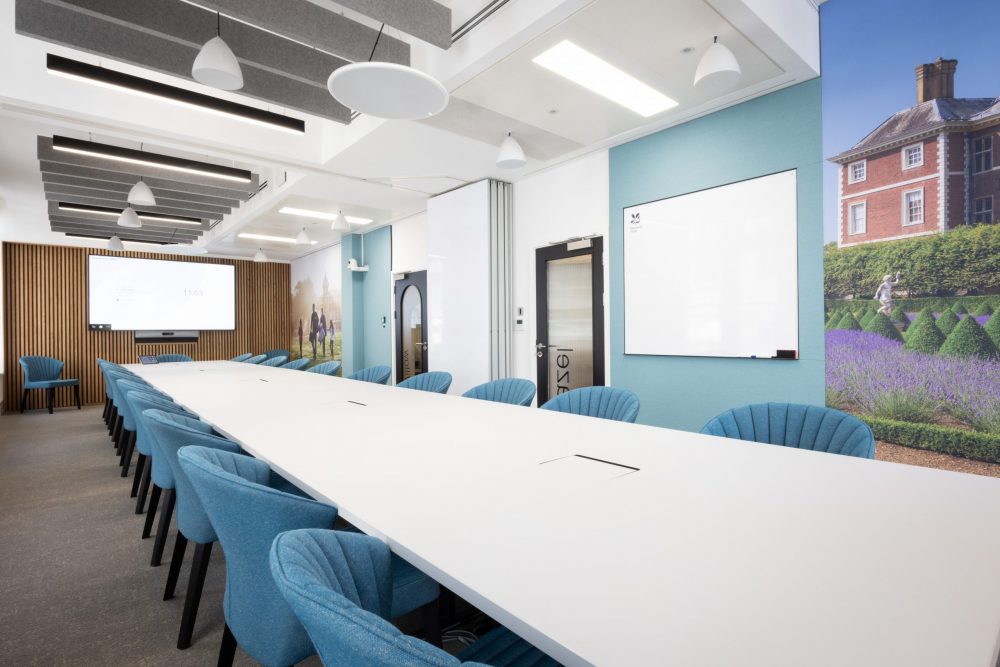
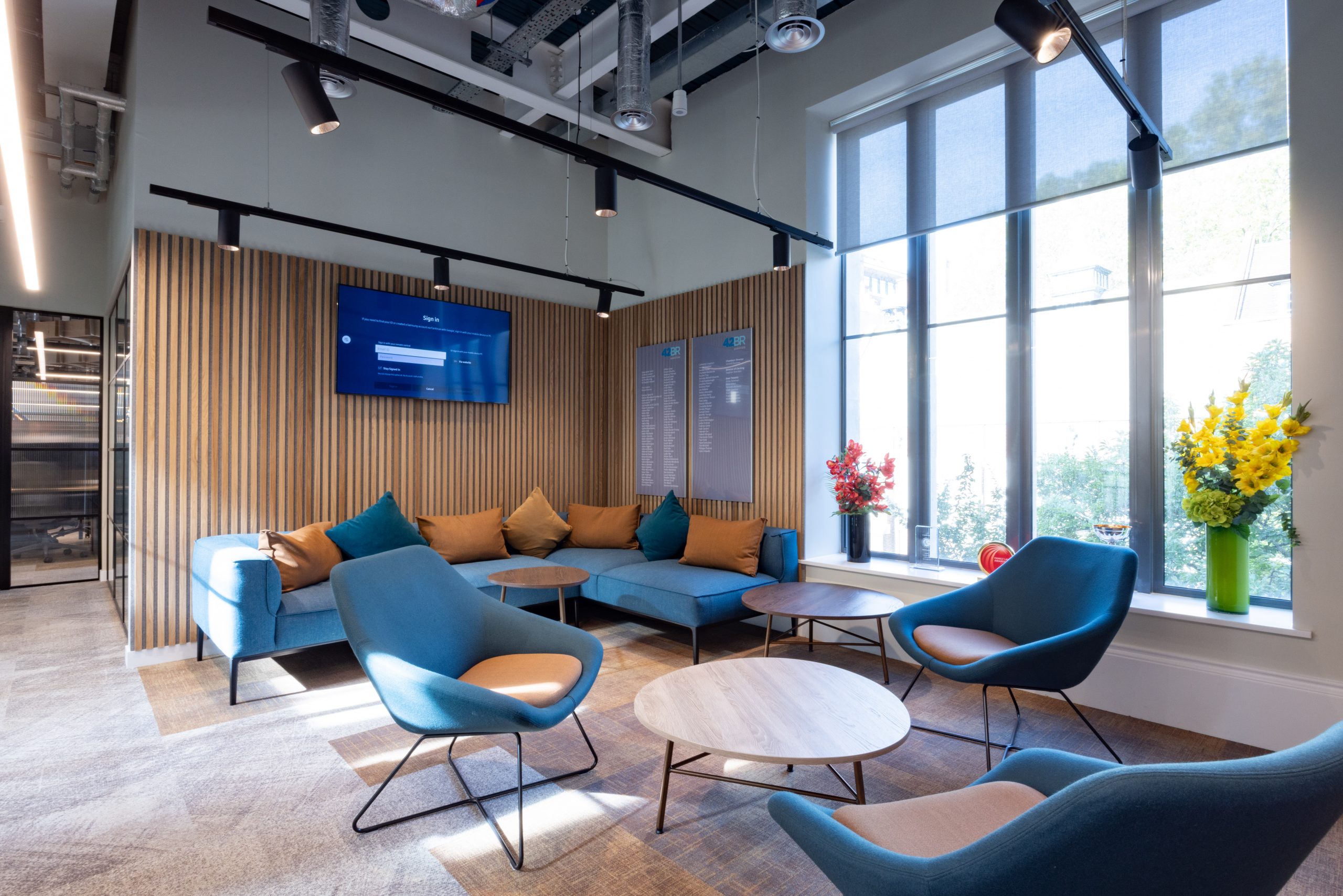
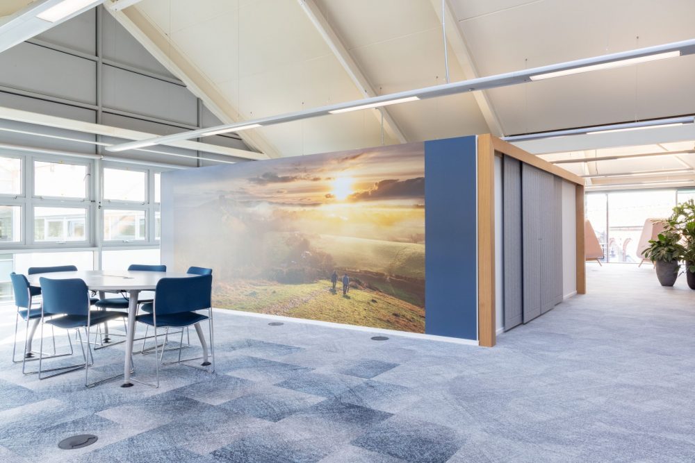
In workspaces, blue continues to shine as a colour that encourages calm and concentration. Warmer slate blue-greys or muted steel tones create professional yet comfortable environments, especially when contrasted with soft neutrals or earthy greens. For hospitality interiors, we’re seeing more marine and coastal inspiration reimagined for winter – blending deep marine blues with sandy neutrals, pebble greys and warm lighting to evoke the serenity of the shoreline without feeling too summery.
Lighting plays a key role in making blue feel inviting. Diffused or layered lighting such as wall fixtures, table lamps and concealed LEDs to help highlight texture and bring warmth to the palette. Adding soft, diffused light turns what could be a cool tone into something cocooning and intimate. For those ready to make a bold statement, blue kitchens and bathrooms are in! Matte navy cabinetry, paired with marble worktops or brushed brass fixtures, brings a sense of depth and drama. Powder blue tiles or glazed ceramics can also introduce subtle character and a touch of retro charm.
Ultimately, blue is a colour that needs balance; both tranquil and strong, refreshing yet grounding. When used with intention, it can transform interiors into spaces that feel serene and considered, rather than cold. This winter, embracing the blues isn’t about battling the season’s chill; it’s about creating comfort through thoughtful design, where colour, texture and light come together in perfect harmony. If you’re thinking of switching up your colour palette this winter, embracing the blues doesn’t mean feeling chilly – with the right design approach, it can be the perfect way to bring balance, depth and quiet beauty into the season.