We’ve got the winter blues – but we’re not sad! This week we’re looking at ways of using the colour blue in interior design – successfully! The different shades of blue can create very different atmospheres within a room so it’s important you consider these when deciding how you’re going to transform the space.
Blue can be light, dark, warm and cold – there are huge varieties in colour, tone and the emotions the specific hue can evoke within a room. In general, blues are associated with calmness and relaxation whilst lighter shades can be associated with cleanliness or hygiene and darker colours are very luxurious and often on the more serious side. Powder blue is a colour most of us associate with the sky, it’s a bold but positive colour so can be used in spaces to add a hint of playfulness or energy.
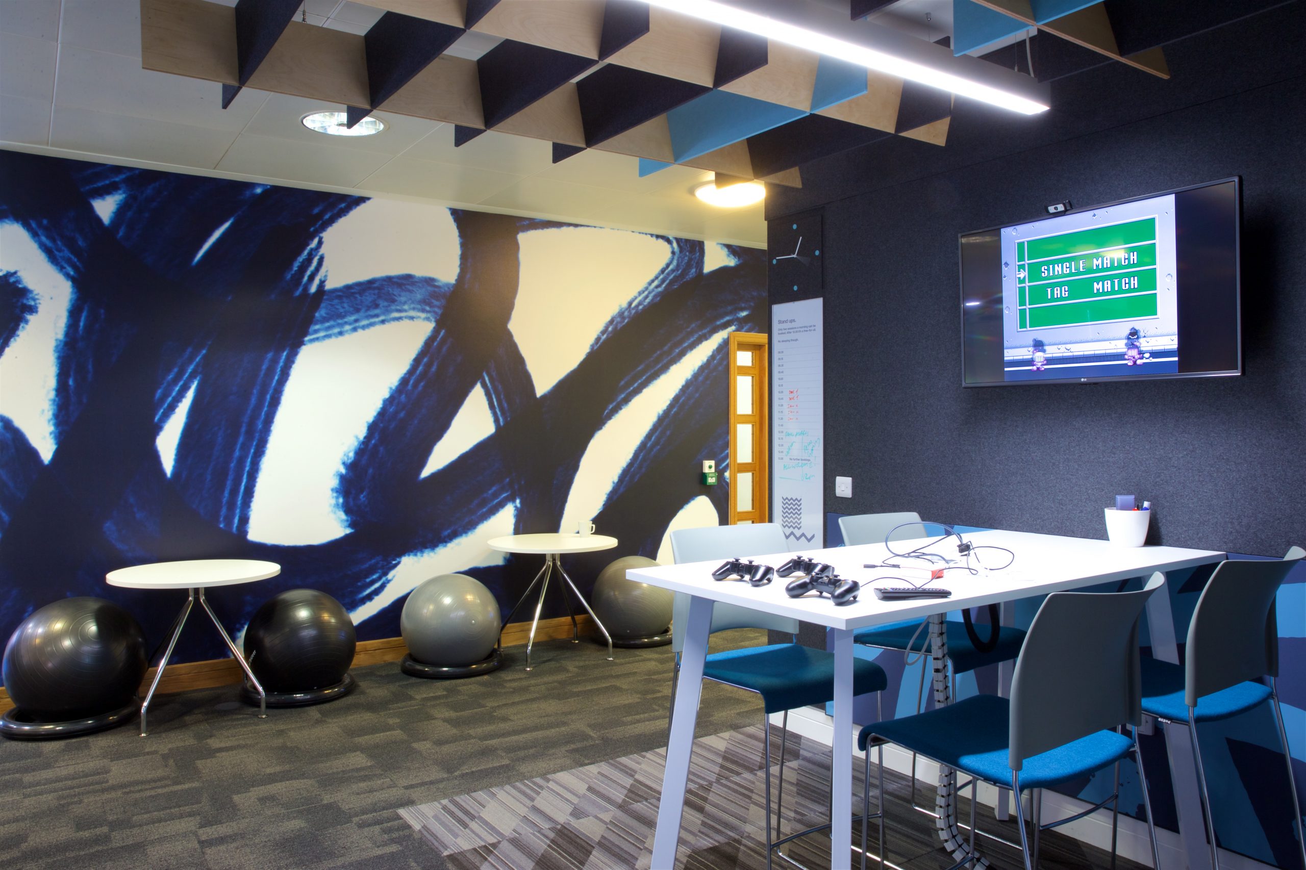
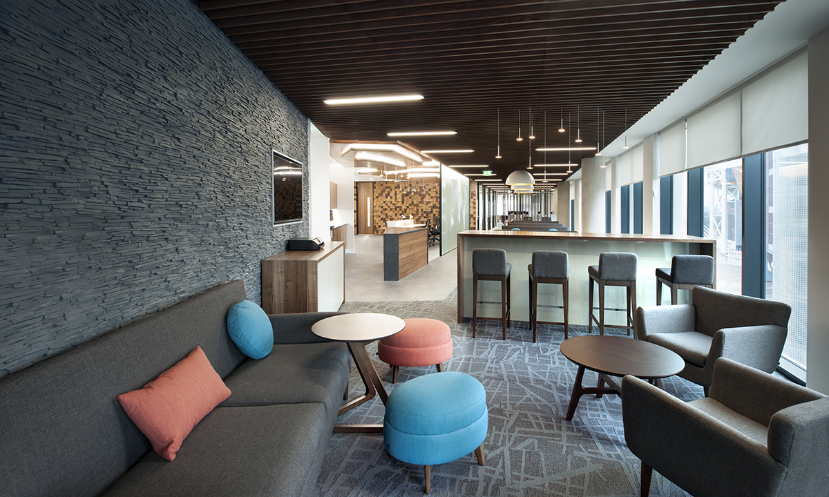
We’ve used blue in several of our design schemes for workplaces – combining bright energetic blues with formal navy and royal blues to balance the scheme into a professional yet modern space. Our blue designs for H3G were as a result of the sky (yellow), land (green) and sea (blue) theme. The patterns were printed or cut from a variety of materials and used to define collaboration areas, glass manifestations and acoustic products. Each element of the interior, from flooring to painted walls, help add to the colour theme and texture of each floor. We think this is the perfect way to go blue in an office space!
Wylde ia / Artworks
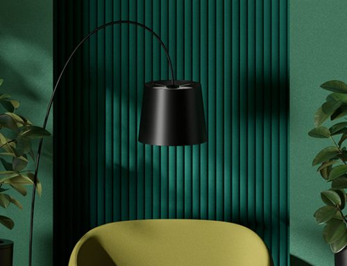
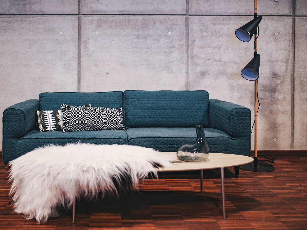
Blues used at home are more personal – we get it! We think deep, inky blues can be the perfect choices for furnishings and a more indulgent touch in a living room space. Dark blues are rich and bold but can be paired with other colours to completely change the mood.
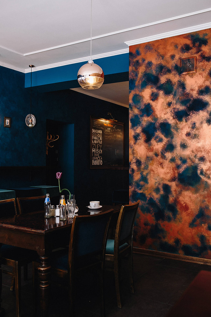
Blue and white is a classic combination that creates a very fresh and bright atmosphere – a great nod to nautical and marine themes, perfect for bathrooms or children’s rooms. Complimenting the colour blue with yellows, warm brown and oranges can neutralise the impact of the blue creating a very balanced and much warmer design scheme.
As we’re heading rapidly towards the festive season, there are some great ways to add a touch of Christmas cheer to your homes, without completely redecorating – and avoiding ghastly clashes of red and green in a blue room. Get icy – add silvers and grey decorations but warm up the room with hints of burgundy. We absolutely love coppers and golds in a blue scheme – tasteful and glamorous!
However you want to use it, we think winter blues are a must!