So the clocks go forwards this weekend and the evenings will stretch even further, there’s a sense that everything is becoming lighter, brighter, and a little more alive! At Wylde, this is when we notice the visual changes, in spring, colour is doing much of the work. In particular, yellow is stepping forward in a way that feels far more refined than its reputation might suggest (especially at other times of the year!)
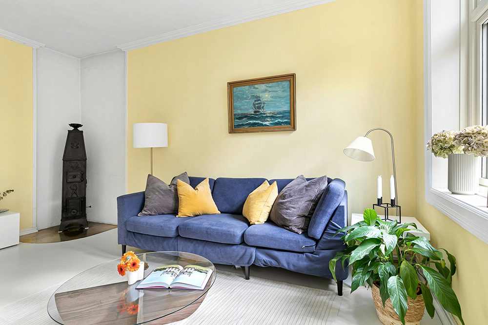
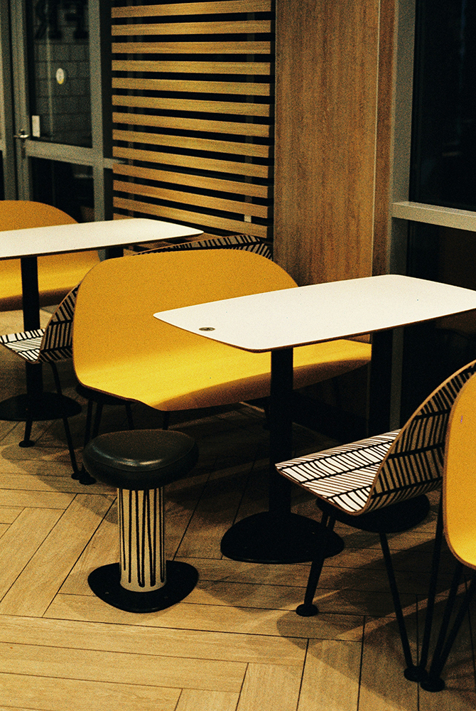
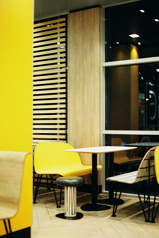
This isn’t the loud, primary yellow of classrooms, we’re focussing on softened, sun-washed tones – butter, primrose, straw, and muted saffron. These hues carry warmth without overwhelming a space, bringing a gentle brightness that feels completely in tune with the spring season. They echo the quality of early spring light; diffused, optimistic, and quietly energising.
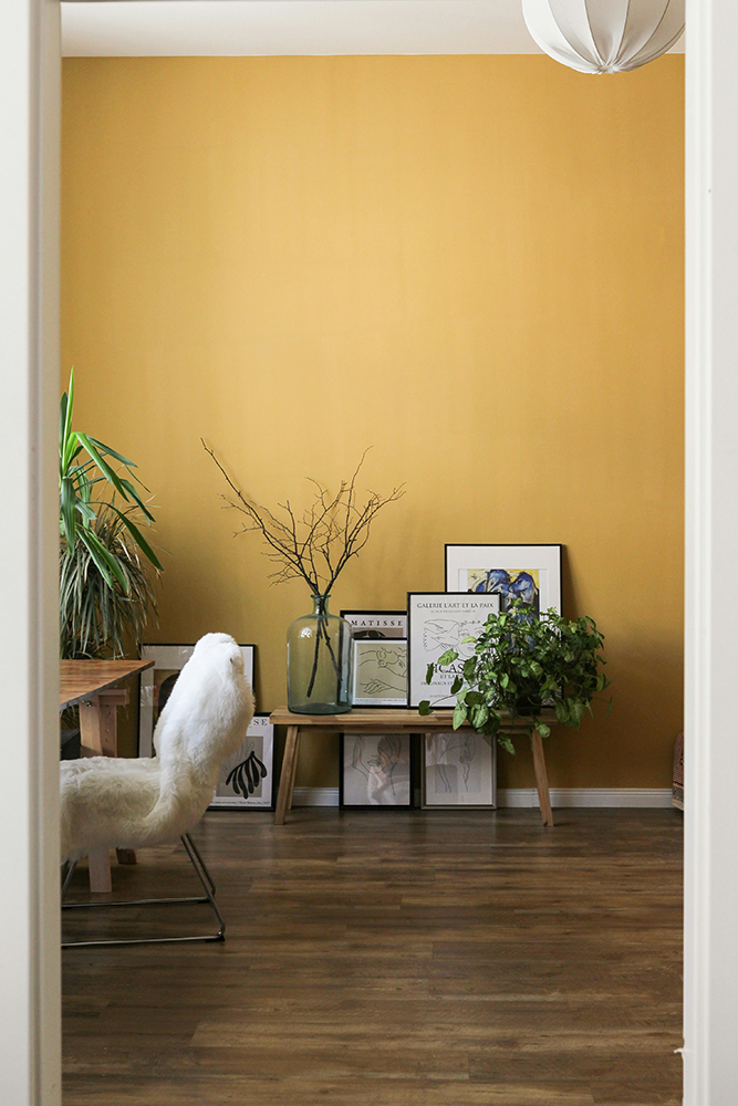
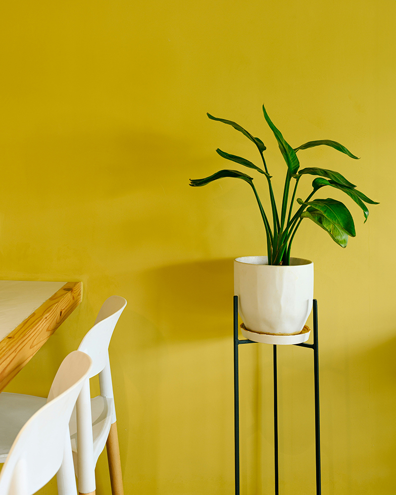
One of the most effective ways to work with yellow in a contemporary interior is to treat it as a tonal layer rather than a statement. A pale buttery wall paired with warmer neutrals such as chalk, sand, and soft taupe, creating a backdrop that feels luminous rather than colourful. It’s subtle, but transformative, especially as natural light shifts throughout the day. In the morning, it feels fresh and clean; by late afternoon, it takes on a warmer, almost golden depth.
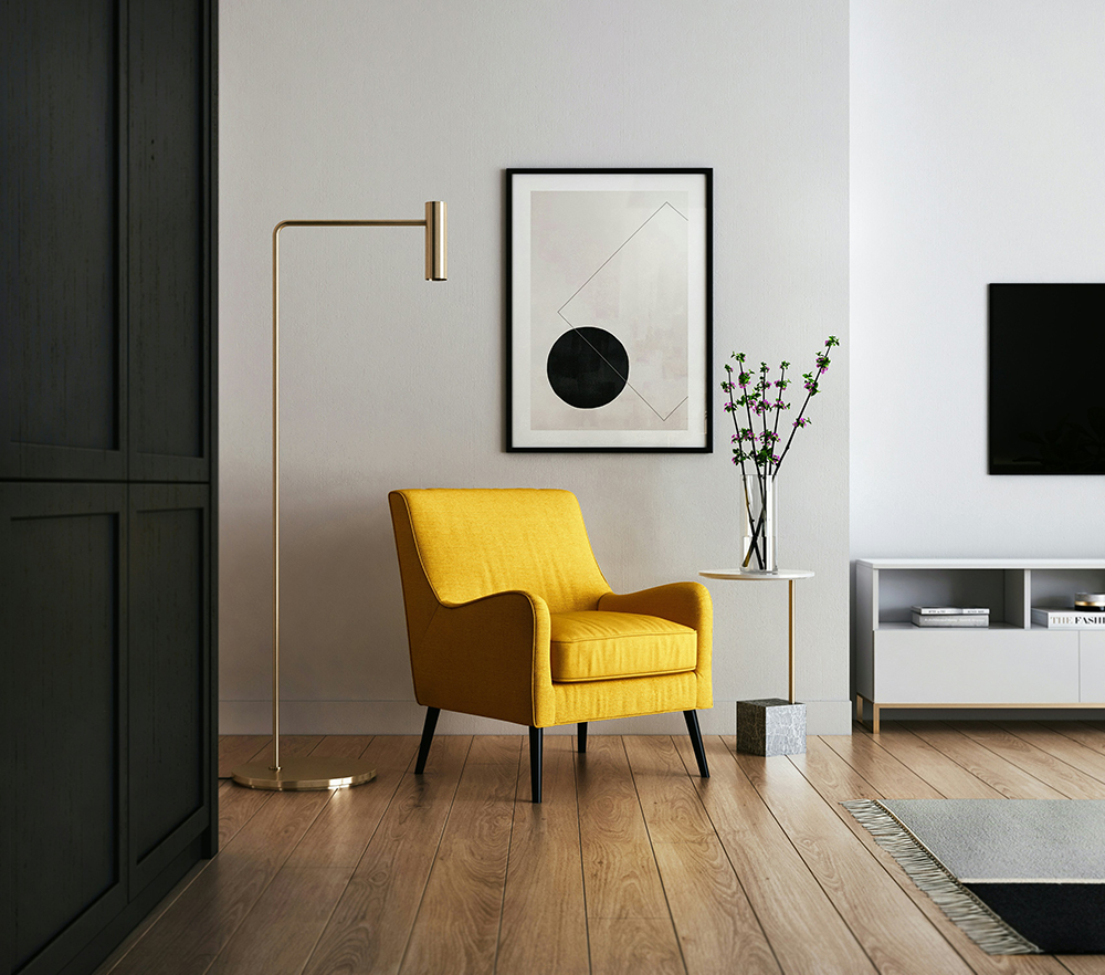
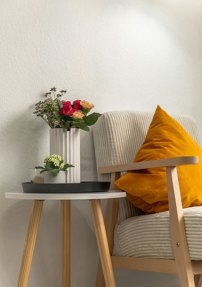
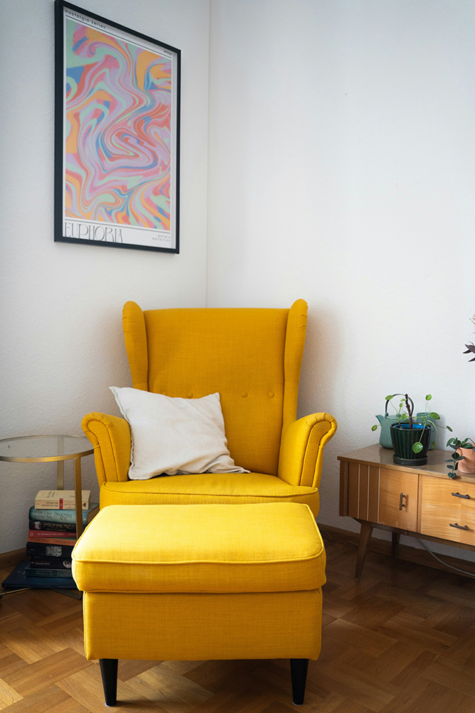
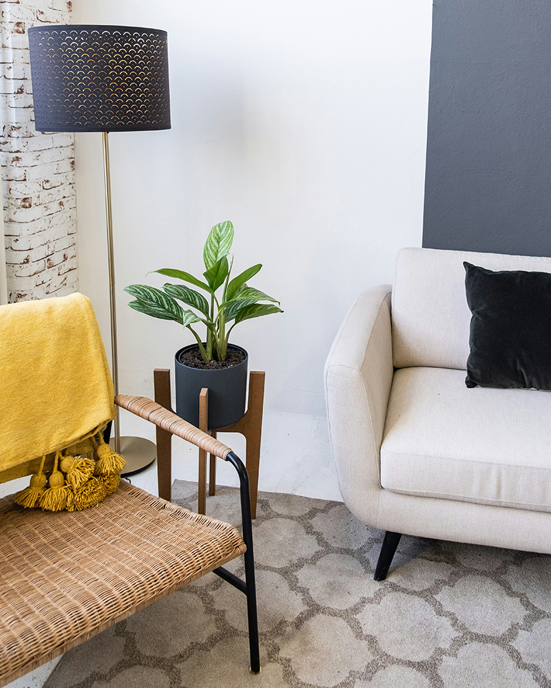
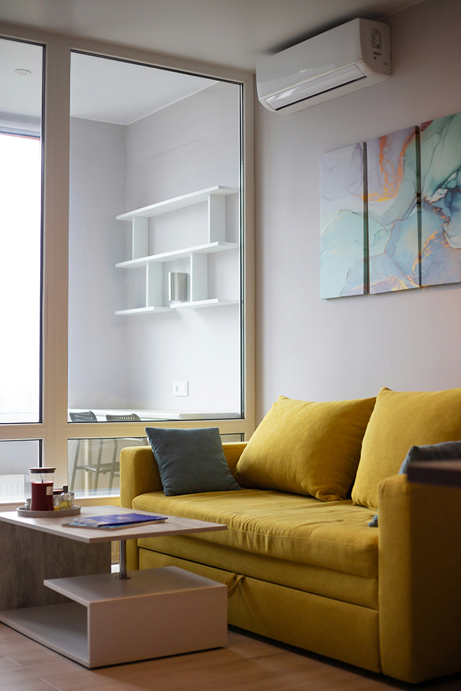
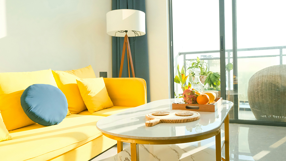
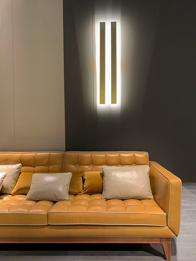
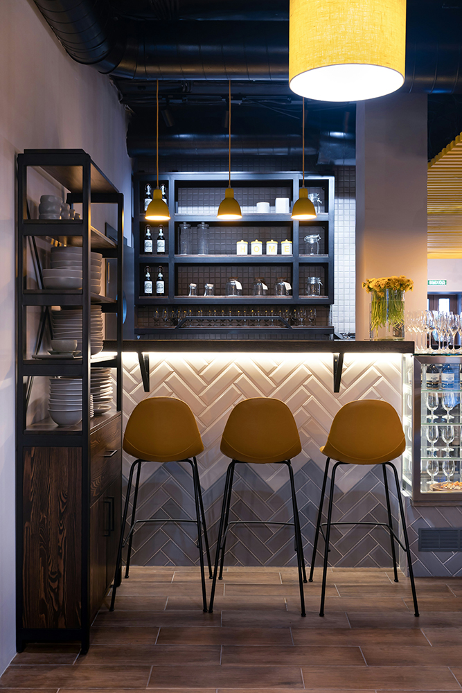
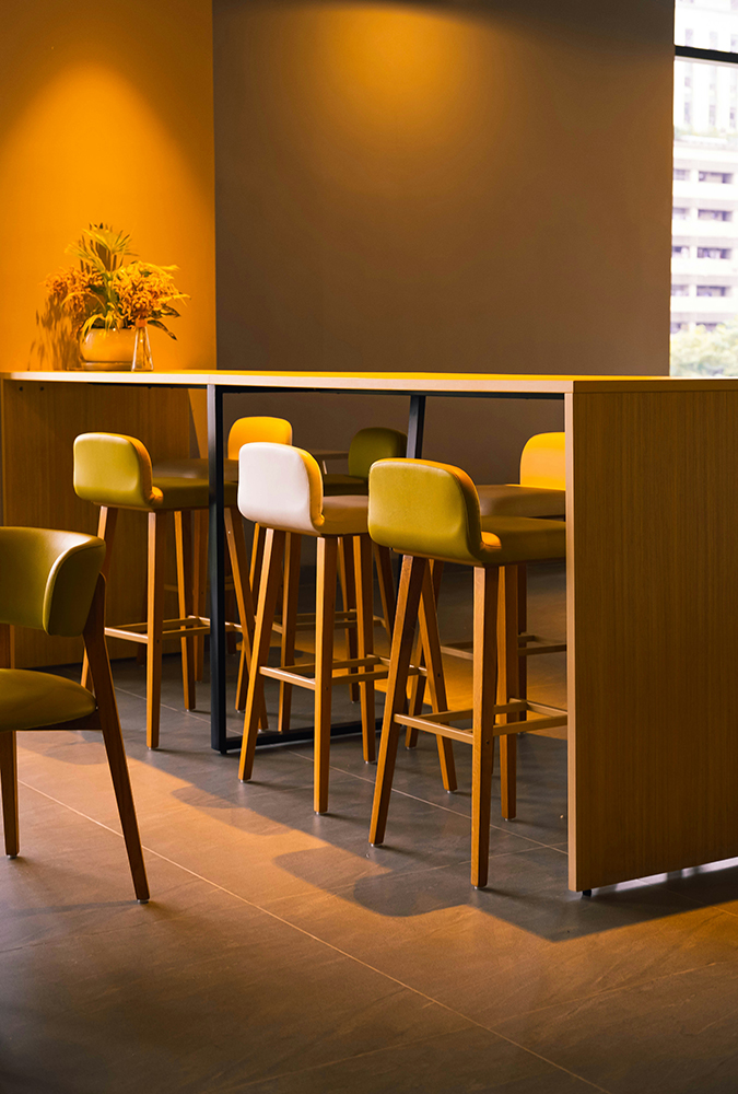
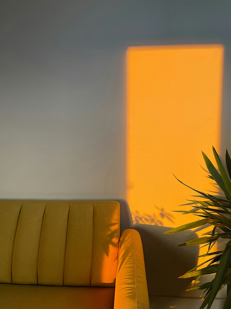
For those who prefer to keep walls neutral, yellow can be introduced through furniture and objects in a more curated way. Upholstery in a washed ochre or a muted saffron adds warmth to a room without dominating it, particularly when balanced with natural materials like linen, light wood, and stone. Even smaller accents – a ceramic lamp, a woven throw, or artwork with sunlit tones – can lift an entire space, catching the eye in a way that feels effortless rather than staged.
What makes yellow particularly relevant in current interior design is how well it integrates into contemporary design. There’s an ongoing shift towards interiors that feel softer and more human – less stark contrast, more tonal depth. Yellow sits comfortably within this, bridging the gap between neutral and colour. It brings a sense of brightness without the coolness of white, and warmth without the heaviness of deeper earth tones.
Light plays a crucial role in how these shades perform. As daylight becomes more generous, yellow begins to interact with it in a way few other colours can, amplifying brightness, softening shadows, and subtly shifting in tone as the day unfolds. This makes it an ideal choice for spaces that might have felt flat over winter. Simply introducing a few yellow elements can completely change the atmosphere, making a room feel more open and responsive.
Texture enhances this effect further. Matte finishes, natural fibres, and gently imperfect surfaces allow yellow to feel grounded rather than glossy. Linen curtains in a pale straw tone, a lightly textured painted wall, or a brushed cotton cushion all contribute to a layered, tactile environment that aligns with current interior trends. It’s less about polish and more about presence creating spaces that feel lived-in, calm, and quietly uplifting.
There’s also something inherently optimistic about yellow, particularly in these softer iterations. It speaks to growth, to longer days, to that gradual return of warmth after the stillness of winter. Used thoughtfully, it doesn’t shout for attention, it simply enhances what’s already there, bringing a sense of balance and lightness that feels entirely appropriate for the season.
Spring interiors don’t need a complete overhaul to feel renewed. Sometimes, it’s just a matter of shifting the palette, allowing a little more light in, and introducing colour in a way that feels considered and current. As the clocks move forward and the days begin to unfold, yellow offers a way to reflect that change. Check out this week’s gallery for some yellow design inspiration;