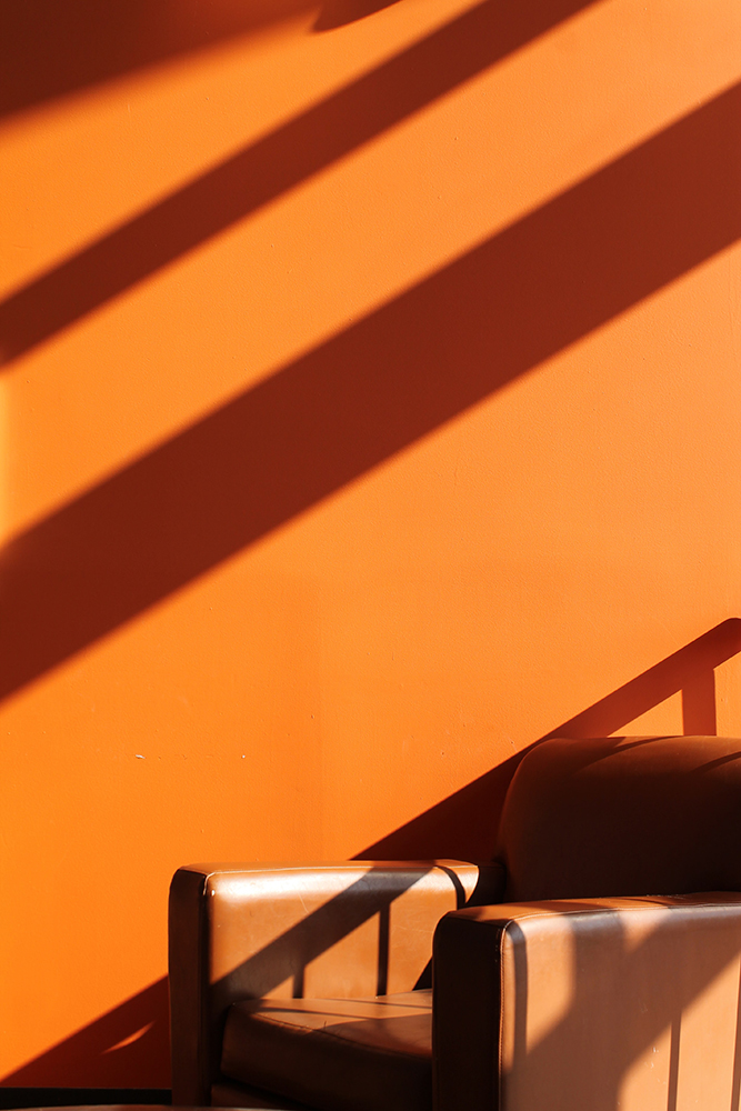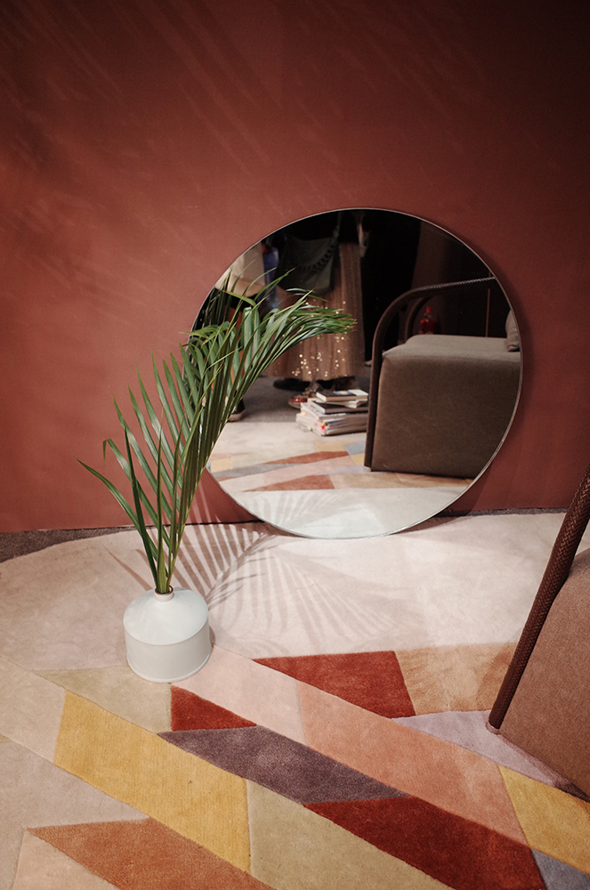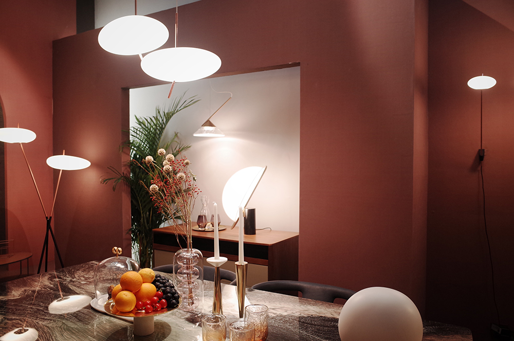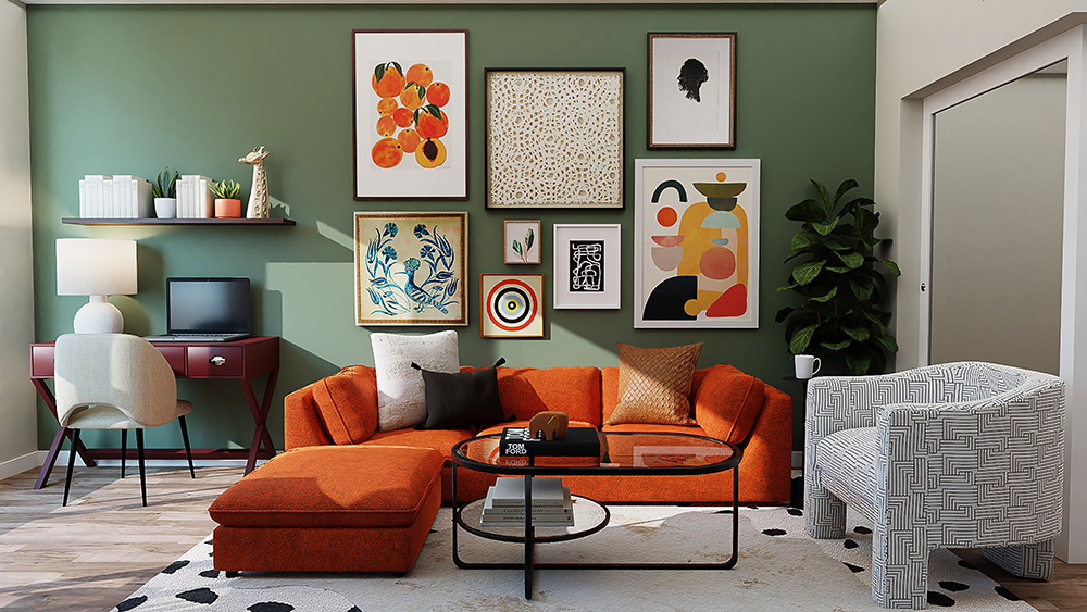
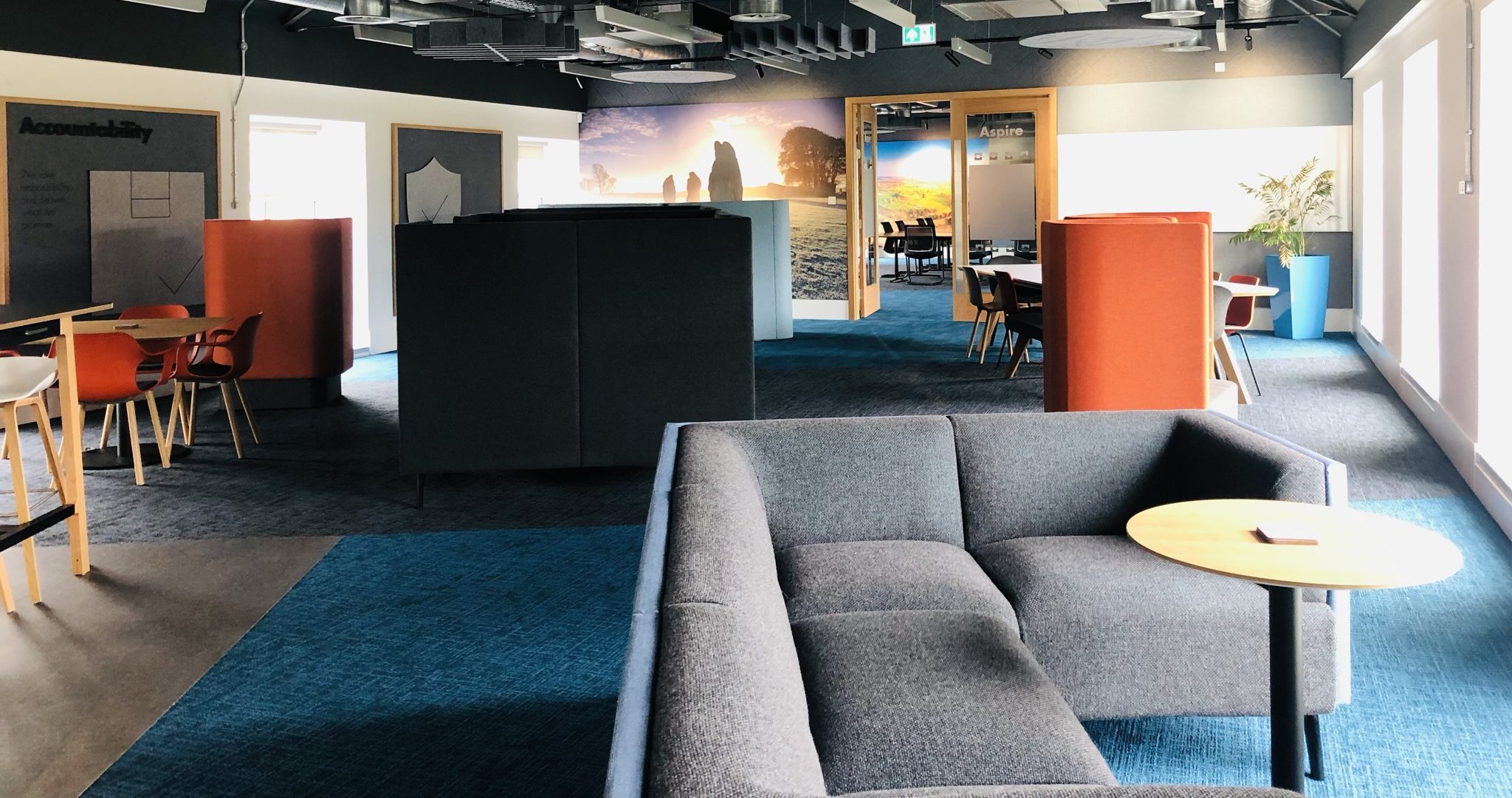
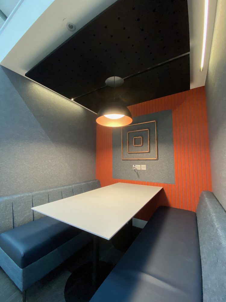
In the Wylde blog we’re celebrating ‘burnt orange’ as our colour of the week! It’s officially autumn and we’re embracing it. As the temperature begins to slowly drop and the days shorten we’re heating things up with some burnt orange colour palettes for interior spaces.
Orange is obviously linked to autumn and the colour of dying leaves and pumpkins but also associated with warmth and fire – so this really is the perfect palette to cosy things up with. Specifically burnt orange is on the medium to darker end of the scale and was officially titled in 1915 although it’s true shade is up for debate!
Did you know Auburn University contends that Burnt Orange comes with blue undertones, while the University of Texas disagrees. It turns out that Pantone follows the version of Burnt Orange with blue undertones!
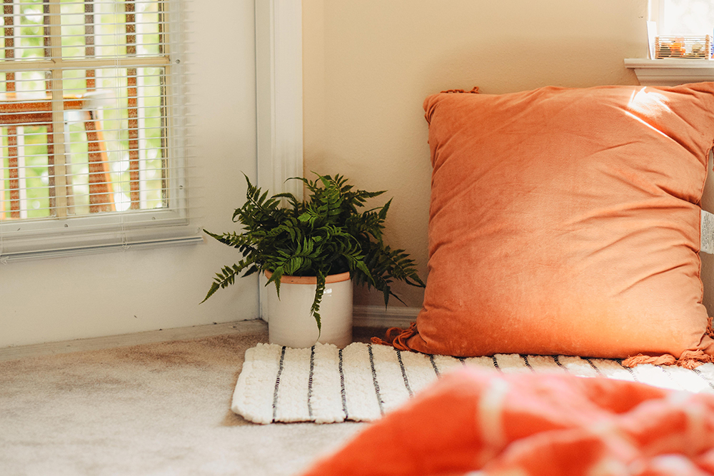
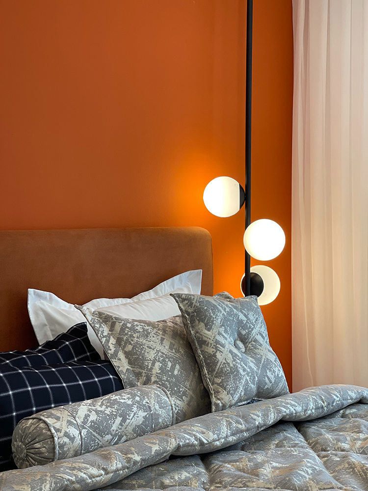
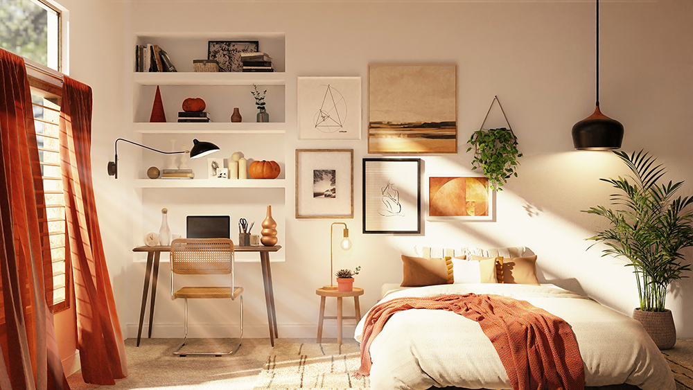
The colour itself has both negative and positive connotations which should always be considered when using in an interior space. The colour is associated with stubbornness and childishness but also warmth and togetherness. In terms of colour theory, it’s complimentary tones are deep blues and greys but can also sit well next to minty blue and peachy pinks!
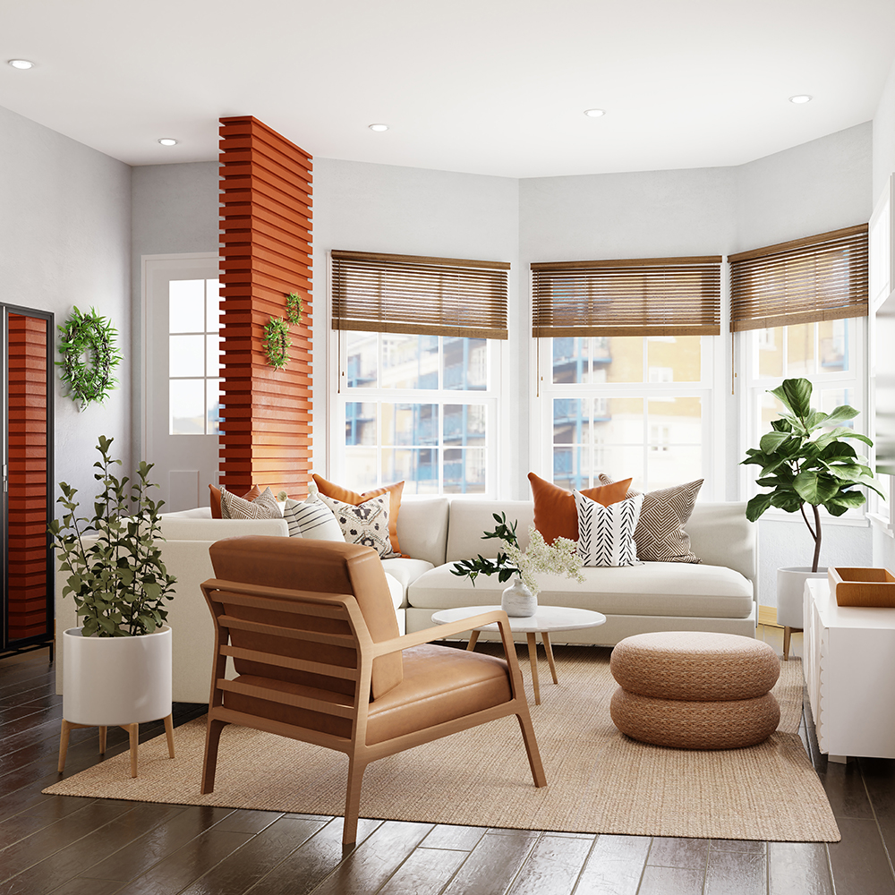
Remember when integrating these colours into your interior design scheme that blues and greys are cool shades and to balance accordingly if you’re wanting to warm your space up visually! For smaller spaces we’d advise pairing with lighter shades such as peach and dusty pinks or light terracottas to avoid making your spaces shrink! We love the kitsch aesthetic that can be created with layered fabrics – think chunky knit throws and faux-fur rugs, or if you’re going all in on vintage vibes – burnt oranges can be paired with mustard yellows and rusty reds.
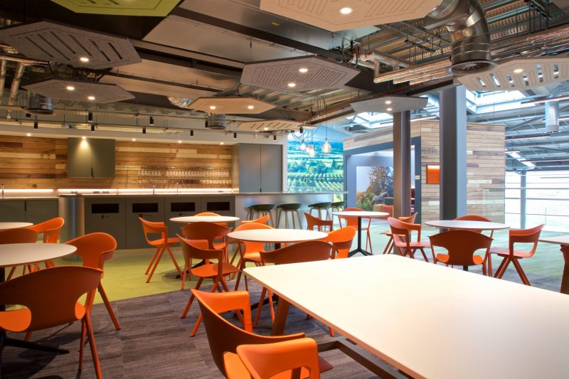
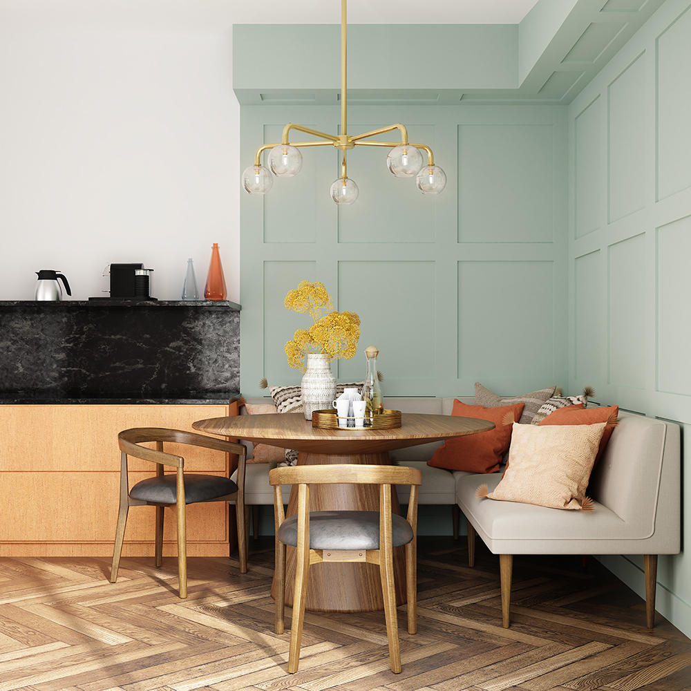
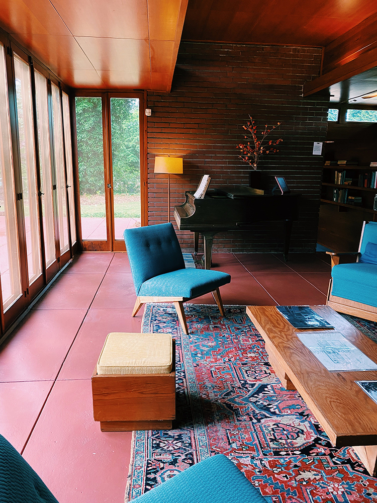
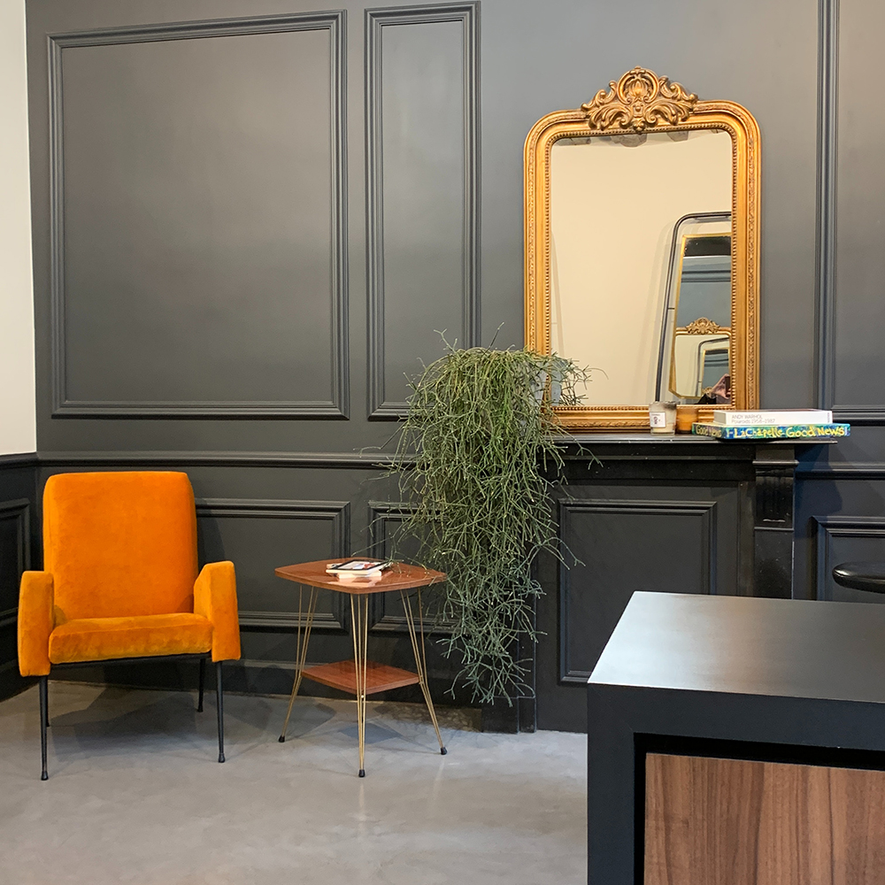
We’ve collated a gallery of burnt orange interior design inspiration to help get you started!
-

- Sterling Check Swansea
-

- Wylde Alliance Pharma Progress
-

- ADEY
-

- Wylde ia Thatchers HQ