
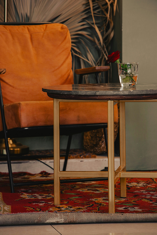
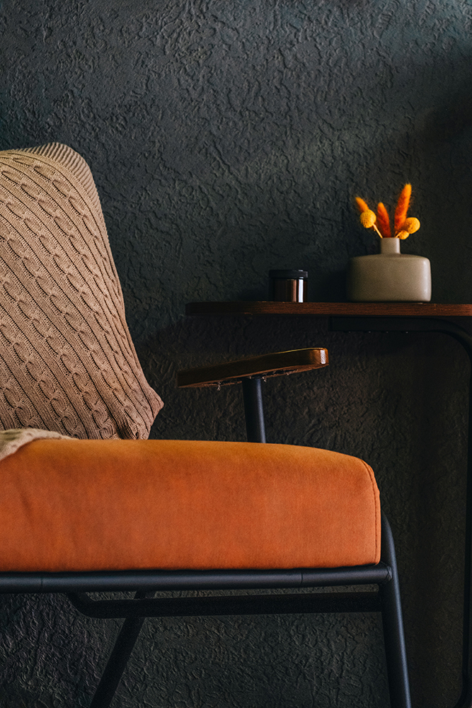
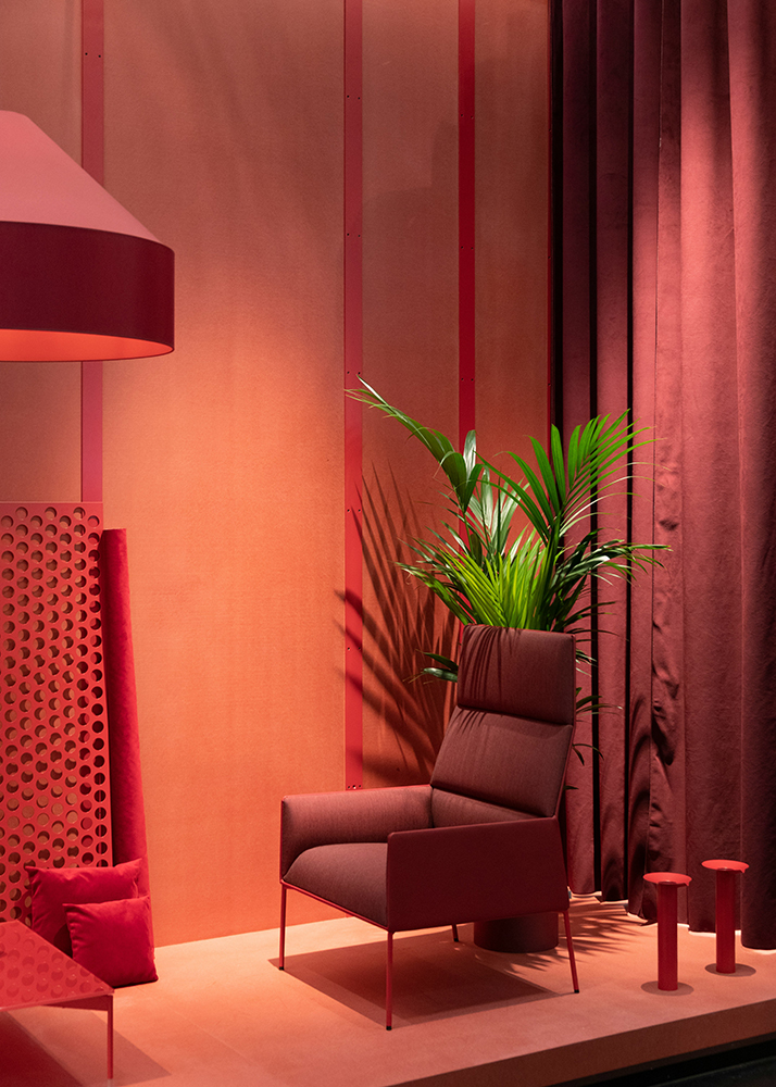
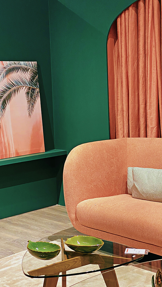
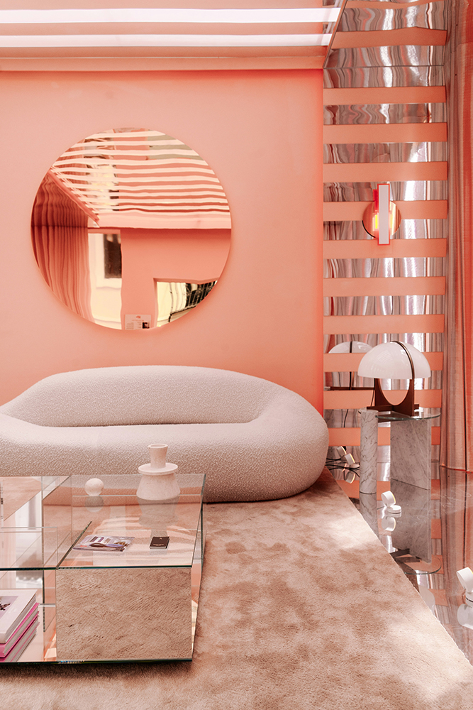
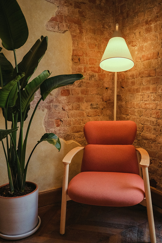
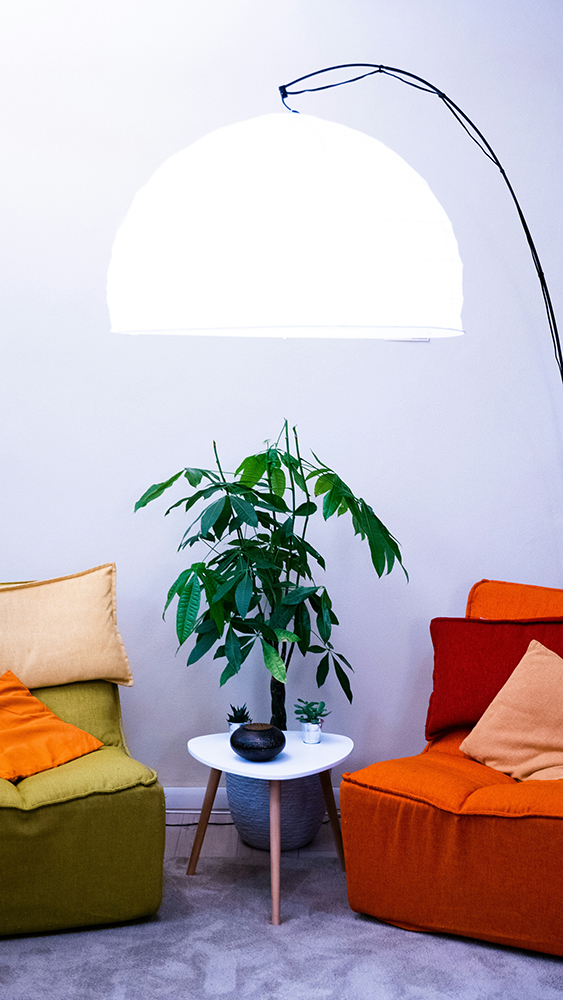
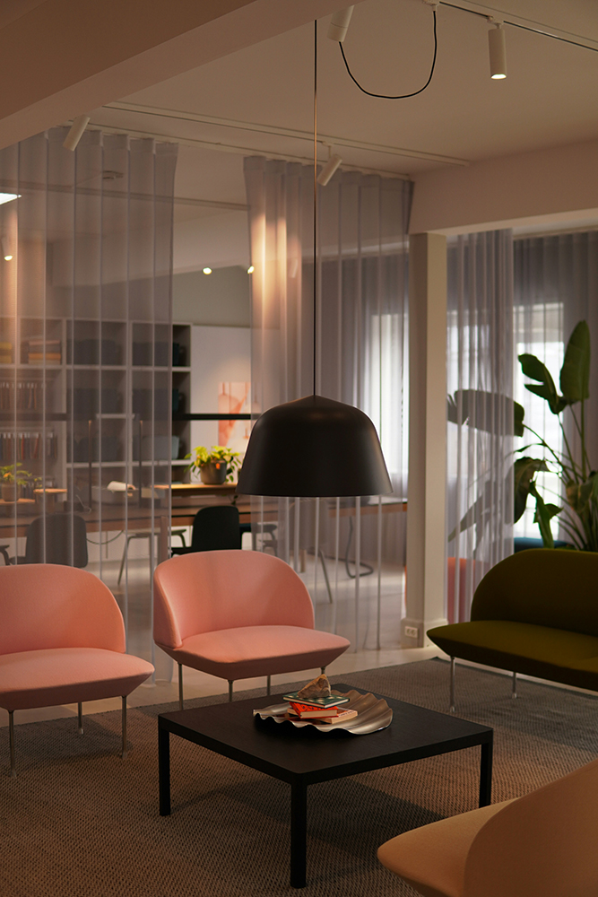
For this week’s Wylde insight we’re bringing you a freshly squeezed blog about fruity, joyous and bold summer colour schemes – think peach, mango, nectarine and watermelon. How to introduced these colours, themes and textures into your homes for a bright, hot and glowing summer even when the good old British sun isn’t shining!
Summer interiors do not need to rely on sunshine to feel bright, warm and full of energy. This season’s colour palette is inspired by the shades of tropical fruit bringing a fresh, playful feel into the home even when the weather in the UK is doing its usual thing… The soft blush of a peach, the rich golden warmth of mango, the glowing orange-pink of nectarine and the vibrant punch of watermelon all bring an instant sense of joy into a space. Even when the skies are grey, these colours can create interiors that feel sun-drenched, energising and full of zest.
These colours work because they feel warm and natural rather than harsh or overpowering. They instantly make a room feel more relaxed, sociable and lived in, whether you are using them in small details or going all in with bigger pieces.
Peach is probably the easiest shade to introduce. It is softer than orange, warmer than pink and works well in almost any room. Peach-toned cushions, lampshades, ceramics or artwork can brighten darker corners without feeling too bold, while painted walls in softer peach shades can make a space feel warmer and lighter instantly. It pairs especially well with natural wood, cream tones and linen textures.
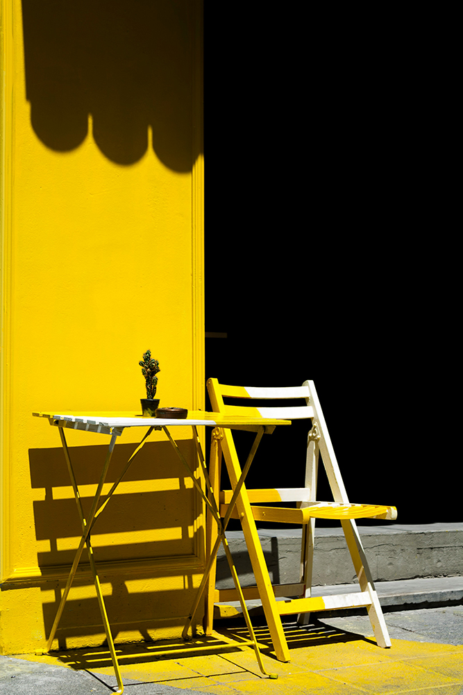
Mango shades bring stronger golden tones into the mix and work brilliantly in kitchens and dining spaces. Think rich yellows with hints of amber and saffron. Even something as simple as colourful crockery, painted dining chairs or warm-toned cabinetry can completely shift the feel of a room and make it feel brighter and more inviting.
Nectarine shades sit somewhere between coral, terracotta and orange, making them really versatile. These tones work best when layered with natural textures like woven rattan, relaxed linen, bouclé fabrics and handmade ceramics. Keeping the rest of the palette grounded with sandy neutrals and earthy tones helps the brighter colours feel balanced rather than overpowering.
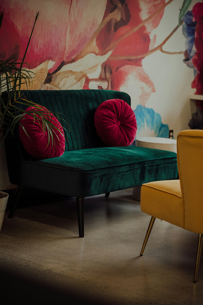
Watermelon pinks and reds are where the palette becomes a bit more playful. These shades work best as accents through artwork, upholstery, tableware or decorative accessories. Against crisp white walls or deeper earthy shades, watermelon tones can make a space feel fresh, modern and full of personality.
Texture is just as important as colour when creating that warm summer feel. Washed linens, cottons, woven materials, glossy ceramics and natural woods all help make interiors feel more relaxed and layered. Mixing different finishes keeps the space from feeling flat and adds warmth without needing loads of pattern or colour.Lighting also makes a huge difference, especially during those more gloomy summer days! Warm-toned bulbs, table lamps, candles and reflective finishes can help these fruity shades feel richer and softer throughout the evening. The goal is to create a space that still feels bright and glowing even when the skies outside are grey.
Peach, mango, nectarine and watermelon shades bring energy into the home in a way that feels fun rather than overly polished. Combined with natural textures and warm lighting, they can make any space feel like summer, regardless of what the forecast has planned!