This week in the Wylde blog we’re providing you with the kind of January Blues that we can get along with – yes, we’re talking colours not moods!
Whilst it’s been proven that Blue Monday was in fact a PR stunt – originally dreamed up to sell holidays. It is a myth, a likely sounding calculation based on things like the gloomy weather, post-Christmas debt, guilt from breaking new year’s resolutions, the slog of going back to a job you don’t like combined with general doom and gloom. The January Blues however aren’t to be dismissed; it is peak season for Seasonal Affective Disorder which is a major depressive disorder that affects those living far from the equator with fewer hours of daylight in the winter months. It can be serious, so if the low mood, sadness, lack of motivation or tiredness and fatigue don’t lift or become unbearable; reach out for help.
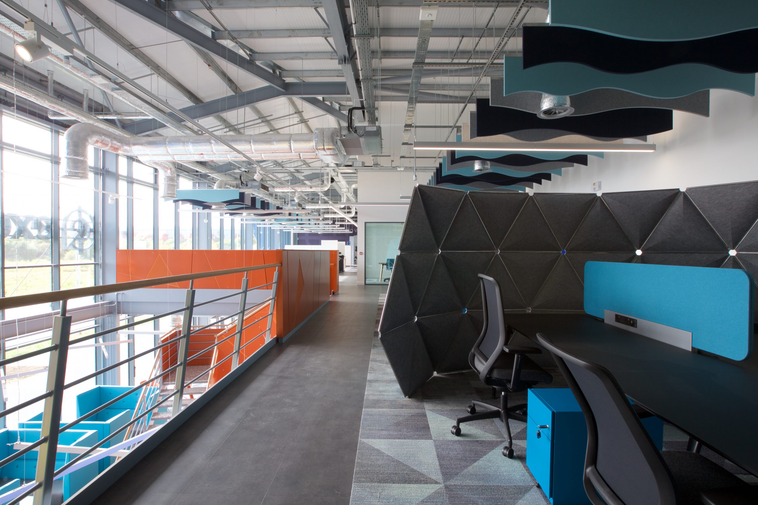
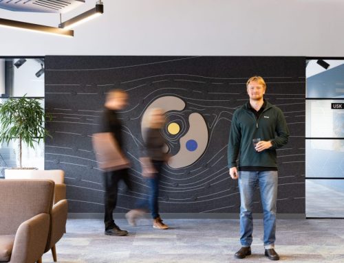
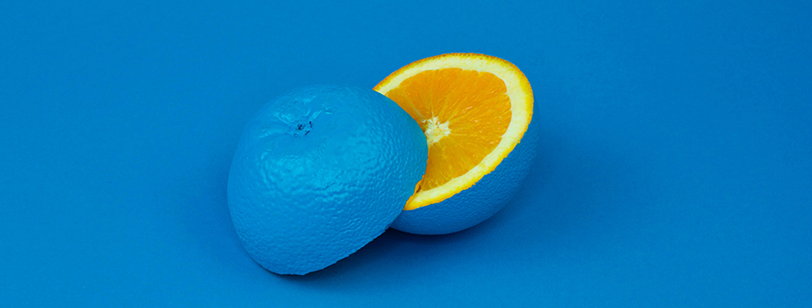
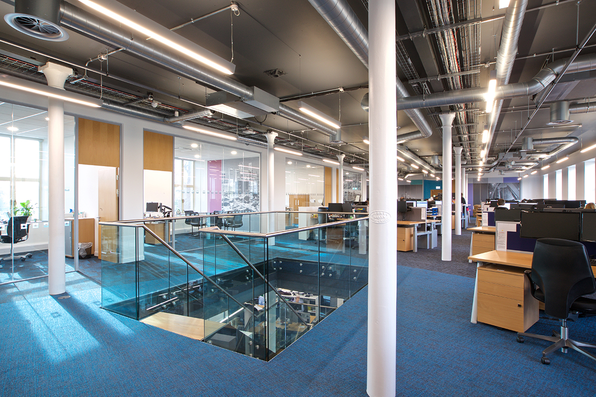
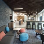
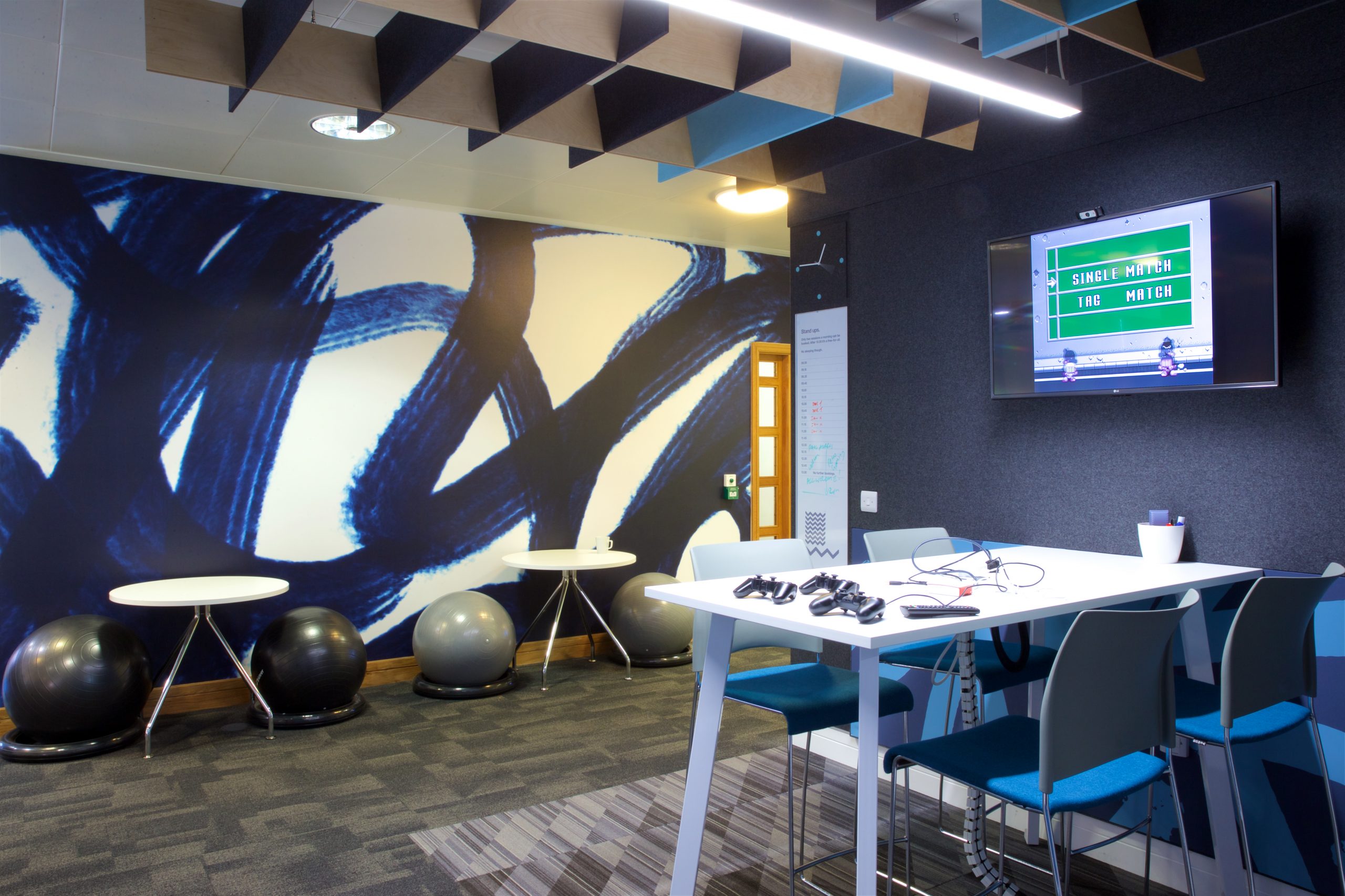
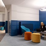
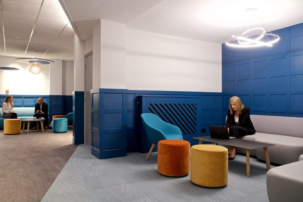
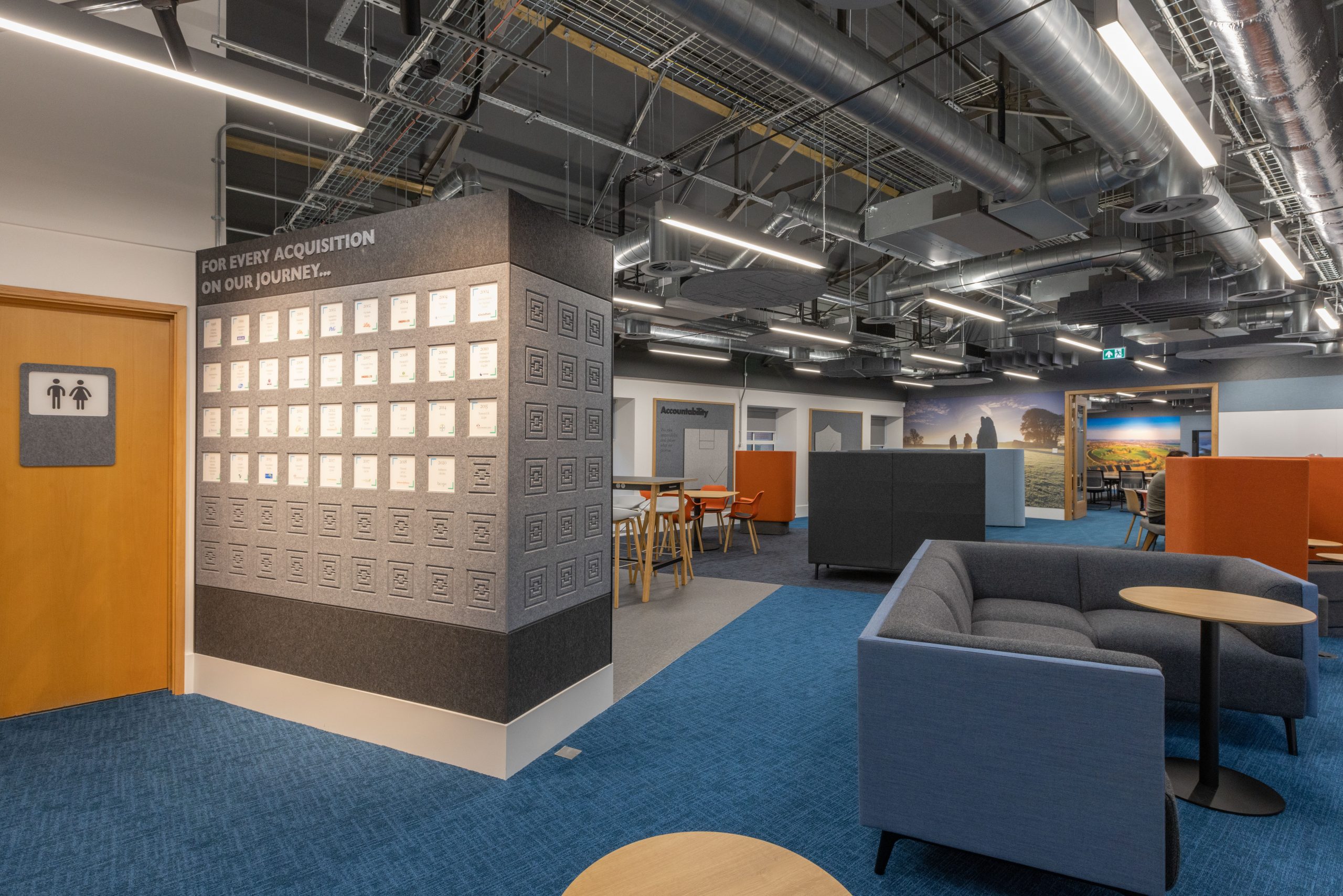
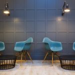
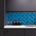
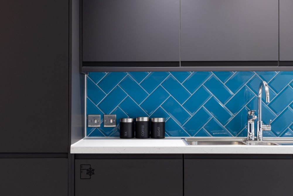
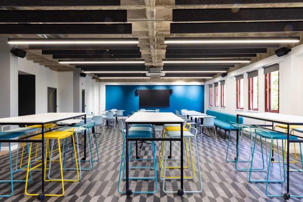
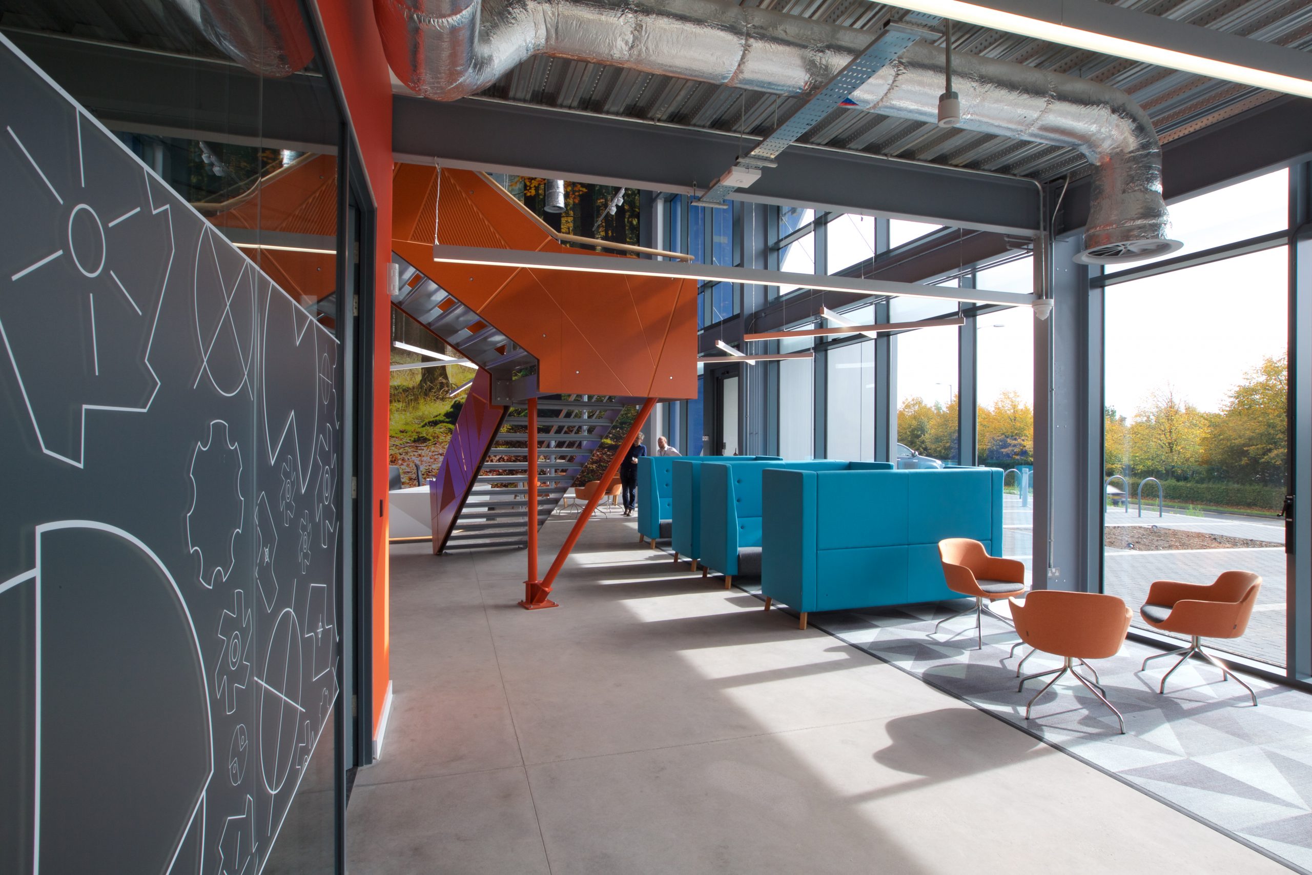
To the blues – some say blue has become the new black in interior design , with certain shades trending over the past few years. We love a feature wall and have seen rich, opulent dark blues and teals make a huge comeback in recent times. However, there is a new blue on the block that is set to become a trend in 2023; Wellness or Calming Blue. This is a bright yet creamy and relaxing hue with turquoise notes making it reminiscent of water and clear skies combined. The green undertones immediately make this cool tone naturally soothing with designers suggesting it will be a popular choice for home offices, studios and nooks for meditation or break out areas.
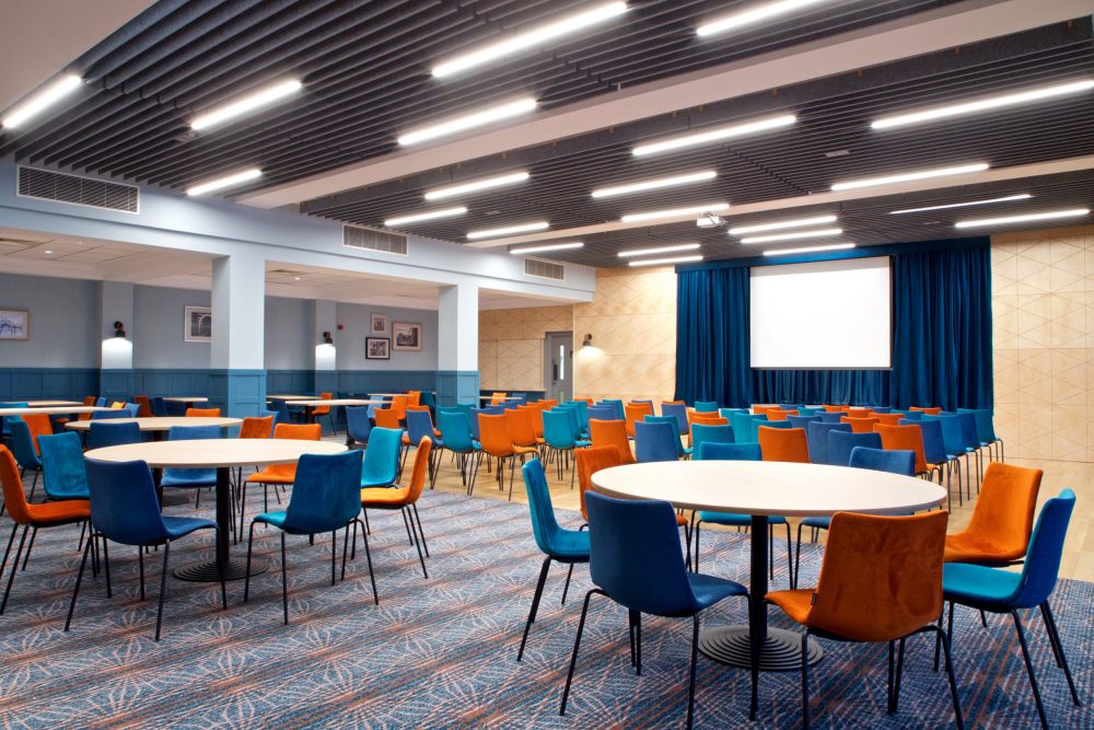
A mid-tone bright blue is a bold statement but one that oozes positivity and tranquility – something we could all do with after a somewhat tumultuous few years. Some have mentioned the associations with future, technology and energy – a sentiment echoed with the vivacious magenta Pantone colour of the year. This year is all about picking loud, unapologetic colours and using them to evoke the emotions we want more of!
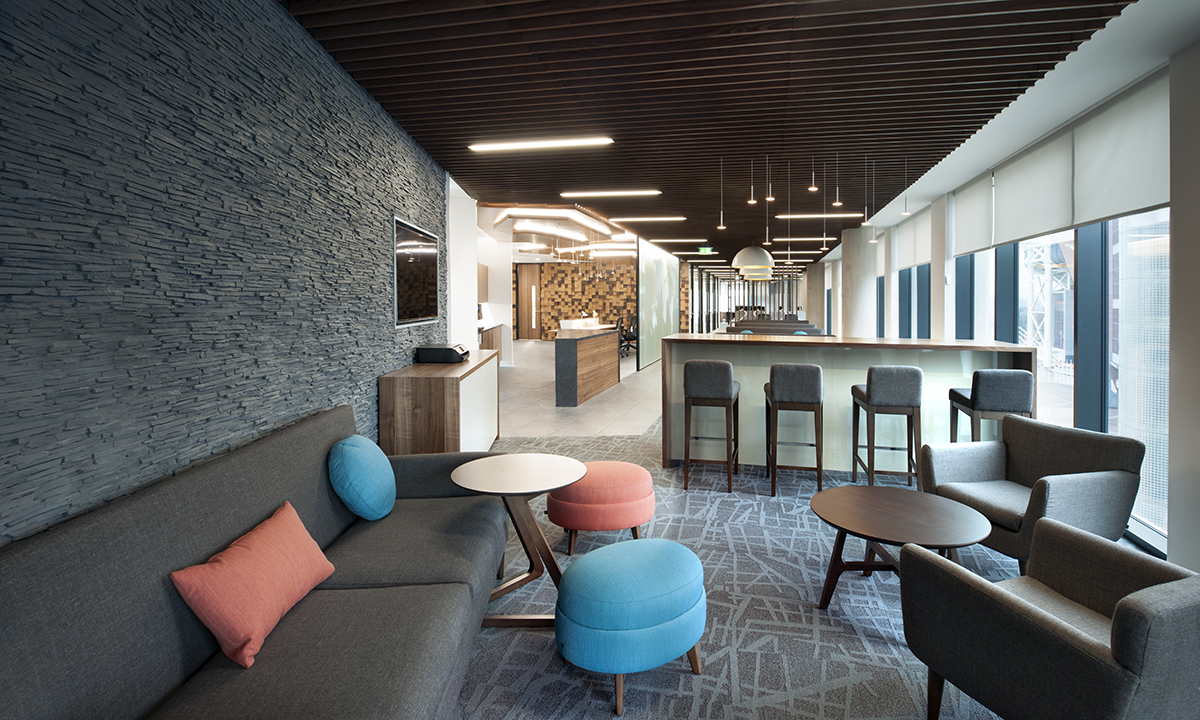
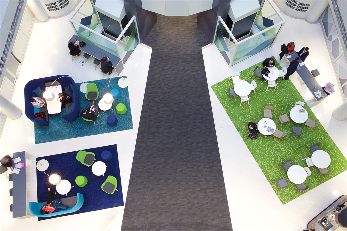
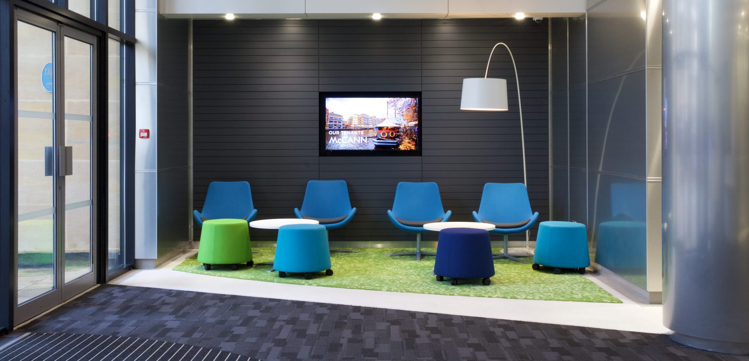
Whether you redecorate entirely and paint your walls with a wash of Wellness Blue or you simply inject elements of colour into your existing scheme in fabrics and furnishings. We’ve used this bold tone in many of our schemes; sometimes as a stand alone statement and often paired with rich complimentary orange tones – but also greens, yellows and even magenta! Check out our inspiration gallery and see how you can embrace the right kind of blues this January.
-

- Wylde IA – Alliance Pharma
-
- Wylde IA – MotoNovo
-

- Wylde ia – Redcliff Quay
-

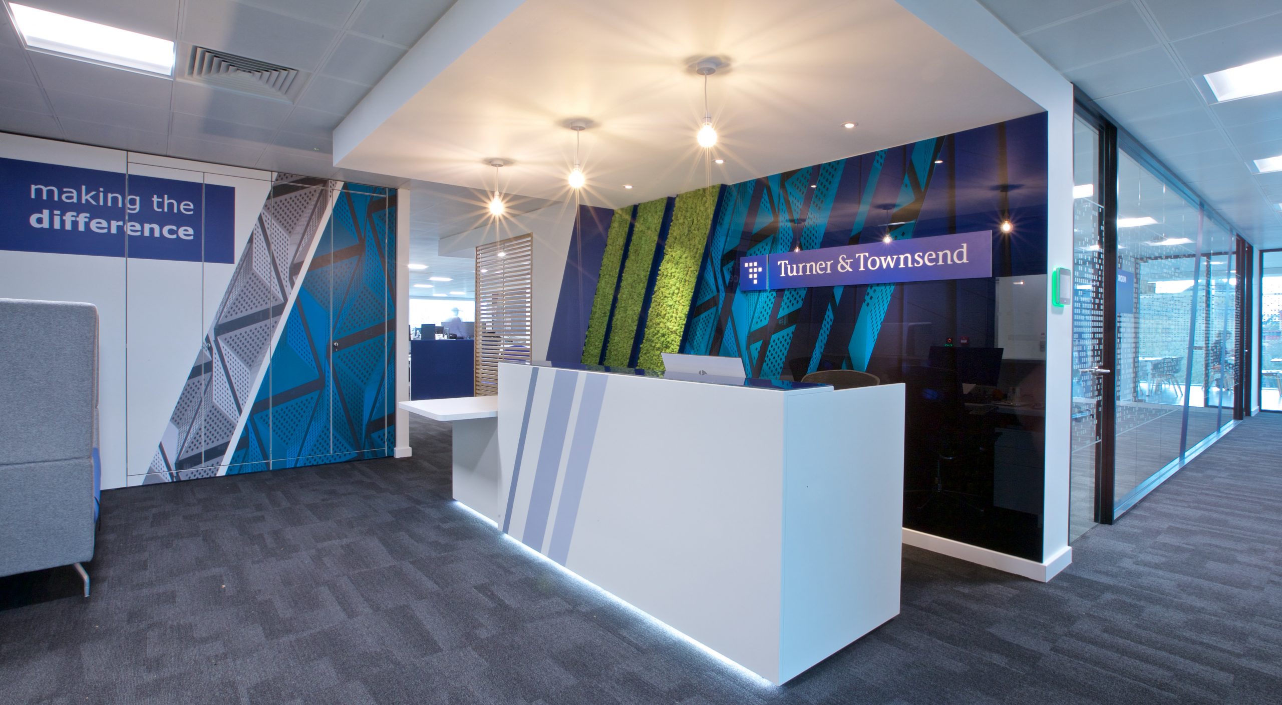
- Wylde ia – Turner Townsend
-

- Wylde IA – Redcliff Quay
-

- Wylde IA – Three
-
- Wylde IA – BAWA
-

- Wylde IA – BAWA
-

- Wylde IA – Alliance
-
- Wylde IA – Hartham Park
-
- Wylde IA – BCC
-

- Wylde IA – BCC
-
- Wylde IA – H3G
-

- Wylde IA – Exactaform
-

- Wylde IA – Exactaform