Cool off this week with the Wylde blog taking you through the cool blues, aquatic turquoises and tropical greens trending in this summer’s interior colour palettes. The Pantone colour of the year is Very Peri; a soft purple-blue tone. We covered this in one of the first blog post’s of the year here – but as the year has continued it’s become apparent that this tone isn’t the only shade of blue that is popular this year!
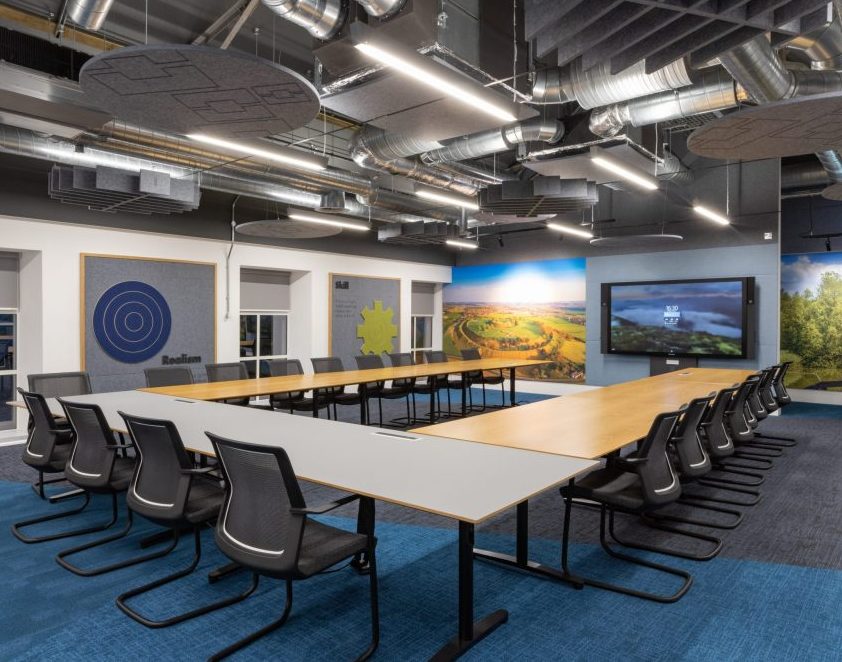
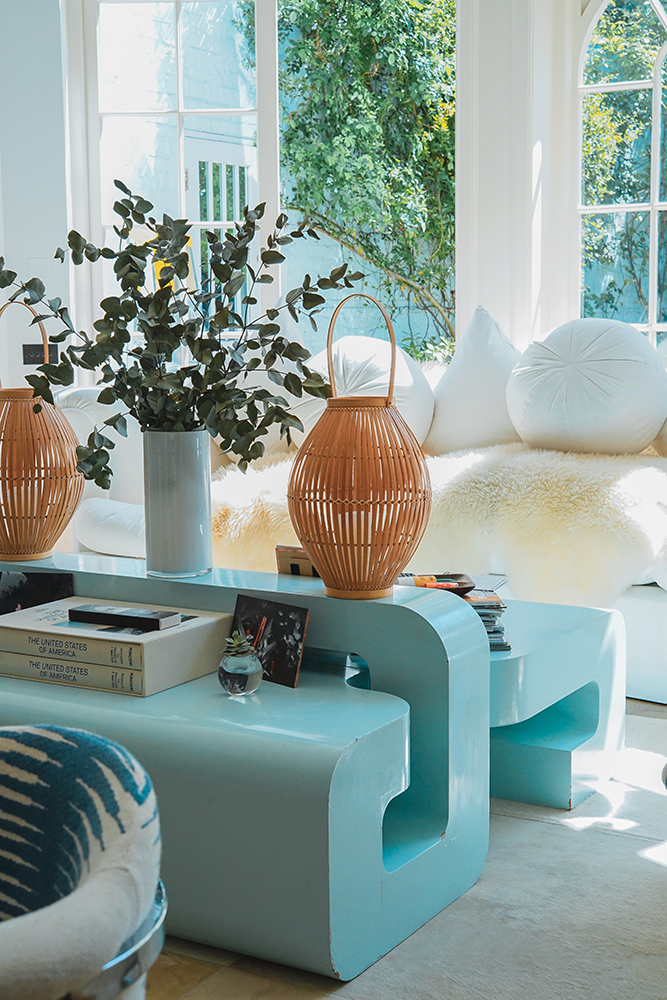
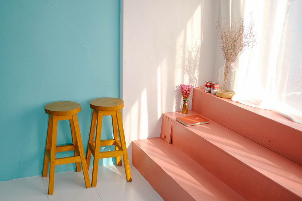
Bring the summer sky indoors with bright powder blues. We love to go bold with colour and enjoy contrasting and complimentary colours such as rich scarlets and hot oranges, especially for workplaces and areas that require users to be alert and energised. However, for those wanting a more relaxing scheme for the home – blue is such a versatile and tranquil colour – just splashes of carefully considered design elements will help inject serenity, peace and calm.
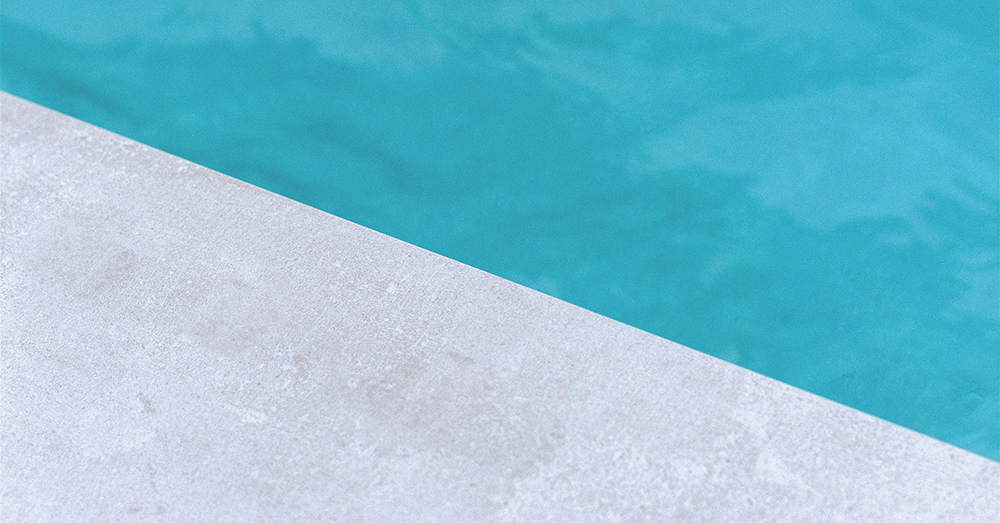
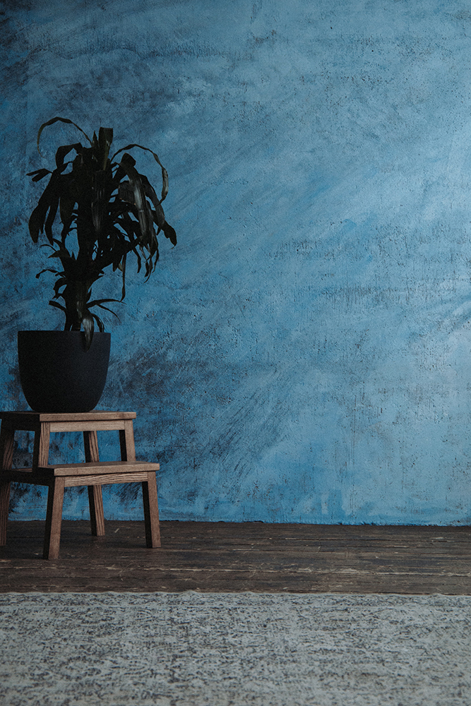
The soft, paler tones of blue are gentle and linked closely to the sky, especially when used for larger areas of space in interior design such as for feature walls and larger pieces of furniture/flooring. The more greys or lowered saturation in blues, the colder the colour will appear. Icy blues are stylish and chic, but careful when using these as they can dramatically freeze the ambiance of the room.
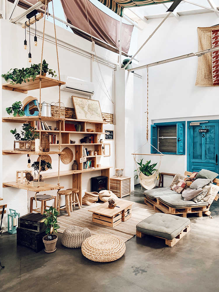
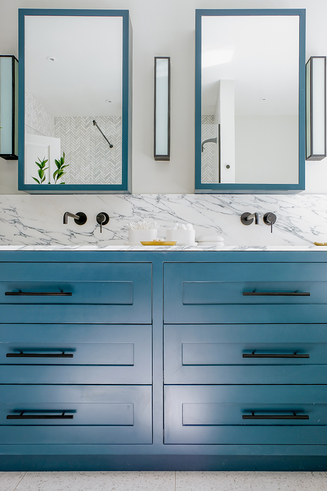
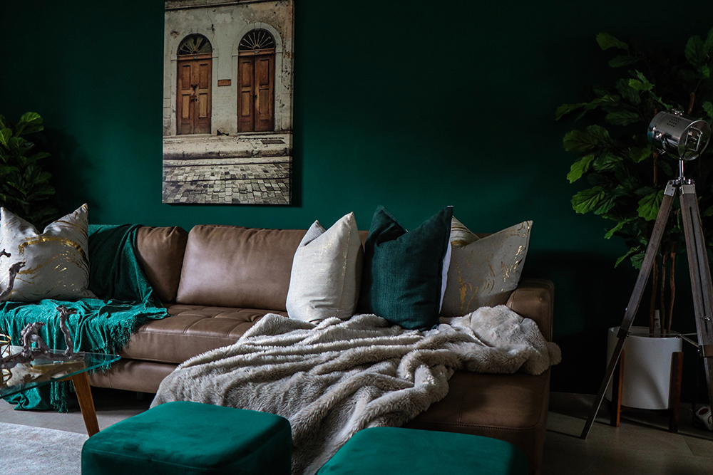
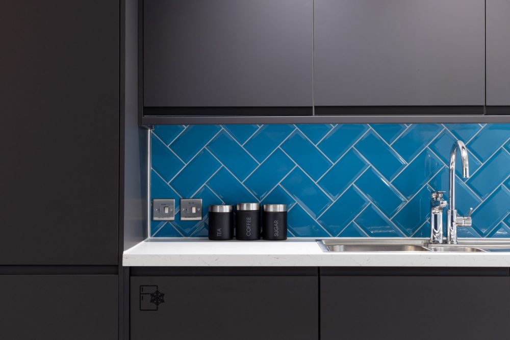
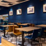
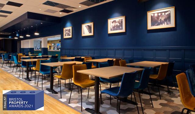
When greens are mixed with blues beautiful aquatic turquoise tones are produced. Cheerful, light shades of turquoise are associated with friendliness and mental clarity. Darker, rich teals are opulent and luxurious, offering a warm yet sophisticated feel to a space. We love deep green-blues matched with copper tones and brass fixtures. Aqua colour palettes can add a playful retro feel to a space, paired with dusty sunset pinks and kitsch flamingo magentas, you can create a vintage summer dream palette!
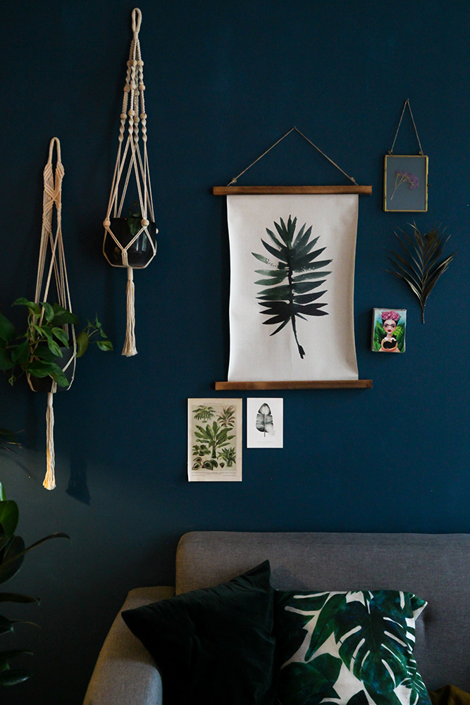
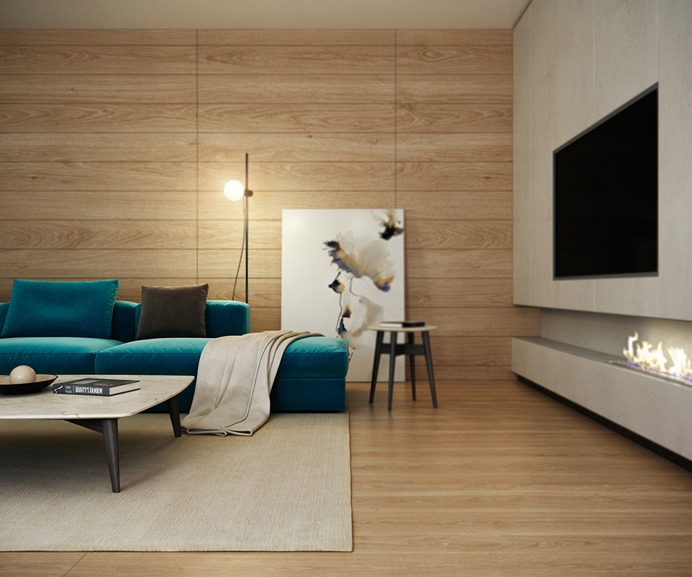
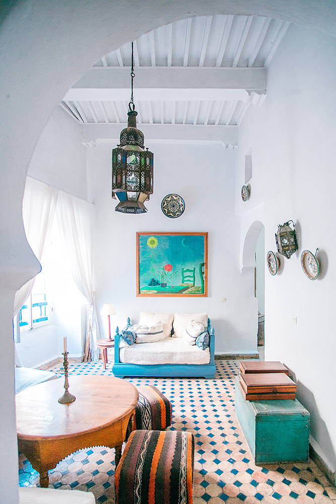
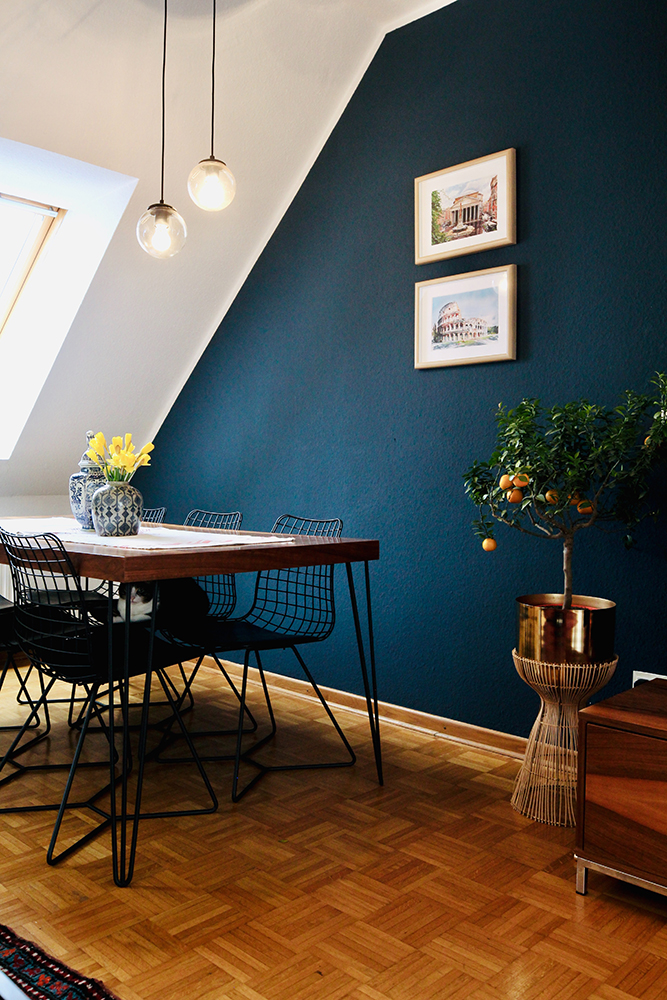
If you dare to go dark – royal blues and ultramarines are elegant and powerful tones – which when paired with bright whites or carefully selected pops of bright colours, can make any scheme look magically Mediterranean (or Moroccan).
Whatever you’re going for, blue hues offer a sense of calm and confidence. Whether you’re going big or just adding a hint here and there, depicting the ocean and the sky within your own space is something we can all get behind as we settle in for some more summer heat this week!
-
- Wylde IA – BCC
-
- Bristol Property Awards 2021
-

- Alliance Pharma Completed