As we enter the third month of the year, everything feel much the same as it has for the past year… we’re almost used to the new ways of life; working from home, socialising over the internet and picking up weird and wonderful habits and hobbies everytime we re-enter a lockdown! Springtime is coming and we’re looking at ways we can brighten up and refresh our homes – this week we’re looking at the colours that are in this year incase you fancy giving your walls a lick of paint!
Neutrals are in – and yes, that still includes grey (a Wylde favourite!). This year’s trends are earthy and natural tones that create a relaxing and soothing atmosphere in your home. Dulux have announced ‘Brave Ground’ as their colour for 2021
“A warm, natural neutral, Brave Ground, brings a bolstering, balancing feel to any room. What has emerged from our trend forecast this year is that we’re all reassessing what really matters in our lives. We’re taking stock and finding a new and positive way forward by having faith in ourselves, working together, building on the past and planning for the future. It takes courage to embrace change and our homes can help provide a solid and supportive foundation, as well as giving us the scope to be creative.”
A warm, brown-grey is a comforting neutral that can be paired with many other colours that can compliment and theme a room. Pantone have paired two colours for their annual selection – one neutral and one bold! Pantone have chosen a pandemic grey and a fluoroscent yellow as their match;
“A message of happiness supported by fortitude, the combination of Ultimate Gray + Illuminating is aspirational and gives us hope. We need to feel that everything is going to get brighter – this is essential to the human spirit.”
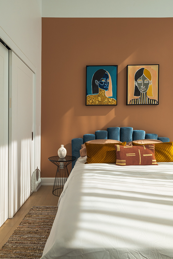
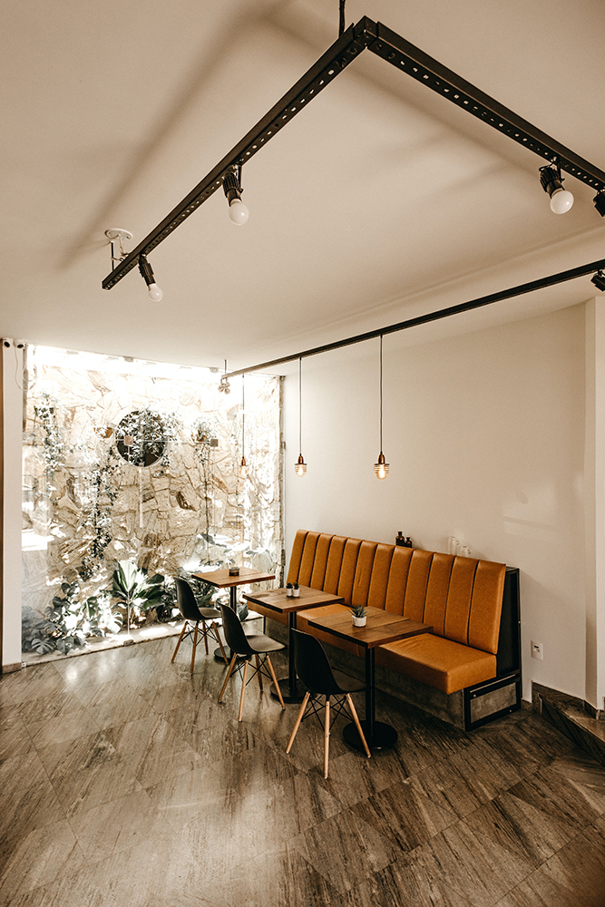
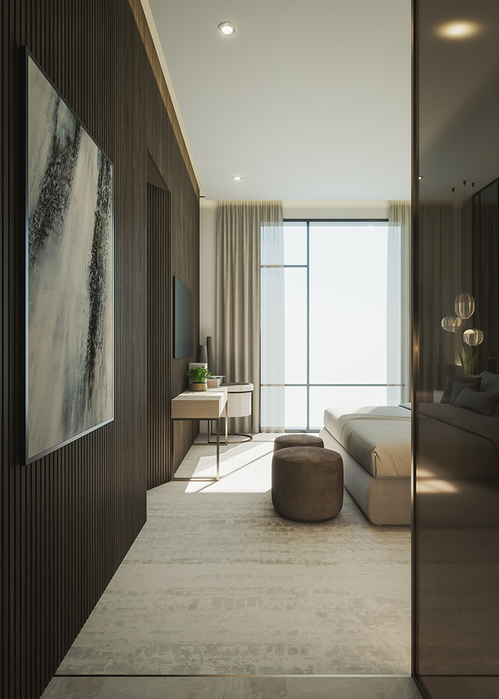
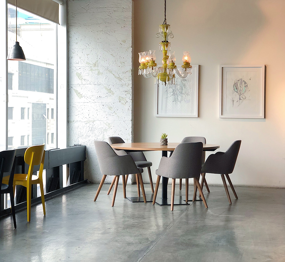
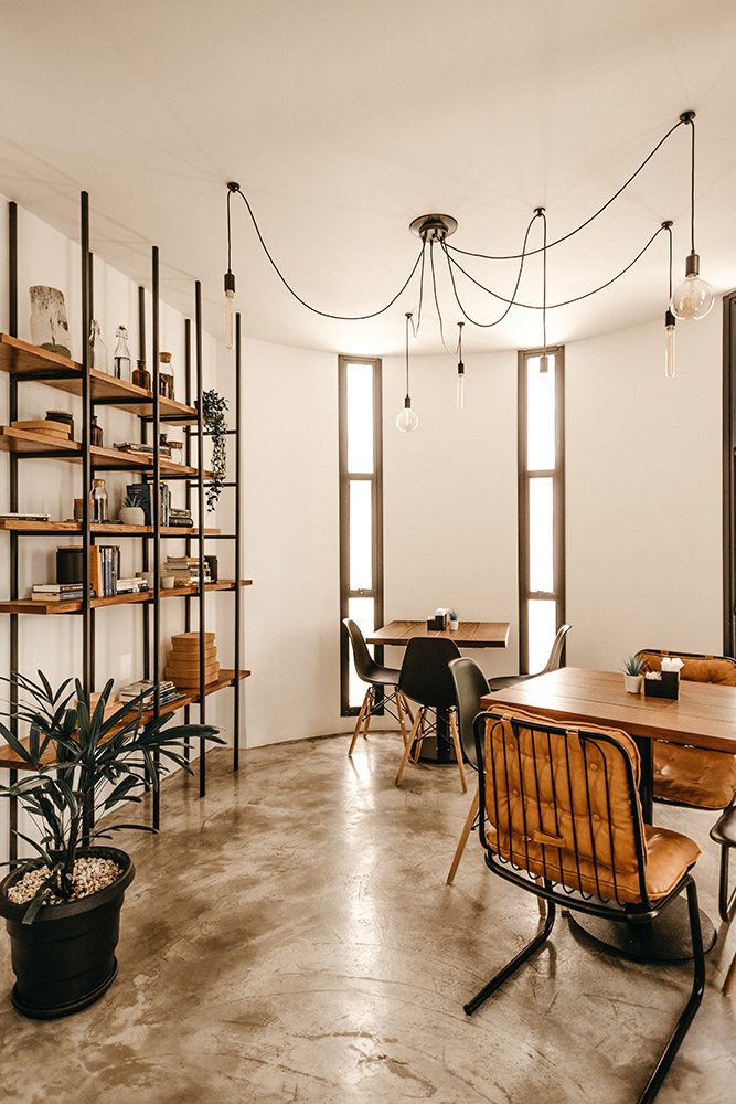
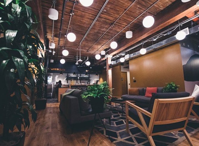
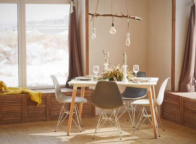
British paint & wallpaper manufacturers Farrow&Ball have selected three different hues for their ‘earthy tones’ colour trends for the year. Again, after spending so much time indoors we are all craving a desire for a connection with nature and the outdoors. As always, Farrow&Ball have not disappointed on their interesting naming of their distinctive colours – 1. Jitney 2. India Yellow and 3. Dead Salmon! Each with their own unique hue, these colours are warm brown tones that provide an elegance twist to a cosy and comforting palette.
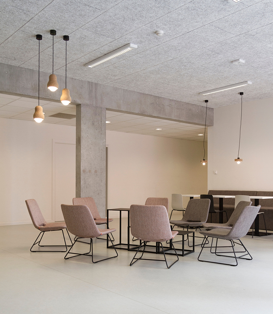
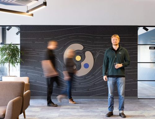
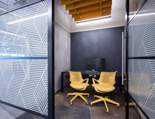
As workplace specialists – we don’t often opt for earth tones in a working environment because it’s important to create a motivating and stimulating environment rather than one you want to curl up and read a book in. It’s important to consider the function of the room when choosing paint colours as different tones evoke different psychological reactions from the user. We’d suggest using warm neutrals in spaces you’re going to use to relax and unwind in!
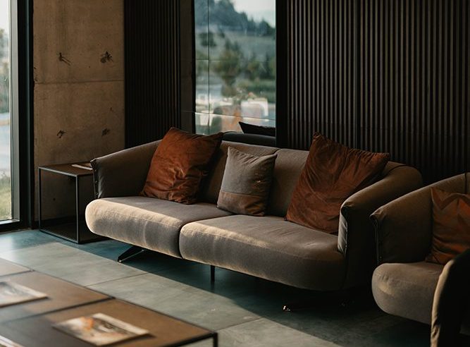
Here are some beautiful earthy-toned design schemes. Enjoy!